1. Magazine Inspiration
There are many aspects that I’ll copy a use in my magazine. Since most magazines are copies of one
another, I believe it’s important to do the same as by not following the typical template the
magazine could look deformed and messed up. The alignment of my masthead will follow a typical
convention of all mastheads. The
mastheads are all aligned evenly, so
nothing is out of place. This makes the
masthead look sleek and efficient but
also professional. I will try to follow the
alignment of these mastheads, as I
want everything in my magazine to
look perfect; if I follow the alignment
like in these 2 major magazines, the
masthead will be on point. Not only
will I try to follow the alignment, I will
try to focus on text size and font. As
you can see in these two magazines,
the text is thick and bold. This connotes
power, and hardness. Since my genre is Hip Hop, and normally related to these connotations then I
will have to include these features. When producing my magazine masthead, I will have to choose
carefully the alignment and text.
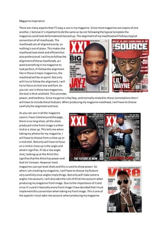
As you can see in all the magazine
covers I have listed around the page,
there is no long shots; all the shots
produced in the front image is either
mid or a close up. This tells me when
taking my photos for my magazine, I
will have to choose from a close up or
a mid shot. Not only will have to focus
on a mid or close up is the angle and
what it signifies. If I do a low angle
shot, looking up at the Artist this
signifies that the Artist has power and
that he’s known. However most
magazines use eye level shots and this is used to show power. So
when I am creating my magazine, I will have to choose my feature
very carefully since angles imply things. Not only will I take camera
angles into account, I will also take the rule of third into account when
producing my magazine front image. Due to the importance of it and
since it’s used in basically every front image I have decided that I must
implement this convention when taking my front image. This is one of
the aspects I must take into account when producing my magazine.
2. My last and final aspects that ill try to recreate in my magazine is the double page spread. Usually
within a double page spread, half of the page is covered by an image and the other half is usually a
headline with an article below. This is a typical layout of a double page spread, and I will follow this
when producing my double page spread in my magazine.
As you can
see, the way
you can
approach
your double
page spread
can vary in
terms of
style, but
all double
page
spreads
get
across
the same
meaning.
For
example all headlines presented in the spread
relate to the image. The image helps to back up the headline, and I will try to do the same through
camera angles are other conventions.