
Recommended
More Related Content
What's hot
What's hot (20)
Similar to Smash hits double page spread analysis-
Similar to Smash hits double page spread analysis- (20)
More from asmediad14
More from asmediad14 (20)
Recently uploaded
Recently uploaded (20)
Smash hits double page spread analysis-
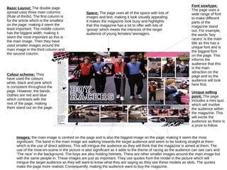
- 1. Basic Layout; The double page spread uses three main columns (Rule of thirds). The first column is for the article which is the smallest on the page; making it seem the least important. The middle column has the biggest width; making it seem the most important as this is the main image. Then they have used smaller images around the main image in the third column and the second column. Colour scheme; They have used the colours white, black and pink which is consistent throughout the page. However, the bands clothes are red and blue which contrasts with the rest of the page, making them stand out on the page. Font size/type; The page uses a wide range of font to make different parts of the magazine stand out. For example, the words 'boy racers' is the main title as this has a unique font and is the biggest font on the page. This informs the audience that this is the main attraction on the page and so the audience will look here first. Unique selling point; The page includes a mini quiz which will involve the audience within the magazine. This will excite the audience as there is a prize to follow. Space; The page uses all of the space with lots of images and text, making it look visually appealing. It makes the magazine look busy and highlights that this magazine has a lot to offer with lots of 'gossip' which meets the interests of the target audience of young females/ teenagers. Images; the main image is centred on the page and is also the biggest image on the page; making it seem the most significant. The band in the main image are walking towards the target audience and seem to be looking straight at them which is the use of direct address. This will intrigue the audience as they will think that the magazine is aimed at them. The use of the mise-en-scene in the picture is also significant as it adds to the theme of racing as the audience can see cars and 'The race' in the background. The boys are also holding helmets. There are other smaller images around the main image but with the same people in. These images are just as important. They use quotes from the model in the picture which will intrigue the target audience as they will want to know what they are saying as they see these models as idols. The quotes make the page more realistic Consequently, making the audience want to buy the magazine.