
Recommended
More Related Content
What's hot
What's hot (16)
Viewers also liked
Viewers also liked (14)
Similar to Choosing Fonts and Design Elements to Make Magazines Stand Out
Similar to Choosing Fonts and Design Elements to Make Magazines Stand Out (20)
Recently uploaded
Recently uploaded (20)
Choosing Fonts and Design Elements to Make Magazines Stand Out
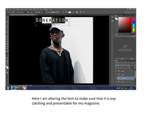
- 1. Here I am altering the font to make sure that it is eye catching and presentable for my magazine.
- 2. Here again, I am demonstrating how to change the font of my magazine so that it looks presentable, by making the font bigger it would make my magazine stand out.
- 3. Choosing the right font is key, as it will be the most stand out aspect of the magazine, as well as the picture that is chosen.
- 5. Here I jumped ahead by playing with Photoshop and discovering new ways to alter and make my magazine appealing to my market
- 6. Here was my final piece, although I had to do plenty tweaks to alter and make my magazine stand out so that people will recognise it.
- 7. Here I am playing around with Photoshop so that I can choose the background that I require so that it would make my content page stand out within the other peoples work.
- 8. Within this content page, I made it very modern and cleaned it up by using the ‘G’ with the generation so that it looks more simple and appealing.
- 9. Yet again I added another layer for the content so that people know what page it is and can boldly see that it is the content page.
- 10. Here I’ve jumped ahead into adding all the necessary details onto my content page, so that it looks appealing to the eye, I made it very simple.
- 11. This was my final piece of the content page, although I believe that I need to add more information to that white background.
- 12. I created a simple double page spread so that the picture would be bolder and using the direct stare to look at its chosen audience.
- 13. I added more words and my quote to make my double page stand out within others.
- 14. I jumped along to adding my chosen text to my work, the text I used was similar to the ones that were seen with the magazine of ‘XXL’ which I used for my inspiration
- 15. I am pleased of how my final double page spread turned out to be, it ticks all the criteria that I require.