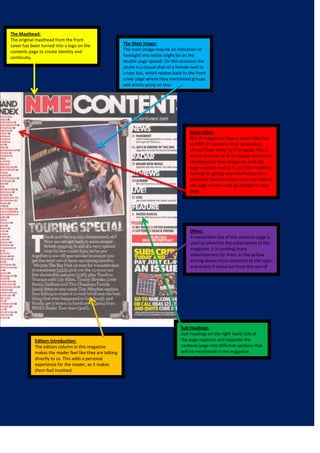
1. The Masthead:
The original masthead from the front
cover has been turned into a logo on the
contents page to create identity and
continuity.
The Main Image:
The main image may be an indication or
foresight into white might be on the
double page spread. On this occasion the
photo is a casual shot of a female next to
a tour bus, which relates back to the front
cover page where they mentioned groups
and artists going on tour.
Band Index:
Not all magazines have a band index but
to NME it’s become their convention,
almost ‘their thing’ as if to speak. This is
where they list all of the bands and artists
mentioned in their magazine with the
page number next to it, so if the reader is
looking for gossip and information on a
particular band or artist, whey can look at
the page number and go straight to that
page.
Other:
A reasonable size of the contents page is
used to advertise the subscription of the
magazine. It is creating more
advertisement for them as the yellow
writing draws more attention to the topic
and makes it stand out from the rest of
the text.
Sub Headings:
Sub headings on the right hand side of
the page organise and separate the
contents page into different sections that
will be mentioned in the magazine.
Editors introduction:
The editors column in this magazine
makes the reader feel like they are talking
directly to us. This adds a personal
experience for the reader, as it makes
them feel involved.