1. Tom Snaith
Contents Page Analysis
House Style - Q magazine sticks to the same house style throughout the majority of their magazines in the way
that they have their logo in the top left corner of the page. Also they use the same font and font size for the body
text. The structure of their contents pages is also the same in the sense that they have the text listed at the side of
the page in a column format. Finally they always use a large image in the strong fallow zone of the page.
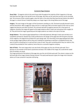
Imagery - The main image on the page is of the Courteeners standing on a hill. The band iscasually dressed in jeans
and tee shirts/shirts. With scraggy hair styles and are in a wide open field, all of these aspects of the mise en scene
suggest the band are and indie rock band. This contrasts well with Q magazine because this is their genre of
magazine, therefore the image will appeal to the target audience which is both man and women from roughly 16-
35. They will think the image is good because the target audience can relate to the style of the bae.
Design Balance – The contents page displayed here is informally balanced. Although it looks neat and tidy it isn’t
completely symmetrical. Despite this it looks professional as the design of the page links with the genre and style
of the magazine. All magazines by Q follow this same design style. The informality of the page displayed will relate
to the younger target audience well as they aren’t looking for something to read that is completely formal, they
want to look for something fun to read and that is easy to read. They want something which they can relate to, this
is what Q has provided for their audience; hence they are a successful magazine company.
Rule of Thirds – The main image which uses two thirds of the page uses the rule of thirds quite well. This is
because no one member of the band is positioned centrally in the middle of the image; this could tell the reader
that all members are equal.
The image positioned at the bottom of the page also uses the rule of thirds quite well. The column is places on the
left hand side of the image instead of being centered. This works well because it gives the image more character
where as if it was centered it may look a bit boring.