Opportunities, challenges, and power of media and information
Evaluation q1
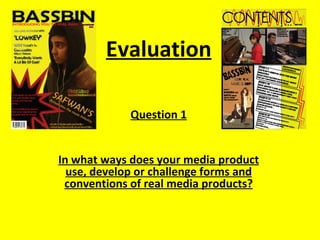
1. Evaluation
Question 1
In what ways does your media product
use, develop or challenge forms and
conventions of real media products?
2. Masthead:
I have chosen to use a masthead that
really stands out for my music magazine,
I thoroughly believe that the word
BASSBIN will receive plenty of attention
as it is a snappy word and holds a lot of
power with the word bass. Furthermore I
Cover Lines: followed the conventions and placed it in
I have followed the conventions of a the top third of my magazine to make it
real magazine by having a main cover look appealing and recognizable. In
line. Also my other cover lines show addition to the name of the magazine, I
that this is a music magazine because used bassbin as it will reflect and portray
they are mainly to do with the charts the reader images of true rap.
and successful music artists. In
addition to this I also used big named
stars on the front cover to show that
this magazine consists of huge music Main Image:
idols such as Nicki Minaj which also
My main image is of a 18 year old male
shows that this is a rap magazine.
model, I used this photo to show the
target audience that this is a magazine
for them. The target audience for my
magazine are young male adults aged
between 16 and 25. The posture of the
Rule of Thirds: image is dominant which shows the
The use of rule of thirds follows the personality of the Rap genre, also the use
conventions of the magazines I of headphones shows that this is a music
researched because it helps keep my magazine and his clothing and colour also
magazine looking organized and keeps fits in with the colour scheme of my
the cover lines and my main image in magazine and portrays rap fashion too.
position.
Barcode/ Price/ Date:
The use of a barcode on my magazine shows
that I have followed the conventions of a
published magazine, this is an essential feature
Footer: to have on my front cover as it allows it to be
The use of footer on my magazine tells the reader additional features in the published. The price and date is also important
magazine to make them aware of it. I chose to use the same font as it tells the reader how much my magazine is
throughout the magazine to keep it original and understandable. Also, the and when it was issued. I have placed these
magazines I researched used a footer, therefore I followed this convention. features at the bottom corner of my magazine
and just below my masthead.
3. The use of having my masthead The use of having the word “contents” The use of having page
at the top follows the house at the top of the page follows the numbers on my images follows
style of my magazine and also connotations of magazines as it tells the the conventions of magazines
follows the conventions of reader what the page is. as the image relates to the
music magazines as the cover lines on the contents
masthead is usually at the top of page. It also attracts the
the contents page. readers attention.
I also put a list of the most popular RnB
artist at the side behind a grey
background for it to stand out and also
to remind the audience that this is a
music magazine. This follows the
conventions of a music magazine as in
the magazines I researched had a list of
artists that are popular this month.
I have used a variety of images on my
contents page to make it look more
interesting and appealing to the reader,
it also relates to what else in involved in
the magazine and attracts the readers
attention. This shows I have followed
the conventions of a magazine as they
all have images on them to make it
more image lead and appealing.
I used sub-headings to break down the
cover lines on my magazine and to keep it
aimed at the target audience by having it
split into sections to make it more
appealing. This follows the connotations of
magazines as it shows the reader the
features in the magazine and what is
included in every issue published.
4. The use of having the title of my article take
up half of the page is to keep it looking
funky and informal, I have used graffiti type
text to keep it young and aimed at my
target audience and to represent the music
genre of my magazine. I also used the
colour blue as it fits in with the colour
scheme and also to remind the reader that
the article is about male artists.
The drop cap shows that I have
followed the conventions of a
magazine as all articles start off
with one.
The highlighted text
shows the questions
asked, the font is kept
the same throughout
the article to keep the
house style consistent
and also the colour is
kept the same
throughout. This is to
keep it simple and
easy for the reader.
The use of the big text in
speachmarks shows that
I have followed the
connotations of a real
double page spread.
Having a bold The effect of this image being on the side allows the reader to use the use of the rule of thirds helps to
catchphrase or title at the image as a poster, as I used it as a cover line on my front cover, keep the layout and text organized and
the top attracts the this follows the conventions of a music magazine that I researched as in position. This follows the conventions
attention of readers. the majority of the articles have a full image that many of the of magazines and it is essential to keep
readers can use as posters. the pages organized.