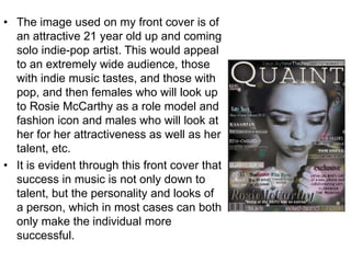
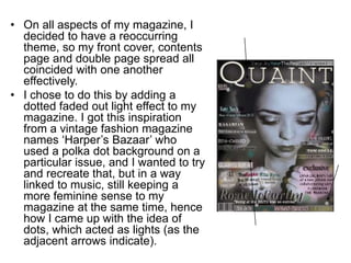
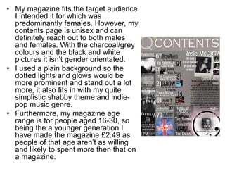
How does your social media
product represent particular
social groups?
Media Evaluation
Question 2
• The image used on my front cover is of
an attractive 21 year old up and coming
solo indie-pop artist. This would appeal
to an extremely wide audience, those
with indie music tastes, and those with
pop, and then females who will look up
to Rosie McCarthy as a role model and
fashion icon and males who will look at
her for her attractiveness as well as her
talent, etc.
• It is evident through this front cover that
success in music is not only down to
talent, but the personality and looks of
a person, which in most cases can both
only make the individual more
successful.
• On all aspects of my magazine, I
decided to have a reoccurring
theme, so my front cover, contents
page and double page spread all
coincided with one another
effectively.
• I chose to do this by adding a
dotted faded out light effect to my
magazine. I got this inspiration
from a vintage fashion magazine
names ‘Harper’s Bazaar’ who
used a polka dot background on a
particular issue, and I wanted to try
and recreate that, but in a way
linked to music, still keeping a
more feminine sense to my
magazine at the same time, hence
how I came up with the idea of
dots, which acted as lights (as the
adjacent arrows indicate).
• My magazine fits the target audience
I intended it for which was
predominantly females. However, my
contents page is unisex and can
definitely reach out to both males
and females. With the charcoal/grey
colours and the black and white
pictures it isn’t gender orientated.
• I used a plain background so the
dotted lights and glows would be
more prominent and stand out a lot
more, it also fits in with my quite
simplistic shabby theme and indie-
pop music genre.
• Furthermore, my magazine age
range is for people aged 16-30, so
being the a younger generation I
have made the magazine £2.49 as
people of that age aren’t as willing
and likely to spent more then that on
a magazine.

Question 2 media evaluation

  • 1.
    How does yoursocial media product represent particular social groups? Media Evaluation Question 2
  • 2.
    • The imageused on my front cover is of an attractive 21 year old up and coming solo indie-pop artist. This would appeal to an extremely wide audience, those with indie music tastes, and those with pop, and then females who will look up to Rosie McCarthy as a role model and fashion icon and males who will look at her for her attractiveness as well as her talent, etc. • It is evident through this front cover that success in music is not only down to talent, but the personality and looks of a person, which in most cases can both only make the individual more successful.
  • 3.
    • On allaspects of my magazine, I decided to have a reoccurring theme, so my front cover, contents page and double page spread all coincided with one another effectively. • I chose to do this by adding a dotted faded out light effect to my magazine. I got this inspiration from a vintage fashion magazine names ‘Harper’s Bazaar’ who used a polka dot background on a particular issue, and I wanted to try and recreate that, but in a way linked to music, still keeping a more feminine sense to my magazine at the same time, hence how I came up with the idea of dots, which acted as lights (as the adjacent arrows indicate).
  • 4.
    • My magazinefits the target audience I intended it for which was predominantly females. However, my contents page is unisex and can definitely reach out to both males and females. With the charcoal/grey colours and the black and white pictures it isn’t gender orientated. • I used a plain background so the dotted lights and glows would be more prominent and stand out a lot more, it also fits in with my quite simplistic shabby theme and indie- pop music genre. • Furthermore, my magazine age range is for people aged 16-30, so being the a younger generation I have made the magazine £2.49 as people of that age aren’t as willing and likely to spent more then that on a magazine.