My magazine genre is Indie, I took
inspiration from current/exsisting
magazines “Q” and “Indie”. However, I
followed “Q” in more depth than “Indie”.
The colour theme of my front cover
includes all of the colours that I think
represent Indie music, mainly consisting
of dark subtle colours, it is clearly
suitable for all genders because it may
interest women as well as men for various
different reasons, colour scheme being
one of them.
My magazine is targeted for all genders, I
didn’t want to prioritize one specific
gender. I have done this by using a male
model which may attract the ladies, but
also with the use of different artists and
bands being male and female shows an
equal balance of both genders published
onto my magazine cover.
With regards to costume and props, I
choose specific clothing that would suit
the theme of Indie and represent majority
of peoples style being casual. I used a
guitar to help represent the musical social
groups and those who play or are
interested in music.
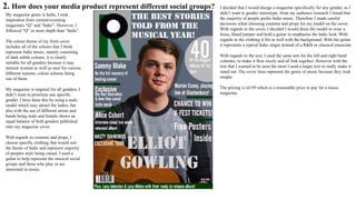
I decided that I would design a magazine specifically for any gender, as I
didn’t want to gender stereotype, from my audience research I found that
the majority of people prefer Indie music. Therefore I made careful
decisions when choosing costume and props for my model on the cover.
With regards to the cover, I decided I would dress the model to wear a
loose, bland jumper and hold a guitar to emphasise the Indie look. With
regards to the clothing it fits in well with the background. With the guitar
it represents a typical Indie singer instead of a R&B or classical musician.
With regards to the text, I used the same text for the left and right hand
columns, to make it flow nicely and all link together. However with the
text that I wanted to be seen the most I used a larger text to really make it
stand out. The cover lines represent the genre of music because they look
simple.
The pricing is £4.99 which is a reasonable price to pay for a music
magazine.
2. How does your media product represent different social groups?
With regards to my contents page, I have
included a few female singers with my
images. This has ensured to make my
magazine attract both genders as there is an
equal variety of both male and female. When
creating my contents page, I also looked into
both genders and what bands/artists they both
like, including a selection of bands and artists
which I made up myself that way I could
include a wide selection of male and female
singers/bands.
After receiving the feedback from my draft
contents page, it cropped up that this page was
slightly biased due to more female singers
appearing on the overall page, however the
photograph in the right hand corner of the
concert, if you look carefully it is in fact a
male band, therefore I don’t get the
impression that it is that biased, although this
may affect some audience members who read
it.
With inspiration from researching and
analysing current Indie Magazines. I decided
to keep my model in the same clothing as on
the cover just for consistency, this is effective
with regards to portraying my genre of music,
representing a typical social group because the
colours of his shirt are gendered for male as
well as female.
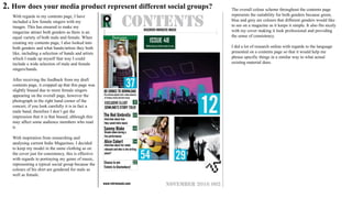
The overall colour scheme throughout the contents page
represents the suitability for both genders because green,
blue and grey are colours that different genders would like
to see on a magazine as it keeps it simple. It also fits nicely
with my cover making it look professional and providing
the sense of consistency.
I did a lot of research online with regards to the language
presented on a contents page so that it would help me
phrase specific things in a similar way to what actual
existing material does.
2. How does your media product represent different social groups?
With regards to my DPS, although it is a male model, from
looking at current magazines, the majority of the mixed gender
magazines also include a DPs which either includes a male or
female singer onto the page. Therefore I had the opportunity to
chose male or female.
The colour theme of my DPS would attract more male audiences,
however this is useful within informing the readers straight away
that these pages will be based around and upon a male singer
without even acknowledging and reading the text. I decided that I
would inco-operate some colours I had already featured onto my
front cover, I figured that this would make my magazine more
well thought and professional. My model is placed in a plain blue
jumper, this not only fits with the colour scheme of the DPS but
also allows my magazine to be successful within attracting a
middle/working class target audience. I kept the jewellery and
accessories simple only being a watch to emphasise the class that
my magazine is suited for.
The background of my DPS represents different social groups
because it was captured in Camden Market in London in the
clothing section this will help represent the different genders who
like shopping that can be of men and women.

Question 2

  • 1.
    My magazine genreis Indie, I took inspiration from current/exsisting magazines “Q” and “Indie”. However, I followed “Q” in more depth than “Indie”. The colour theme of my front cover includes all of the colours that I think represent Indie music, mainly consisting of dark subtle colours, it is clearly suitable for all genders because it may interest women as well as men for various different reasons, colour scheme being one of them. My magazine is targeted for all genders, I didn’t want to prioritize one specific gender. I have done this by using a male model which may attract the ladies, but also with the use of different artists and bands being male and female shows an equal balance of both genders published onto my magazine cover. With regards to costume and props, I choose specific clothing that would suit the theme of Indie and represent majority of peoples style being casual. I used a guitar to help represent the musical social groups and those who play or are interested in music. I decided that I would design a magazine specifically for any gender, as I didn’t want to gender stereotype, from my audience research I found that the majority of people prefer Indie music. Therefore I made careful decisions when choosing costume and props for my model on the cover. With regards to the cover, I decided I would dress the model to wear a loose, bland jumper and hold a guitar to emphasise the Indie look. With regards to the clothing it fits in well with the background. With the guitar it represents a typical Indie singer instead of a R&B or classical musician. With regards to the text, I used the same text for the left and right hand columns, to make it flow nicely and all link together. However with the text that I wanted to be seen the most I used a larger text to really make it stand out. The cover lines represent the genre of music because they look simple. The pricing is £4.99 which is a reasonable price to pay for a music magazine. 2. How does your media product represent different social groups?
  • 2.
    2. How doesyour media product represent different social groups? With regards to my contents page, I have included a few female singers with my images. This has ensured to make my magazine attract both genders as there is an equal variety of both male and female. When creating my contents page, I also looked into both genders and what bands/artists they both like, including a selection of bands and artists which I made up myself that way I could include a wide selection of male and female singers/bands. After receiving the feedback from my draft contents page, it cropped up that this page was slightly biased due to more female singers appearing on the overall page, however the photograph in the right hand corner of the concert, if you look carefully it is in fact a male band, therefore I don’t get the impression that it is that biased, although this may affect some audience members who read it. With inspiration from researching and analysing current Indie Magazines. I decided to keep my model in the same clothing as on the cover just for consistency, this is effective with regards to portraying my genre of music, representing a typical social group because the colours of his shirt are gendered for male as well as female. The overall colour scheme throughout the contents page represents the suitability for both genders because green, blue and grey are colours that different genders would like to see on a magazine as it keeps it simple. It also fits nicely with my cover making it look professional and providing the sense of consistency. I did a lot of research online with regards to the language presented on a contents page so that it would help me phrase specific things in a similar way to what actual existing material does.
  • 3.
    2. How doesyour media product represent different social groups? With regards to my DPS, although it is a male model, from looking at current magazines, the majority of the mixed gender magazines also include a DPs which either includes a male or female singer onto the page. Therefore I had the opportunity to chose male or female. The colour theme of my DPS would attract more male audiences, however this is useful within informing the readers straight away that these pages will be based around and upon a male singer without even acknowledging and reading the text. I decided that I would inco-operate some colours I had already featured onto my front cover, I figured that this would make my magazine more well thought and professional. My model is placed in a plain blue jumper, this not only fits with the colour scheme of the DPS but also allows my magazine to be successful within attracting a middle/working class target audience. I kept the jewellery and accessories simple only being a watch to emphasise the class that my magazine is suited for. The background of my DPS represents different social groups because it was captured in Camden Market in London in the clothing section this will help represent the different genders who like shopping that can be of men and women.