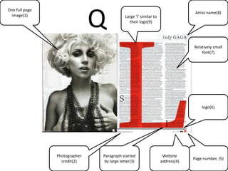
The document analyzes double page spreads across three magazines: Q, KERRANG, and UNCUT. Some common techniques used include a large central image to set the tone and topic, the artist's name to identify the subject, paragraph headers in enlarged text, and small credits and labels. Together these design choices help guide the reader through the content in an accessible and engaging manner to encourage repeat purchases and brand loyalty.
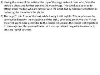
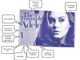


![Lesson+3 v2.0 slide_show [autosaved]](https://cdn.slidesharecdn.com/ss_thumbnails/lesson3v2-131214094704-phpapp02-thumbnail.jpg?width=640&height=640&fit=bounds)


![Powerpoint on vibe[1]](https://cdn.slidesharecdn.com/ss_thumbnails/powerpointonvibe1-101121144632-phpapp02-thumbnail.jpg?width=640&height=640&fit=bounds)


![5G Explained! A High Level Overview [Introduction]](https://cdn.slidesharecdn.com/ss_thumbnails/5gexplainedahighleveloverview-260119165306-cc137a3e-thumbnail.jpg?width=640&height=640&fit=bounds)


