
Recommended
More Related Content
What's hot
What's hot (20)
Viewers also liked
Viewers also liked (12)
Similar to Front cover analysis of The Source magazine
Similar to Front cover analysis of The Source magazine (20)
More from Twist3dd
More from Twist3dd (18)
Front cover analysis of The Source magazine
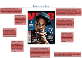
- 1. Front cover analysis The main image shows the artist with a very The main image has filled the “frame”; this is a very common aggressive facial expression. This can be used to convention among magazines. This will increase the express the target audience of the magazine and is importance of the image and the artist who the image is of. a common convention of Rap/hip-hop magazines. The artist may be popular so by making him or her as the main image will draw fans/readers into buying this issue The masthead is kept in the same place in ever issue keeping its brand The names of popular artists within the identity and therefore the magazine will again draw readers into audience can familiarise buying it if they support or enjoy those their selves with the artists music. With the addition of more magazine layout. well known artists in the magazine, the readers will feel like they are getting more “value for their money” The word “Exclusive” adds to the importance of the article inside the magazine. It can also make the reader feel exclusive The main sell line is kept to and important if they buy it and the left. As it is the most read it. important issue inside the magazine it should be kept on the left hand side as this is where the reader’s eye The Sell line of “We’ve got will go first gifts” draws the readers into buying the magazine. Readers love to receive stuff for free and will therefore feel more incline to buy the The barcode and price are hidden away and magazine in order to get the kept at the bottom of the page as it is the least “free” gift. important piece of information. The target audience will also have to search for the price The sell line featuring Keri Hilson as a “Very bad girl” may entice meaning they will see most of what’s on the readers to buy the magazine and look inside. This will also give an cover, and therefore more likely to see content idea of the Target audience of the magazine. they like in the magazine.
- 2. The masthead is in uppercase and in a bold Some Conventions within magazines has not been kept by this edition solid display font. This suggests a male target of “The source”; the main central image Does Not fill the “frame” as audience. The image covering the letter “O” most, if not all normally would, this may suggest that the artist that of a fist holding a microphone also represents features as the main image does not need to fill the whole “frame” as what type of magazine it is and also shows he is very well known. However even though he does not fill the masculinity which enhances the thought of it “frame” it doesn’t mean that his importance is lowered. In fact his being targeted at a male audience. importance will be heightened a little bit as readers will still buy the The strapline of “The bible of Hip-Hop Music, Culture and magazine based on the fact that Jay-Z is the artist. Politics” will further entice readers into buying the magazine as they will believe that they will know everything there is to know about those three particular subjects from reading this Direct address is also another important and very common magazine alone, which is what this strapline suggests. convention amongst magazines however yet again this edition of “The Source” has chosen to ignore that. This can reflect heavily on The main sell line is kept to the left. As it is the the target audience. This can suggest that like the artist on the most important issue inside the magazine it cover of the magazine that the target audience are also laid back should be kept on the left hand side as this is and “Don’t care much” for “conventions” and that they do what where the reader’s eye will go first. The Sell line they like. is Bolded and placed in a bigger font size than the other sell lines, highlighting its importance. The barcode and price are hidden away and The masthead is kept in the kept at the bottom of the page as it is the same place in ever issue least important piece of information. The keeping its brand identity target audience will also have to search for and therefore the audience the price meaning they will see most of what’s can familiarise their selves on the cover, and therefore more likely to see with the magazine layout. content they like in the magazine. The names of popular artists within the magazine will again draw readers into buying it if they support or enjoy those artists’s music. With the addition of more well known artists in the magazine, the readers will feel like they are getting more “value for their money”