
Recommended
More Related Content
What's hot
What's hot (17)
Viewers also liked
Similar to Textual Analysis Part one
Similar to Textual Analysis Part one (20)
More from Thomas Griffiths
More from Thomas Griffiths (20)
Recently uploaded
Recently uploaded (20)
Textual Analysis Part one
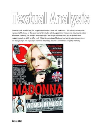
- 1. This magazine is called ‘Q’ This magazine represents indie and rock music. This particular magazine represents Madonna as the cover star and includes artists, upcoming releases and albums and artists and bands updating the readers with their lives. The target audience for Q is a little older than magazines such as NME as it for early 20’s and onwards as Madonna had world wide records when she was younger and a younger audience these days wouldn’t know those songs by memory.<br />Cover Star<br />The cover star used on this magazine is Madonna, who is one of the biggest well known British artist, therefore this will attract readers to this magazine. She dominates most of the magazine, her face is two thirds of the way up of the magazine as like all magazines that’s the first thing the readers will see. Her face is more or less central of the magazine therefore it dominates the magazine. <br />Colour<br />The colour scheme on this particular magazine is red white and black, however black isn’t really classed as a colour therefore the third colour is grey. White on a black background stands out so it’s easy to read and captures the readers attention. The colours contrast each other well so it looks more sophisticated. They use a lot of red on the magazine and they also use a sexy well known woman artist as the cover star, which I think they dress her in red or have red around her to symbolise sex or herself being sexy.<br />Price/Date/Bar Code<br />All 3 of these, the price, date and barcode is all placed on the top left of the magazine, the price and date is printed in small print on the barcode, the print of the date and price is always the smallest print on the front cover of the magazine as it’s essential you put this information on but not important to the music magazine itself.<br />Masthead<br />The mast head is on the top right hand corner in a big red box. It’s placed in a bright colour, boldly, with a white Q as this appeals to its readers as it stands out. The effect the masthead ‘Q’ gives to it’s readers is the word ‘queue’ Therefore it comes across as a popular magazine as you have to queue for it. This is also a vital and important piece of a magazine that readers are attracted to firstly looking at it therefore , it must be bright big and bold.<br />Header/Rating Stars<br />There are many headers splashed on this page, at the top an don the sides of the magazine. These describe important events, or interviews or information inside the magazine however not as important as the biggest header splashed across the page so you can’t miss it saying ‘MADONNA’ At the bottom is an advertisement for women so this would capture women’s attention to buy the magazine. At the top corner of the magazine are artists names presented such as Rolling Stones which can advertise to anyone who enjoys that type of music therefore is a unisex magazine. Headers/Rating stars are important information to show its readers what is featured in the magazine that will attract you to buy it. <br />