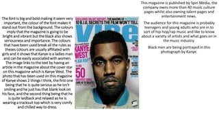
1. The font is big and bold making it seem very
important, the colour of the font makes it
stand out from the background. The colours
imply that the magazine is going to be
bright and vibrant but the black also shows
seriousness and importance. The colours
that have been used break all the rules as
theses colours are usually affiliated with
girls and it shows that Kanye is a ladies man
and can be easily associated with women.
The image links to the text by having an
article in the magazine about the cover star
on this magazine which is Kanye West. The
photo that has been used on this magazine
of Kanye shows 2 things I think, the first one
being that he is quite serious as he isn’t
smiling and he just has that blank look on
his face, and the second thing being that he
is quite laidback and relaxed as he is
wearing a tracksuit top which is very comfy
and chilled way to dress.
This magazine is published by Spin Media, the
company owns more than 40 music culture
pages whilst also owning talent pages and
entertainment news.
The audience for this magazine is probably
teenagers and young adults who are in to
sort of hip-hop/rap music and like to know
about a variety of artists and what goes on in
the music industry.
Black men are being portrayed in this
photograph by Kanye.
2. This magazine has quite chilled writing on
it showing that it is quite indie and
different. The font colour that is used are
quite stand out from the crowd colours.
The reds and blues stand out from the
grey/silver background and the big bold
red font used for the words ‘Arctic
Monkeys’ shows that they are a major
part of the magazine and their lead singer
Alex Turner is the cover star for this
magazine. The picture of Alex Turner
makes him look very serious and also very
cool. He is staring straight out from the
cover making the reader feel like he is
looking at them, but the fact he has kept
the top 3 or 4 buttons of his shirt undone
makes him look like he is a very chilled
out, secretive character.
3. The black and gold represent importance
and that links in with the cover star, Jay Z,
as he wears big black tshirts and gold
chains. The picture of him is big showing
self importance and confidence as it is a
close up, his blown up imagine could
represent his blown up ego that his music
gives us vibes of.
The big bold writing on the magazine
gives the reader a feeling that there is
something big and exclusive inside. The
title Clash implies that it goes against the
mainstream magazines and flow.