2. Having been a Media student for 3 years I have
gathered reasonable skills and capabilities in
Photoshop. This allowed me to challenge
myself and chose a cover with several different
components. My first step was finding the
correct dimension of a CD cover (7.24in by
7.24in), then applying a background. I acquired
this image from a google image search as we
had limited time to produce, however with the
correct resources I could have created a
background myself. The CD Cover I recreated
had a worn in and scrap book look which meant
that most of the layers need a filter. I added
noise to each layer to take away the crisp and
precise look which made the layers lack realism
and look more that one piece. To remove
unwanted background I used the magic eraser
tool which is incredibly useful in photoshop.
Lastly, to add additional worn effect I created
tears and rips in the background
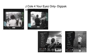
3. The CD cover took shape as further elements were
downloaded from Google. I used more ripped paper to
replicate that of the J Cole cover. Other conventions such as
the parental advisory was added to mirror the previous
production, a feature which is seen on most rap artists albums.
As I was yet to go for a photoshoot, I used an alternative image of the artist to
give the cover proportions so I could sort the proximity of the layers. Once
resizing, I added a black and white mask, and adding noise to remain consistent,
to the image. This step really shown that the cover was developing well, as clear
similarities could be drawn between my creation and the real cover.
4.
5. To add colour I used the paint bucket
tool, adding to each individual piece.
To get the correct colour, the pipette
tool became very useful as it gives
users the closest colour match to what
it is presented with. This saved a lot of
time and gave the best overall effect.
Once comparing to the original, I
noticed that the opacity and fill which
I had initially chosen was far from
what was desired. I changed the
opacity back to 100% which darkened
the background and increased the fill
to improve the image. To roughen the
edges of the main image, I adjusted
the hardness of eraser tool to give a
less accurate and précised look.
FINAL PRODUCT BEFORE
PHOTOSHOOT
6. PHOTOSHOOT-
A variety of shots were taken
to see which would fit best for
the genre and cover. I found
an area which was similar to
the one J Cole used and took
photos on an iPhone 6. The
image highlighted was chosen
after consideration. The
lighting was bright outside so
the indoor lighting was never
need, creating a more
naturalistic look.
7. Once
substituting and
swapping the
images and
adding the same
filters, the cover
was near
complete. I
added a few
more rips and
tears using the
lasso tool which
can be seen in
the toolbar
opposite.
The font used is rather contradictory of the genre, so I
though that finding the correct font may be an issue. I
searched for handwritten fonts by using the site DaFont,
allowing me previews of what I wanted said. The
downloaded font can be used directly inside Photoshop
without license which is a huge advantage of the website.
The site contains 1000s of fonts which I will use again
8.
9. The rear of the CD Cover contains
several pieces of institutional
information which I can add to my list
of conventions. For example the
Record label, copyright information,
FBI Piracy (US), barcode etc. These
were obtained from the internet but
most had to have backgrounds
removed so they looked seamless on
the cover. The magnetic lasso tool
once inversed deleted unwanted
background, along with the faster but
less accurate magic eraser. The most
time consuming task was removing
black from the small print information,
this had to be magnified to 400% to
work.
10. Like the title of the album, I typed out the
tracklisting the positioned them as
similarly as possible. This part of the task
was time consuming but gave a
professional look and produced a good
product.