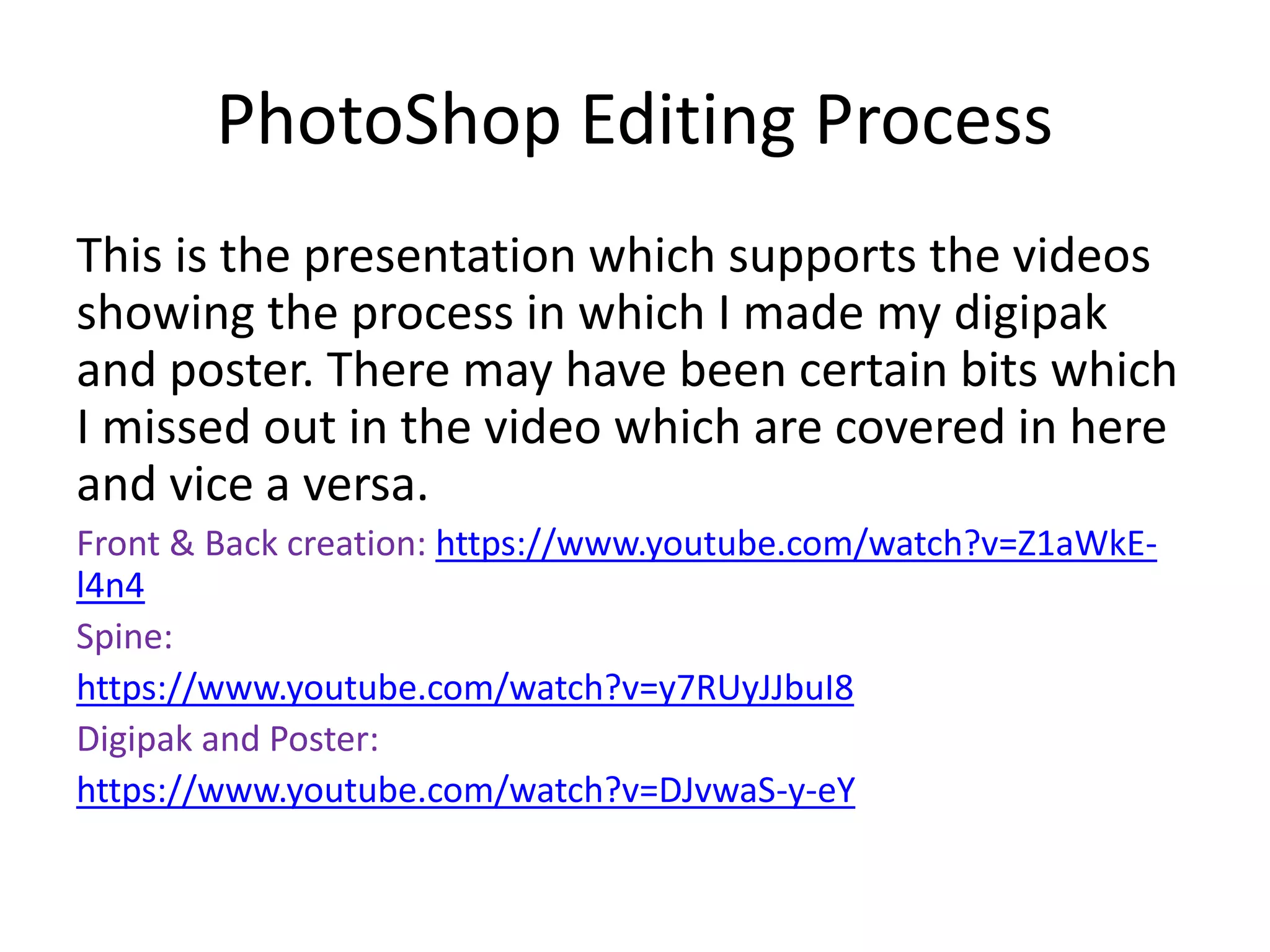
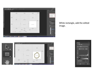
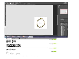
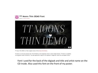
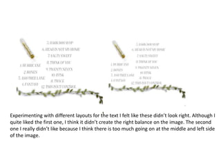
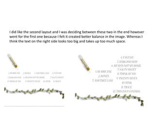
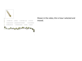
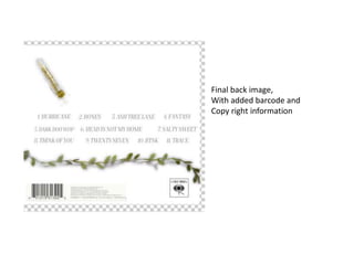
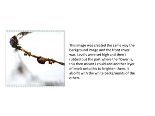
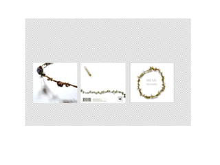
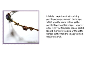
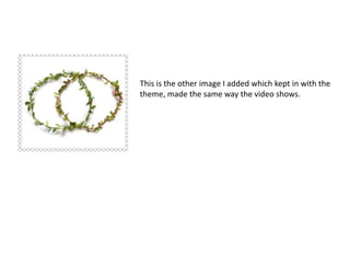
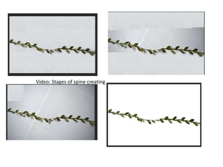
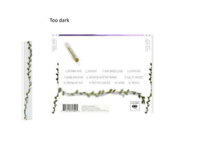
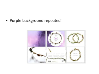
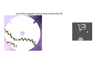
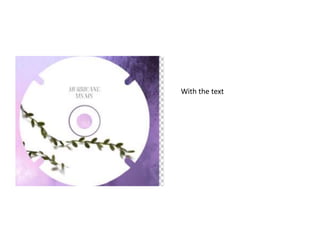
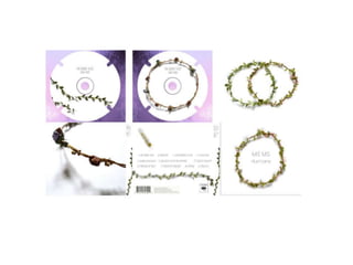
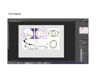
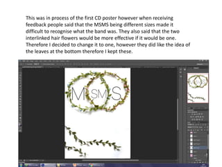
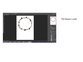
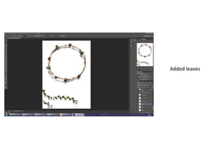
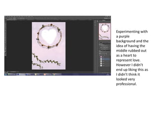
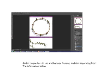
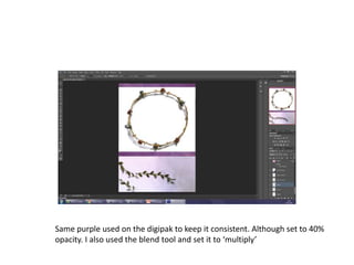
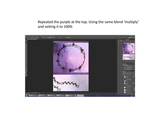
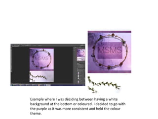
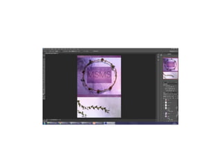
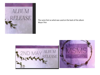
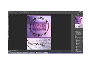
PhotoShop Editing Process
This is the presentation which supports the videos
showing the process in which I made my digipak
and poster. There may have been certain bits which
I missed out in the video which are covered in here
and vice a versa.
Front & Back creation: https://www.youtube.com/watch?v=Z1aWkE-
l4n4
Spine:
https://www.youtube.com/watch?v=y7RUyJJbuI8
Digipak and Poster:
https://www.youtube.com/watch?v=DJvwaS-y-eY
Front album cover
Original Image
First draft, too dark not bright enough
White rectangle, add the edited
image.
Too dark
Font I used for the back of the digipak and title and artist name on the
CD inside. Also used this font on the front of my poster.
Experimenting with different layouts for the text I felt like these didn’t look right. Although I
quite liked the first one, I think it didn’t create the right balance on the image. The second
one I really didn’t like because I think there is too much going on at the middle and left side
of the image.
I did like the second layout and I was deciding between these two in the end however
went for the first one because I felt it created better balance in the image. Whereas I
think the text on the right side looks too big and takes up too much space.
Shown in the video, this is how I selected and
moved.
Final back image,
With added barcode and
Copy right information
This image was created the same way the
background image and the front cover
was. Levels were set high and then I
rubbed out the part where the flower is,
this then meant I could add another layer
of levels onto this to brighten them. It
also fit with the white backgrounds of the
others.
I did also experiment with adding
purple rectangles around the image
which was the same colour as the
purple flower on this image. However
after receiving feedback people said it
looked more professional without the
border as they felt the image worked
best on its own.
This is the other image I added which kept in with the
theme, made the same way the video shows.
Video: Stages of spine creating
Too dark
The purple image I used for the background
Added CD
Text added and the circle around
the smaller circle
• Purple background repeated
Use of the magnetic tool to draw around the CD
With the text
Final Digipak
This was in process of the first CD poster however when receiving
feedback people said that the MSMS being different sizes made it
difficult to recognise what the band was. They also said that the two
interlinked hair flowers would be more effective if it would be one.
Therefore I decided to change it to one, however they did like the idea of
the leaves at the bottom therefore I kept these.
The flowers I used
Added leaves
Experimenting with
a purple
background and the
idea of having the
middle rubbed out
as a heart to
represent love.
However I didn’t
end up liking this as
I didn’t think it
looked very
professional.
Added purple bars to top and bottom, framing, and also separating from
The information below.
Same purple used on the digipak to keep it consistent. Although set to 40%
opacity. I also used the blend tool and set it to ‘multiply’
Repeated the purple at the top. Using the same blend ‘multiply’
and setting it to 100%
Example where I was deciding between having a white
background at the bottom or coloured. I decided to go with
the purple as it was more consistent and held the colour
theme.
The same font as what was used on the back of the album
Moon Thin
Q4 PhotoShop Process

Q4 PhotoShop Process

  • 1.
    PhotoShop Editing Process Thisis the presentation which supports the videos showing the process in which I made my digipak and poster. There may have been certain bits which I missed out in the video which are covered in here and vice a versa. Front & Back creation: https://www.youtube.com/watch?v=Z1aWkE- l4n4 Spine: https://www.youtube.com/watch?v=y7RUyJJbuI8 Digipak and Poster: https://www.youtube.com/watch?v=DJvwaS-y-eY
  • 2.
    Front album cover OriginalImage First draft, too dark not bright enough
  • 3.
    White rectangle, addthe edited image.
  • 6.
  • 7.
    Font I usedfor the back of the digipak and title and artist name on the CD inside. Also used this font on the front of my poster.
  • 8.
    Experimenting with differentlayouts for the text I felt like these didn’t look right. Although I quite liked the first one, I think it didn’t create the right balance on the image. The second one I really didn’t like because I think there is too much going on at the middle and left side of the image.
  • 9.
    I did likethe second layout and I was deciding between these two in the end however went for the first one because I felt it created better balance in the image. Whereas I think the text on the right side looks too big and takes up too much space.
  • 10.
    Shown in thevideo, this is how I selected and moved.
  • 11.
    Final back image, Withadded barcode and Copy right information
  • 12.
    This image wascreated the same way the background image and the front cover was. Levels were set high and then I rubbed out the part where the flower is, this then meant I could add another layer of levels onto this to brighten them. It also fit with the white backgrounds of the others.
  • 14.
    I did alsoexperiment with adding purple rectangles around the image which was the same colour as the purple flower on this image. However after receiving feedback people said it looked more professional without the border as they felt the image worked best on its own.
  • 15.
    This is theother image I added which kept in with the theme, made the same way the video shows.
  • 16.
    Video: Stages ofspine creating
  • 17.
  • 19.
    The purple imageI used for the background
  • 20.
  • 21.
    Text added andthe circle around the smaller circle
  • 22.
  • 23.
    Use of themagnetic tool to draw around the CD
  • 24.
  • 26.
  • 27.
    This was inprocess of the first CD poster however when receiving feedback people said that the MSMS being different sizes made it difficult to recognise what the band was. They also said that the two interlinked hair flowers would be more effective if it would be one. Therefore I decided to change it to one, however they did like the idea of the leaves at the bottom therefore I kept these.
  • 28.
  • 29.
  • 30.
    Experimenting with a purple backgroundand the idea of having the middle rubbed out as a heart to represent love. However I didn’t end up liking this as I didn’t think it looked very professional.
  • 31.
    Added purple barsto top and bottom, framing, and also separating from The information below.
  • 32.
    Same purple usedon the digipak to keep it consistent. Although set to 40% opacity. I also used the blend tool and set it to ‘multiply’
  • 33.
    Repeated the purpleat the top. Using the same blend ‘multiply’ and setting it to 100%
  • 34.
    Example where Iwas deciding between having a white background at the bottom or coloured. I decided to go with the purple as it was more consistent and held the colour theme.
  • 36.
    The same fontas what was used on the back of the album Moon Thin