
Recommended
More Related Content
What's hot
What's hot (19)
Similar to Digipak 2
Similar to Digipak 2 (20)
More from Tom Cornock
More from Tom Cornock (14)
Recently uploaded
Recently uploaded (20)
Digipak 2
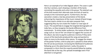
- 1. Here is an example of an Indie Digipak advert. The cover is split into four sections, each showing a member of the band, connoting the equality and unity in the group. The abstract use of the bird reveals their alternate style and lack of need to comply to the mainstream genre. Furthermore, the low saturation creates a low key presentation of the band, enhancing the importance of the music instead of band image. The font used is similar to an old style computer font, suggesting they my not create the modern or new type of music. This would help to engage the targeted demographic of indie fans, so they recognize the bands difference from mainstream. To entice wider audiences, the names of their hit songs such as ‘sex on fire’ are shown to suggest the success of the album, but also to jog the audiences memory if they were unsure of the band who produced the song and wanted to listen to more to the bands other pieces. To engage the viewer of the poster further, a link to play.com is placed to show where the CD can be purchased, increasing the likelihood of audiences following up on the advertisement. Lastly, the poster is composed in a form that the majority would follow by reading the band title at the top, this spreads knowledge even if full attention is not gained.
- 2. Wretch 32’s digipak poster clearly cements the genre and possible target demographic for his album. The font is worn down and placed on a tilt, implying the artists rougher side and ‘street’ ties. To similar effect, the background emulates a graffiti stencil which is further associated with rap music and a young target demographic. The inclusion of a council estate suggests that the primary demographic may be one of lower class, possibly E or D. This helps the audience to establish who the music is intended for. Unlike pop posters, the structure is not symmetric. Going against the conventions of a digipak shows that the artist has a more specific and narrower target audience. So users recognise and album, an image of the cover is placed at the bottom of the page, which may help viewers to remember the cover while in a shop etc. Conventional features are included such as a date, with ‘08’ a reference to slang, and a list of places where the album is available for purchase to heighten a possibility of a sale. Finally, guest names are included to broaden a fan base and so audeicnes may buy due to features with other artists.
- 3. This Digipak image helps to build the desired image of the artist. The contrast of high key and low key lighting portrays Ellie Goulding as a bright figure, almost innocent and angelic. The Effect also links to the title of the album, Lights, reinforcing the message of the poster. The clear midshot is used so audiences can identify the artists face, as a pop artist, this is crucial as she would be recognized by the majority which would help audiences to engage with the poster. A rounded and symmetric font, placed centrally, holds the attention of viewers while conveying a sense of youth. Established and renowned reviews are used to show the success and rating of the album, to help persuade audiences to buy. By using reputable newspapers such as The Independent, audiences are more likely to believe or take it into consideration. In order to lead audiences to the album sale, a web address is included (proliferating platform for CD sales)-however a date is not revealed so we assume it is ‘out now’
- 4. This advert contains information unseen on others. Slipknot, a heavy metal band, strive off a image of intimidation which is created through the poster. The red font connotes danger and also blood, while the design shares similar connotations. The low key lighting used and the overcast sky configures the dark theme of their music, which are simple to recognize by primary audiences. The costume of the band is mysterious, alternatively intriguing, engaging those who seen the image as they look further to see what is being worn. In addition, the location of the image is unexpected of a band, luring viewers to the poster. This advert has a dual purpose- advertising the album and the tour which showcases the album. This means that those who enjoy or purchase have the possibility of seeing the band live, creating more money for the group. Differing fonts are used for the band title and album name, with the classic font portraying the group as unique.
- 5. As the image below shows, digipak adverts are almost always composed similarly to the CD cover itself. Olly Murs, a pop artist with wide recognition due to X Factor, is purposely placed largely and centrally on the cover to attract audiences. The different positions of the artist imply that he has different sides or styles to his personality as well as his music, intriguing those who see the poster. Casual and fashionable costume is used, demonstrates the artists contemporary look. The red and white colour way works complementary, making the image and title stand out, this may possibly be effective from a longer distance if it was put outside etc. Conventional information such as the date is included and the released singles (which have succeed in the chart0, perhaps foreshadowing the quality of thealbum