
Recommended
More Related Content
What's hot
What's hot (20)
Similar to Cartographic_Design.ppt
Similar to Cartographic_Design.ppt (20)
More from ThomasHundasa1
More from ThomasHundasa1 (20)
Recently uploaded
Recently uploaded (20)
Cartographic_Design.ppt
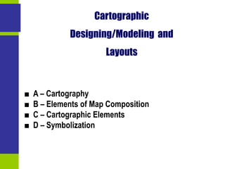
- 1. Cartographic Designing/Modeling and Layouts ■ A – Cartography ■ B – Elements of Map Composition ■ C – Cartographic Elements ■ D – Symbolization
- 2. Cartography ■ 1. Maps and their Uses ■ 2. Efficiency and Mapping A
- 3. Maps and their Use ■ Mapping is a communication tool ■ A picture worth one thousand words • Convey a message to a public through a medium. • Some forms of communication are better than others. • All maps are not equal, even if some are representing the same features. • Cartographic quality. • Maps are using visual communication tools. 1 Map Data/Information Message Cartography Map reading
- 4. Maps and their Use ■ Recording and Storing Information • Institutions use maps to store large amounts of information. • Location of resources. • Location of people. • Parcels. • Property. • Infrastructure. • Utilities. • Etc… 1
- 5. Maps and their Use ■ Analyzing Distributions and Patterns • Maps can be used to analyze spatial distributions. • Visualization helps conceptualization of patterns and processes. 1
- 6. Maps and their Use ■ Presenting and Communicating • Express concepts and ideas that are verbally difficult and complex to portray. • Demonstrate. • Convince. • Persuade. • Inform/Misinform. 1
- 7. Efficiency and Mapping ■ Cartography • Science / art / technique of map production. • Uses a set of defined graphical elements to communicate a message. ■ Graphical elements specific to cartography • Coordinate systems. • Map projections. • Scale. • Symbology ■ Legend • Explaining the meaning of graphical symbols. • With the large diffusion of maps, some symbols do not require explanation anymore. 2
- 8. Efficiency and Mapping ■ Symbolic abstraction • Encoding real-world geographic features. • How much to simplify? • How to symbolize? 2
- 9. Efficiency and Mapping ■ Designing a Good Map • A good map conveys well its intended message. ■ What is the goal of the map? • What the reader should gain from the map or how the reader should respond. • Motives vary greatly. • Convey accurate information about spatial relationships. • Sway public debate. • The motive will have a great bearing on the content of the map (the information included) and its form (the cartographic strategies employed). 2
- 10. Efficiency and Mapping ■ Who is the reader? • Map design is not the same according to the intended public. • Identify the type of reader being addressed. • Important to have an idea about what the audience is likely to know about the subject matter of the map. • Map literacy: • How much background the readers have in using maps. • A map intended for specialists who have a background in cartography might be organized far differently than one intended for use in a public debate. 2
- 11. Efficiency and Mapping ■ Where it will be used? • Usage depend on the type of medium the map will be published in (book, magazine, news, web site, etc.). • Some maps are used only once and then discarded. • Others are intended to used for reference for decades or centuries. ■ What data is available? • Some maps use reliable sources while others have sketchy information. • Decisions about map design are tempered greatly by source materials themselves. ■ What resources and equipment are available? • Underline the time and the costs for map production. 2
- 12. Elements of Map Composition ■ 1. Format of Final Production ■ 2. Generalization, Simplification and Abstraction ■ 3. Common Elements ■ 4. Balancing Elements ■ 5. Map Layouts B
- 13. Format and Final Production ■ Final format • Size and the media will determine the map-making process. • Size influence the level of detail and the quantity of information. • Media determines the availability of colors, patterns and lettering. 1 B&W Insert in an article 3” 5” Poster 24” 24”
- 14. Generalization, Simplification and Abstraction ■ Cartography is a process of abstraction • Features are generalized and simplified. • Not all elements are relevant to the message a map convey. • The reader must have his/her attention of the message portrayed by the map. ■ Detail • Too much details undermine the message of the map. • The amount of detail is related to the scale of the map. • A small scale map must be generalized. • A large scale map can contain more details at the expense of generalization. 2
- 15. Generalization, Simplification and Abstraction 2
- 16. Generalization, Simplification and Abstraction 2
- 17. Common Elements ■ Basic set of elements • Title. • Scale. • Legend. • Body of map. • North arrow. • Production Date. • Projection Used. • Sources. • Most elements are found on all maps, but some are more context sensitive. 3
- 18. Map Elements The United States of America Alaska Lambert Conformal Conic Projection Source: U.S. Dept. of State 0 4 1 2 3 hundreds of kilometers 0 4 0 4 Washington,D.C. National Capital Legend Scale Credits Place name Inset Background Neat line Title Hawaii 3
- 19. Balancing Elements ■ Concept • Each map element has its own importance. • The cartographer must organize them according to priority. • Important elements should be in prominent positions within the map. • Important elements should have an according size; a larger area. ■ A general rule: • The most important elements should be on the top left. • The least important elements should be on the bottom right. 4
- 20. Balancing the Importance of Elements 4 Most important information Least important information Visual Center
- 21. Balancing Elements ■ Placement • Importance should also be given to the placement of elements within the map frame. • Distribute evenly to avoid crowding and blank areas. 4
- 22. Map Layout ■ Rules • Only experimentation tells which layout is the best. • It used to be a costly and long experience. • Today, GIS packages enable to do this easily. 5
- 23. Map Layout ■ Relevance of the elements on the map • Each one should be justified. • Those of less importance should be simplified. • Those of importance should be explained. • Simple design are more readable. • Too much detail and complexity will confuse the reader. • The rules are generally vague, so it is to the cartographer to develop his/her “style”. 5
- 24. Cartographic Elements ■ 1. Distance and Scale ■ 2. Direction ■ 3. Legend ■ 4. Sources ■ 5. Context Sensitive Elements ■ 6. Effective Communication Elements C
- 25. Distance and Scale ■ Distance or scale • Must always be indicated or implied. • Except in the case where the audience is very familiar with the map and the distance portrayed. • Verbal, numeric and graphic scale. • Graphic form is often preferred: • Map are drafted at a different scale than they are printed. • If verbal and numeric scales are used, the cartographer must make sure that the map is printed at the precise scale indicated. 1 1 cm equals 10km 1:50,000 Verbal Numeric Graphic
- 26. Direction ■ Conventional North • The top of the map is the True North, that is the direction of the North Pole. • If the top of the map is not the true north, an arrow indicating the direction of the true north should be placed on the map. ■ Magnetic North • Changing according to the geophysical conditions of the earth’s crust and core. • Navigation maps both contain the magnetic north and the true north. • Compass readings show the magnetic north and adjustments are made to find the true north. 2 Adjustment to be made (declination)
- 27. Direction - Some Examples Where is north on this map? Where is north on this map? 2
- 28. Legend ■ Nature and placement • List of symbols used on the map and their significance. • Symbols on the map should look exactly the same on the legend. • The choice of symbols is open, but they should portray a good abstraction. • Some conventions are difficult to escape from. • Often, legends are not necessary if textual annotations are put directly on the map. • Legend should be placed on an empty part of a map to create some balance. 3
- 29. Legend 3
- 30. Sources ■ Sources • Since a map is an information medium, it must be referenced. • Source for the base map. • Source for the information portrayed on the map (mostly for thematic maps). • Possibility to verify information and the way it was interpreted. • Age, accuracy and reliability of data is important. • Also relevant to indicate how the data was processed, grouped, generalized and categorized. • Only consider cities of more than 20,000. • Classes are equidistant. 4
- 31. Context Sensitive Elements ■ Title • One of the most essential feature. • Its design should be related to the audience. • Captions usually take the place of titles in maps for books and journals. • Should be comprehensive: • Avoid things such as “Map of…”. • Avoid long descriptions. • “A map of the population growth in Canada between 1980 and 1990 displayed by province” with “Canada population growth by province, 1980-1990”. • “Colonies controlled or ruled by Spain on the eve of the Spanish- American War” with “The Spanish empire in 1898” 5
- 32. Context Sensitive Elements ■ Projection • Influences the representation of area, distance and direction. • An experienced cartographer can identify the projection simply by looking at the map. • Choose the appropriate projection for the mapping context. • Some projections are incompatible with some representations. • The projection used should be indicated on the map if precision is important. • For several thematic maps, projection is factual. • Projection is mandatory for maps to be used in the digitizing process. • Projection is indicated on all topographic maps. 5
- 33. Context Sensitive Elements ■ Cartographer • Name (initials) of the person(s) responsible for the map production. • Could also be a corporate identity. • Seal of approval since the cartographer is linked to his(her) output. ■ Production date • Several map are time sensitive. • The reader must thus know when the map was produced to understand its context. • Illustrates how old is the information, and thus its accuracy. • For some maps, the year is all what is needed. • For maps, such as weather maps, the time precision can go up to the minute. 5
- 34. Effective Communication Elements ■ Neatlines • Used to frame a map and to clearly indicate where it begins and ends. • Also used to clip some area out of a locator, inset or index map. • Some maps do not need neatlines, notably when they are well- known maps. 6 Northeastern United States
- 35. Effective Communication Elements ■ Locator • Some maps show a location unfamiliar to the reader. • It is useful to put a locator map portraying where is location in relation to a wider area. ■ Inset • Information on a specific part of a map may be too dense. • Useful in this context to put an inset map to zoom in. ■ Index map • Limit to the amount of information that can be put on a map. • Useful to place labels and other information on an index map. 6
- 36. Effective Communication Elements - Locator, Inset and Index Maps 6
- 37. Effective Communication Elements - Locator, Inset and Index Maps 6
- 38. Symbolization ■ 1. Visual Resources ■ 2. Symbolization Strategies ■ 3. Typography ■ 4. Foreground and Background ■ 5. Category Ranges D
- 39. Visual Resources ■ Visual resources • Used to draw attention on map features. • Wide range of resources. • Varies according to the nature of the information being mapped. ■ Modification of visual elements • Can be modified by color and geometry. ■ Color modifications • Hue. • Texture. • Intensity. ■ Geometric modifications • Shape. • Size. • Orientation. 1 Hue Texture Intensity Shape Size Orientation COLOR GEOMETRY
- 40. Visual Resources ■ Visual resources and geographical features • Different geographical attributes can be represented. N 10 km Location Direction Distance Movement Function Process Correlation 1
- 41. Visual Resources Cartographer's Conception Point representation Line representation Area representation Volumetric representation Real World Phenomena Point objects Line objects Area objects Volumetric objects Tree Q X Airport Chemical spill Open-pit mine R Highway Tel. poles Phone line Right of way Animals Animal range Stream Watershed Administrative division Housing density Road density Forest cover Proportional symbol Mountain range Valley 1
- 42. Symbolization Strategies ■ Three levels of measurement • Nominal (qualitative) data. • Ordinal data. • Ratio (quantitative) data. ■ Nominal Data • Information is grouped in categories on the basis of qualitative considerations. 2 Q Town Airport Road Boundary River Swamp Desert Forrest Points Lines Polygons
- 43. Symbolization Strategies ■ Ordinal Data • Grouped by rank on the basis of some quantitative measure. Large Medium Small Highway Road Street Affected area Risk area Points Lines Polygons 2
- 44. Symbolization Strategies ■ Ratio Data • Information that can be arranged along a quantitative scale. 5 10 15 Each dot represents 500 persons Proportional symbols Flow Contour 30 40 50 100 20 Population density Points Lines Polygons 2
- 45. Typography ■ Definition • Placement and appearance of textual information. • Very difficult task. • The cartographer must be concerned about the content and the form. • The content is the relevance and clarity of text. • Avoid confusion and misinterpretations. • Avoid redundancies. • Avoid abbreviations. • The form is the appearance of the text on the map. 3
- 46. Typography ■ Font • Refers to the shape and pattern of letters. • Hundred of fonts are available today, but stick to the basics. • Two major categories: • Serifand Sans Serif. • Sans Serif fonts are easier to read, but readers put more attention on Serif fonts (in theory). • Other variances are Bold and Italic. • Both used to make text stand out. •Fontsize used to play with prominence of the text. • As well as UPPER CASE, lower case and Mixed Case. • The same information usually has the same font and font size. 3
- 47. Typography ■ Labeling points • Avoid lettering across boundaries. • Four places relative to a point where you can put text. • They are not equally advantageous: 1 (best choice), 2, 3 and then 4 (last choice). • Since points do not have an orientation, text should be horizontal. 3
- 48. Typography ■ Lettering Lines and Areas • Text should follow the orientation (direction) of the line. • It links the text more clearly to the graphic element and thus avoid confusion. • Text should occupy the area and its orientation. 3
- 49. Foreground and Background ■ Context • Brings the most important information in the foreground. • Secondary information should be in the background. • The combination of the foreground and the background must be readable, and even enhance readability. • Requires the usage of color, value or patterning. • Creates some 3-D effect and a visual hierarchy. • It helps the reader sorting things out. 4 Less important (background) Some importance Important Most Important (foreground)
- 51. Category Ranges ■ Context • Information being mapped is in categories. • Use a symbolization that express gradients. • Elements that can be played with are the gray scale, the pattern (its density), hue and intensity. • Too many categories will confuse the reader (3 - 7 categories). 5 Gray Scale Pattern Hue Intensity