
Recommended
More Related Content
What's hot
What's hot (20)
Viewers also liked
Viewers also liked (20)
Similar to Researching digipaks
Similar to Researching digipaks (20)
More from csalter1234
More from csalter1234 (18)
Recently uploaded
Recently uploaded (20)
Researching digipaks
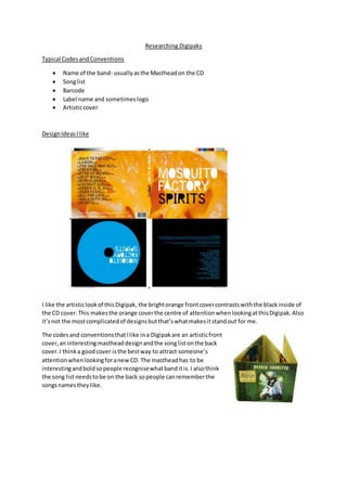
- 1. Researching Digipaks Typical CodesandConventions Name of the band- usuallyasthe Mastheadon the CD Songlist Barcode Label name and sometimeslogo Artisticcover DesignIdeasIlike I like the artisticlookof thisDigipak, the brightorange frontcovercontrastswiththe blackinside of the CD cover.This makesthe orange coverthe centre of attentionwhenlookingatthisDigipak.Also it’snot the mostcomplicatedof designsbutthat’swhatmakesitstandout for me. The codesand conventionsthatIlike ina Digipakare an artisticfront cover,an interestingmastheaddesignandthe songlistonthe back cover.I thinka goodcover isthe bestway to attract someone’s attentionwhenlookingforanewCD. The mastheadhas to be interestingandboldsopeople recognisewhatbanditis.I alsothink the song listneedstobe on the back sopeople canrememberthe songsnamestheylike.
- 2. Here is anotherdigipakthatIlike.Thisone isa bit differenttothe lastas it hasa muchdarker connotations.Ilike the waythe picture of the eyescovertwopanelsof the digipakasit makesitlook at more dramatic. I alsolike the plane frontcoverof thisone as I believe somethingsimple like the star in thisone can say a lotjustlike a busierfrontcover.