
Recommended
More Related Content
What's hot
What's hot (18)
Viewers also liked
Similar to Kerrang
Similar to Kerrang (20)
More from Leah Ellis
Recently uploaded
Recently uploaded (20)
Kerrang
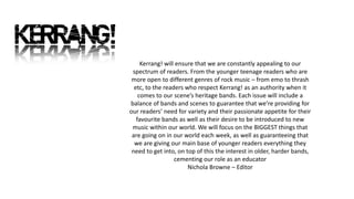
- 1. Kerrang! will ensure that we are constantly appealing to our spectrum of readers. From the younger teenage readers who are more open to different genres of rock music – from emo to thrash etc, to the readers who respect Kerrang! as an authority when it comes to our scene’s heritage bands. Each issue will include a balance of bands and scenes to guarantee that we’re providing for our readers’ need for variety and their passionate appetite for their favourite bands as well as their desire to be introduced to new music within our world. We will focus on the BIGGEST things that are going on in our world each week, as well as guaranteeing that we are giving our main base of younger readers everything they need to get into, on top of this the interest in older, harder bands, cementing our role as an educator Nichola Browne – Editor
- 2. Readership Jim, 22, lives and breathes rock music: it informs his choice of friends, his hobbies, leisure time, attitudes, fashion sense and lifestyle. Above all he is fanatical about THEIR music. He engages with music 24/7, from the minute he wakes up ‘til the minute he falls asleep: when he is not listening to music or watching music TV, he is talking to his friends about music, attending gigs or playing instruments and dreaming about rock stardom. He is plugged in, sharp, has a strong moral code and rejoices in his individuality. He is a fashion trend setter in his peer group but he is heavily influenced by musical icons and scenes. Like the bands he supports he is extremely loyal to the brands he trusts. The way he looks and the clothes he wears is integral to communicating ‘his identity’ to the world. Circulation – 44,013 Readership – 421,000 Mean Age – 22 Soul Readership – 87%
- 3. Mast head: Big mast head placed behind the main image to show they don’t feel the need to have it on show and they are so popular they will be recognised regardless. It has a cracked effect to show that the music they write about is bold and could be loud enough or rebellious enough to break things like glass. Top banner: This is a bar to show free posters inside the magazine. Shows that the reader may want something from the magazine other than just the articles. Posters in most articles, to show that the reader would want to have big images in their home. At the top of the cover so that it is one of the first things you notice, attracts attention from possible readers in stores. Main image: Medium shot of main artist(s) from the feature article. Attracts attention of customers Has room for full bands and show some of their clothing. Gives an idea of who the main article is so that customers will know if they would be interested in the main theme for the week’s article. Coverline: This is the articles down the side of the page to highlight a few big ideas from the magazine. It is down the left of the page so that as the magazines are stacked in the shop, it is the side that is shown so it will be seen and attract readers. Colour Scheme: The magazine uses a lot of red, yellow, black, and white as their main colours of the cover. This is helpful as it is a small colour palette and helps to keep it simple and to not look too overcrowded. Fonts: The magazine uses approximately 4 fonts, this helps to give it structure and not be too overbearing or confusing to the reader. ‘Plus’ Section: This magazine has a section towards the bottom of the covers to show a few extra little bits of the magazine that are contained but are not the main focus of the week.
- 4. Coverline: This is the articles down the side of the page to highlight a few big ideas from the magazine. It is down the left of the page so that as the magazines are stacked in the shop, it is the side that is shown so it will be seen and attract readers.
- 5. Top banner: This is a bar to show free posters inside the magazine. Shows that the reader may want something from the magazine other than just the articles. Posters in most articles, to show that the reader would want to have big images in their home. At the top of the cover so that it is one of the first things you notice, attracts attention from possible readers in stores.
- 6. Main image: Medium shot of main artist(s) from the feature article. Attracts attention of customers Has room for full bands and show some of their clothing. Gives an idea of who the main article is so that customers will know if they would be interested in the main theme for the week’s article.
- 7. Colour Scheme: The magazine uses a lot of red, yellow, black, and white as their main colours of the cover. This is helpful as it is a small colour palette and helps to keep it simple and to not look too overcrowded.
- 8. ‘Plus’ Section: This magazine has a section towards the bottom of the covers to show a few extra little bits of the magazine that are contained but are not the main focus of the week.
- 9. Fonts: The magazine uses approximately 4 fonts, this helps to give it structure and not be too overbearing or confusing to the reader.
- 10. Contents page title: This contents title is bold with drawings of things such as skulls, Ouija board and a megaphone. These are in a sketch or ‘doodle’ design that shows that the readers are interested in non conventional designs and things that are seen as more taboo, such as the Ouija board. Main Picture: The main picture here shows some of the bands that are written about in the edition of the magazine that they have. Here it is the symbols of ‘Avenged Sevenfold’ and Metallica’. It also has the page references of where they are included in the magazine so that it is easier to find for the reader. Editors note: The editor writes a little message to the readers, shown on the contents. It tells the reader a few main articles and interviews that they may be most interested in. List of contents: The contents are placed in a list down the side of the page. They are divided by the theme of the articles. So that the reader can quickly navigate the different type of article that they wish to read. Poster advertising: They have little previews of the posters found later in the magazine so that it keeps the readers interest and lets them know that there is still more in the magazine than just the articles. It advertises their “free gifts” so that the readers see it as better value. Colour Scheme: The magazine is using 3 main colours on this page – white, black, and yellow. This allows the reader to not feel overwhelmed by it being too bright, and the most important things are attracting the readers eye by them being near the yellow. Fonts: There are 3 main fonts used here to separate the different things they are writing, this helps to structure the page and help the reader know which part they are reading.
- 11. Main Picture: The main picture here shows some of the bands that are written about in the edition of the magazine that they have. Here it is the symbols of ‘Avenged Sevenfold’ and Metallica’. It also has the page references of where they are included in the magazine so that it is easier to find for the reader.
- 12. Contents page title: This contents title is bold with drawings of things such as skulls, Ouija board and a megaphone. These are in a sketch or ‘doodle’ design that shows that the readers are interested in non conventional designs and things that are seen as more taboo, such as the Ouija board.
- 13. Colour Scheme: The magazine is using 3 main colours on this page – white, black, and yellow. This allows the reader to not feel overwhelmed by it being too bright, and the most important things are attracting the readers eye by them being near the yellow.
- 14. Fonts: There are 3 main fonts used here to separate the different things they are writing, this helps to structure the page and help the reader know which part they are reading.
- 15. Editors note: The editor writes a little message to the readers, shown on the contents. It tells the reader a few main articles and interviews that they may be most interested in.
- 16. List of contents: The contents are placed in a list down the side of the page. They are divided by the theme of the articles. So that the reader can quickly navigate the different type of article that they wish to read.
- 17. Poster advertising: They have little previews of the posters found later in the magazine so that it keeps the readers interest and lets them know that there is still more in the magazine than just the articles. It advertises their “free gifts” so that the readers see it as better value.
- 18. Title: This is written in bold with doodles around it as similar to the contents page, this shows that the readers would be rebellious and feel like they can doodle over things. And it is the same theme as the context page to keep the consistency throughout. Headline: The headline is in bold and capitals so that it sticks out to the reader and they can know it is the title for the article. It is in very bright colours on the dark background so that it is noticeable and readable. Main Picture: The picture is quite dark and shows the full band so that the reader knows exactly who the article is about and almost get an idea about the kind of music they play from the brightness. Quotation: They have selected a line of the article to highlight by putting it to the side to show how they feel its important. Article: The whole article is put in this bottom right corner of the double page spread. They do this to allow the reader to see the full photo before also reading their interview. It is written in white to be able to be read over the dark image. Mini Photo: This is a small photo to show something the article is talking about. This is a photo of the album cover they are advertising, so that readers know what to look for when they go out to buy it. Colour Scheme: There are 3 main colours on these pages. Black, white, and yellow. This helps the reader differentiate between the background and writing, with some of the more important things placed in the yellow. Fonts: There are approximately 3 fonts on these pages and they are used to help the reader differentiate the sections.
- 19. Title: This is written in bold with doodles around it as similar to the contents page, this shows that the readers would be rebellious and feel like they can doodle over things. And it is the same theme as the context page to keep the consistency throughout.
- 20. Main Picture: The picture is quite dark and shows the full band so that the reader knows exactly who the article is about and almost get an idea about the kind of music they play from the brightness.
- 21. Quotation: They have selected a line of the article to highlight by putting it to the side to show how they feel its important.
- 22. Colour Scheme: There are 3 main colours on these pages. Black, white, and yellow. This helps the reader differentiate between the background and writing, with some of the more important things placed in the yellow.
- 23. Fonts: There are approximately 3 fonts on these pages and they are used to help the reader differentiate the sections.
- 24. Headline: The headline is in bold and capitals so that it sticks out to the reader and they can know it is the title for the article. It is in very bright colours on the dark background so that it is noticeable and readable.
- 25. Mini Photo: This is a small photo to show something the article is talking about. This is a photo of the album cover they are advertising, so that readers know what to look for when they go out to buy it.
- 26. Article: The whole article is put in this bottom right corner of the double page spread. They do this to allow the reader to see the full photo before also reading their interview. It is written in white to be able to be read over the dark image.