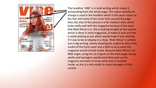
1. The headline ‘VIBE’ is in bold writing which makes it
outstanding from the whole page. The colour dark/burnt
orange is used in the headline which is the same colour as
her hair and some of the cover lines around the page.
Also, the shot of the picture is a far medium shot, which
looks really well with the magazine because of the pose
that Nicki Minaj is in. She is looking straight at the camera
which is done in most magazines, it makes it look as if she
is really looking at you which would make it eye catching
if it was to be on display in a shop. ‘Nicki Minaj’ is written
out in big writing, clearly showing the audience who is the
model of the front cover and a little to as to what the
magazine would include inside. Because Nicki Minaj is an
R&B singer, using her as a figure on the front page, young
adults and teenagers would most likely pick up the
magazine and want to know what else is included
inside, as she is a role model to some teenagers of this
society.
2. Even though the headline ‘Billboard’ is hidden behind Trey
Songz head, it’s still viable what it says. The colour yellow and
white is used repeatedly through out the front page, these
are bright colours and work really well with the heading of
the magazine. Using these colours also contrast with the dark
colours that Trey Songz is wearing. Trey Songz is a really big
R&B star so by having him on the front page will attract the
audience of teenage girls, and would also want to know what
other things about him which may be included inside. The
shot is a medium close up shot, which works well because the
model is also looking straight at the camera which would
make you want to pick up the magazine and see what is
included inside.
3. The magazine ‘Q’ is always in red, however in this
magazine Cheryl Cole’s lipstick is in a shade of red
too. Also the cover lines are in red which make
the colours outstanding from the dark
background of the magazine. The picture is close
medium close shot which works well because it
clearly shows Cheryl Coles lipstick colour and how
it matches with the cover lines around the
magazine.