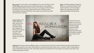
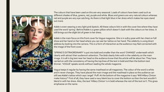
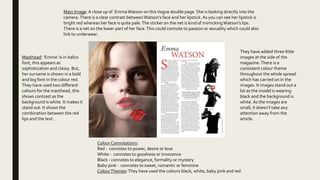
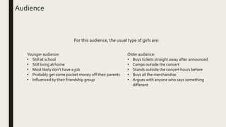
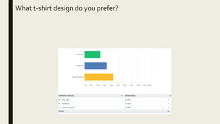
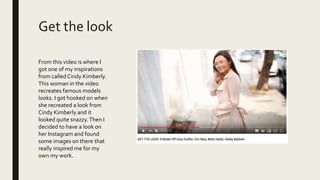
This document contains summaries of magazine covers, articles, and advertisements.
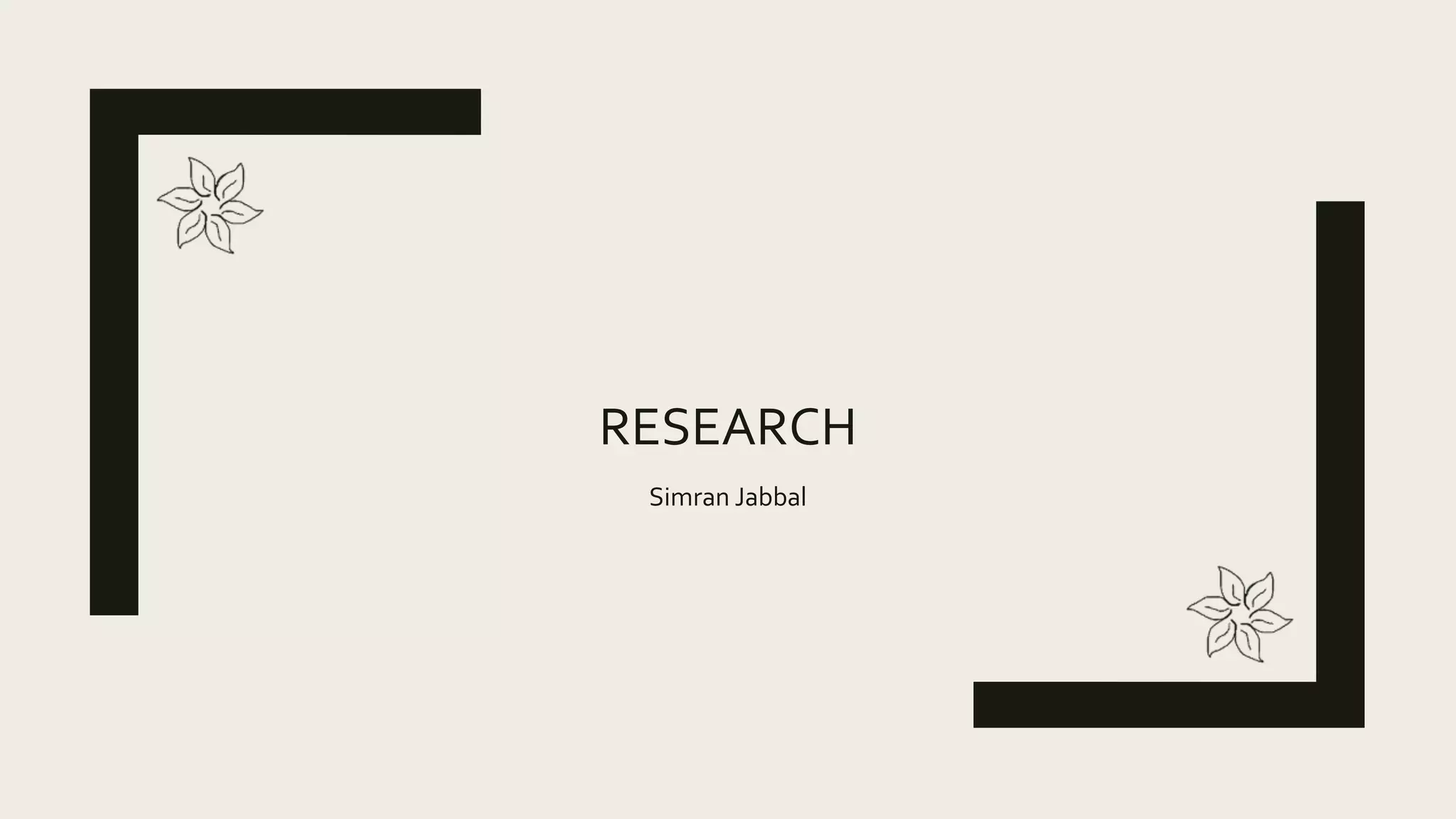
The first summary describes the cover of a NME magazine featuring Craig David. It uses a gray background to make David stand out as he crouches wearing all black. The cover promotes his new album and Spotify playlist.
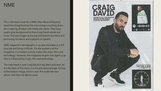
The second summary is about a double page spread in NME featuring Stefflon Don. It continues the black, white, and gray color scheme, with her pink hair standing out. The text calls her a "million dollar baby" though she lacks confidence.
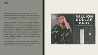
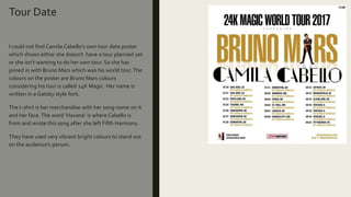
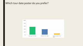
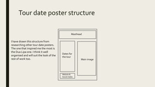
The third summary is a tour date poster for Dua Lipa that continues the consistency of her album covers. It features her in black and white to look


![Magazine research really official [recovered]](https://cdn.slidesharecdn.com/ss_thumbnails/magazineresearchreallyofficialrecovered-160222160255-thumbnail.jpg?width=640&height=640&fit=bounds)

![Magazine research really official [recovered]](https://cdn.slidesharecdn.com/ss_thumbnails/magazine-research-really-official-recovered-160211094822-thumbnail.jpg?width=640&height=640&fit=bounds)


