
Recommended
More Related Content
What's hot
What's hot (14)
Viewers also liked
Viewers also liked (20)
Similar to Back cover process
Similar to Back cover process (20)
More from Rebecca Witty
Recently uploaded
Recently uploaded (20)
Back cover process
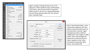
- 1. Again, to begin creating the back cover of my digi-pack, I firstly needed to open up Photoshop and create a new document which I would be able to work on. As soon as I opened Photoshop the first thing I did was select the ‘File’ tab and then I selected ‘New’. Once I had selected ‘New’, a pop up box then appeared and I was able to choose the dimensions of the document I wanted. I again decided to go with a width of ‘1800 Pixels’ and a height of ‘1600 Pixels’. Once I had changed the dimensions of the document to what I wanted it to be, I then renamed the document ‘Back Cover’ then clicked ‘OK’.
- 2. Once I had created the document I wanted, I then needed to open up the image I wanted to use on the back cover – to do this all I had to do was again select the ‘File’ tab and then I clicked ‘Open’. After I had selected this, all of my documents then appeared on the screen and I then had to find the location in which the image I wanted to use was in. Once I had found the image I wanted, I then selected it and clicked ‘Open’.
- 3. After I had put the image onto my document I then noticed it was too big, so I needed to make it smaller. To do this all I had to do was select ‘Edit’, ‘Transform’ and then ‘Scale’. Once I had selected ‘Scale’ I was then able to make the image smaller so that it would fit the document. While I was making the image smaller I actually had to hold down the ‘Shift’ button on the keyboard and I did this to ensure that the image wouldn’t go obscure and would stay exactly the same, but would just be smaller and would fit on the document.
- 4. Once I had the image in the position I wanted it to be in, I then needed to change the colour of the image to make it conform to the genre more, but also to create continuity between this back cover and the front cover of the digi-pack. To start editing the colour of the image I had to select the ‘Image’ tab, ‘Adjustments’ and then ‘Selective Colour’. Once I had selected this, a pop up box then appeared and I was able to begin changing the colour of the image. Before I made any changes, I firstly clicked on the drop down box next to where it says ‘Colours’ and selected ‘Neutrals’ and this meant that all of the neutral colours in the image would change once I change the settings. Once I had done that, I then changed all of the settings to what I wanted them to be to make the image look the way I wanted it to look.
- 5. I then wanted to continue editing the colour of the image by using these settings, but I wanted to change some things. While still on this ‘Selective Colour’ settings I clicked on the drop down box next to where it says ‘Colours’ and selected ‘Reds’. Once I had done this, I then changed all of the settings to what I wanted them to be to make the image look the way I wanted it to look. Once I had done this I then clicked ‘OK’. Once I had changed all of the settings to what I wanted to ensure the image looked the way I wanted it to, you are able to see that the end result of the image is what I have presented on the left.
- 6. I then wanted to continue editing the colour of the image, but this time by using different settings and to do this I had to clicked on the ‘Image’ tab again, then I selected ‘Adjustments’ and then ‘Brightness/Contrast’. Once I had done that, a pop up box then appeared and I was able to begin editing the colour of the image. Once I had changed the setting to what I wanted them to be, I then clicked ‘OK’.
- 7. After I had made those changes to the colour of the image, you are able to see what the image turned out to look like on the left. Similar to when I was creating the front cover, I noticed that the background colour was perfect, but the colour of Laura seemed a little odd, so I wanted to change just the colour of Laura. Again to do this I just had to select the ‘Quick Selection Tool’ and I then I drew an outline around Laura which in the image I have presented on the left, you are able to see that there are dotted lines around Laura and this means that when I try to edit the image, the only thing that will be edited is Laura as she is the only part of the image that I have selected.
- 8. Once I had created the outline around Laura, I then wanted to change the colour of her and I was able to do this by selecting the ‘Image’ tab, ‘Adjustments’ and then ‘Brightness/Contrast’. Once I had selected this, a pop up box appeared and I was then able to change the colour of Laura by changing the settings to what I wanted them to be to make Laura look a normal colour in relation to the background, but also to ensure that she would stand out and be noticeable. Once I had changed the settings to what I wanted them to be, I then clicked ‘OK’.
- 9. I then wanted to continue editing the colour of Laura and again I clicked on the ‘Image’ tab, ‘Adjustments’ and then ‘Selective Colour’. Once I had selected this, a pop up box then appeared and I was able to change the settings to what I wanted them to be, but before I did this, I again clicked on the drop down box next to where it says ‘Colours’ and this time I selected the option called ‘Reds’. Once I had done this, I then changed the settings to what I wanted them to be to ensure that the image looked the way I wanted it to look. Once I had done this, I then clicked ‘OK’.
- 10. I then wanted to continue changing the colour of the image and to do this I again clicked ‘Image’, ‘Adjustments’ and then ‘Curves’. Once I had selected that, this pop up box then appeared and I was able to change the brightness of the image by moving the line. Once I had edited the image to the colour I wanted it to be, I then clicked ‘OK’.
- 11. When I had finished editing the colour of Laura, I then clicked ‘CTRL’ and ‘D’ at the same time on the keyboard to deselect the dotted line around Laura and once I had done that you are able to see how the colour of the image turned out as I have presented it on the left. When looking at the image I noticed that there was a bit of wood on the floor next to Laura’s hand which made it look as if she was holding something, so I decided to get rid of it to ensure that the audience don’t think she is holding something. To begin doing this I had to select the ‘Rectangular Marquee Tool’ and then I had to draw a square around the wood that I wanted to get rid of.
- 12. Once I had selected the bit of wood I wanted to get rid of, I then clicked the ‘Edit’ tab and then selected ‘Fill’. Once I had done this, a pop up box then appeared and to make this piece of wood go away I had to click on the drop down box next to where it says ‘Use’ and I selected ‘Content-Aware’ and this would mean that it would remove the object I had selected and will be aware of the content it is surrounded by, so will get rid of the wood, but will make it look as nothing was there in the first place. Once I had selected this option, I then clicked ‘OK’ and in the image I have presented on the left you are able to see that I was able to get rid of the piece of wood and it no longer looks as if Laura was carrying something.
- 13. Once I had edited the image to look the way I wanted it, I then wanted to add the same rough white background which I included on the front cover and because I already had this image it meant that I just needed to go into my documents to get it. To do this all I had to do was click ‘File’ and then ‘Open’. Once I had selected this, a pop up box then appeared and I was able to locate the image I wanted to use. Once I had found the image I wanted, I then selected it and clicked ‘Open’.
- 14. Once I had the image on my document, I then needed to enlarge it to ensure that it was the same size as my document. Again to do this all I had to do was select the ‘Edit’ tab, ‘Transform’ and then ‘Scale’. Once I had made the image the size of the document, you are able to see what it looks like in the image I have presented on the left.
- 15. Again, I then needed to get rid of all of the black that appeared in the image and I was able to do this by selecting the ‘Eraser Tool’. Once I had selected this, I then put the mouse over all of the black that appeared in the image and once I had done that you are then able to see that all of the black in the image had gone and the main image then appeared on the document and it looked as if the image had a rough white background.
- 16. Once I had edited the image to make it look like the way I wanted it, I then wanted to add a barcode to the back cover to make it look more like a back cover of a digi- pack. The first thing I had to do was actually get an image of a barcode, so I decided to go onto Google Images and get an image of a barcode and once I found one that I wanted to use, I then right clicked on it and selected ‘Save Image As’. Once I had selected this, a pop up then appeared and I was then able to save the image in the location I wanted to save it in. Once I found somewhere to save the image I then changed the name to ‘barcode’ and clicked ‘Save’.
- 17. Once I had saved the image of the barcode, I then went back onto Photoshop so I would be able to put it onto my document. Once I was back onto Photoshop, I then selected ‘File’, and then ‘Open’. Once I had selected this, a pop up box then appeared which lead me on to finding the location in which the image of the barcode I had saved was in. Once I had found where the image was, I then selected it and clicked ‘Open’.
- 18. Once the image was on my document, I then needed to make it smaller to ensure that it was a conventional size and actually make the image look as if it was a back of a digi-pack. To do this, all I had to do was select the ‘Edit’ tab, ‘Transform’ and then ‘Scale’. Again when making this image smaller I had to hold down the ‘Shift’ button on the keyboard and this was to ensure that the image didn’t go obscure and would look the same as it did before, but was just smaller. Once I had done this, I then put the barcode into the position I wanted it to be in which you are able to see in the image on the left.
- 19. I then actually wanted to add some effects to the barcode image to make it stand out more on the back cover and to do this all I had to do was click on the ‘Layer’ tab, ‘Layer Style’ and then ‘Blending Options’. Once I had selected this, a pop up box then appeared and I was able to choose the effects that I wanted to add to the image. The effects I decided to add were called ‘Stroke’ and ‘Drop Shadow’. Once I had selected all of the effects I wanted to make the barcode image stand out, I then clicked ‘OK’.
- 20. Another conventional feature that is generally presented on the back cover of a digi-pack is the record label logo, so this meant that I needed to get an image of the record label I had decided to use. Again, I went onto Google Images and once I found the image I wanted to use, I then right clicked on it and selected ‘Save Images As’. Once I had selected this, I was then taken to my documents and I had to find a location to save this image in. When I had found somewhere to save this image, I then renamed it ‘record label logo’ and clicked ‘Save’.
- 21. I then went back onto Photoshop so I would be able to put the image onto the back cover of the digi-pack. When I got onto Photoshop, I clicked on the ‘File’ tab and then selected ‘Open’. Again, once I had done this, I was then taken to my documents and I had to find the location in which the image I had saved was in. Once I had found the image of the record label logo, I then selected it and clicked ‘Open’.
- 22. Once I had opened up the record label logo I realised that there was a white background that the logo had been placed on and I wanted it to be transparent to ensure that I would be able to put it onto the back cover of my album and it wouldn’t massively stand out because it is on a white background. So to get rid of this background I had to select the ‘Magic Wand Tool’ and once I had selected this, I then moved the mouse around the edges of the logo which selected all of the white background and once I had done this I then pressed the ‘Delete’ button on the keyboard which then got rid of all of the white background and made the image transparent which meant that I was then able to put it onto my back cover.
- 23. Once I had got the image onto the back cover of the digi-pack, I then again needed to resize the image and to do this I just had to select the ‘Edit’ tab, ‘Transform’ and then ‘Scale’. Again, when resizing the image, I had to hold down the ‘Shift’ button on the keyboard and this was to ensure that the image would stay exactly the same but would just be smaller. Once I had resized the image, you are able to see how my back cover was looking in the image I have presented on the left.
- 24. I then again wanted to add some effects to the image to make it stand out more on the back cover and to do this I had to click ‘Layer’, ‘Layer Style’ and then ‘Blending Options’. Once I had selected that, this pop up box then appeared and I was able to choose the effects I wanted. The effects I decided to use were called ‘Stroke’, ‘Inner Shadow’ and ‘Drop Shadow’. Once I had selected all of the effects I wanted, I then clicked ‘OK’.
- 25. I then wanted to add some copyright information to the back cover of the digi-pack and once I had selected the ‘Text Tool’, I then chose the font called ‘Arial’. Once I had selected this, I then wrote the copyright information and placed it into the position I wanted it to be in which you are able to see in the image I have presented.
- 26. Once I had written the text, I then wanted to add some effects to it to again make it stand out more and to do this all I had to do was click on the ‘Layer’ tab, ‘Layer Style’ and then ‘Blending Options’. Again, once I had done that, this pop up box then appeared and I was able to choose the effects that I wanted to use. The effects I decided to use were called ‘Stroke’ and ‘Drop Shadow’. Once I had chosen all of the effects I wanted, I then clicked ‘OK’.
- 27. I then wanted to add the website address’ to the back cover of the album and once I had selected the ‘Text Tool’, I then chose the ‘Arial’ font again and wrote out both of the email address’ that I wanted to be included on the digi-pack. Once I had written these, I then placed them into the position I wanted them to be in which you are able to see in the image I have presented on the left.
- 28. Just like before, I again wanted to add some effects to the text to make it stand out more on the back cover and to do this I just had to click on the ‘Layer’ tab, ‘Layer Style’ and then ‘Blending Options’. Once I had done that, this pop up box then appeared and I was able to choose the effects I wanted to add to the text. The effects I decided to use were called ‘Stroke’, ‘Inner Shadow’ and ‘Drop Shadow’. Again, once I had chosen all of the effects I wanted, I then clicked ‘OK’.
- 29. The most conventional feature that is presented on the back cover of a digi-pack is generally the track listing, so to begin writing this, I again selected the ‘Text Tool’ and then selected the font called ‘Fairydust8’. Once I had written out the text I wanted, I then moved it into the position I wanted it to be in which you are able to see in the image I have presented on the left.
- 30. I then wanted to add some effects to the text to make it stand out more and to do this I had to click on the ‘Layer’ tab, ‘Layer Style’ and then ‘Blending Options’. Once I had selected this, a pop up box then appeared and I was able to choose the effects I wanted to add to the back cover. The effects I decided to use were called ‘Stroke’, ‘Inner Shadow’ and ‘Drop Shadow’. Once I had chosen all of the effects I wanted, I then clicked ‘OK’.
- 31. After I had added all of the features I wanted to the back cover, I then needed to save the document as an image and I was able to do this by click on the ‘File’ tab and then ‘Save As’. Once I had clicked on this, a pop up box then appeared and I was able to choose a location to save the document in. When I found somewhere to save the document, I then clicked on the drop down box next to where it says ‘Format’ and selected ‘JPEG’ and this would ensure that the back cover would be saved as an image rather than a Photoshop document which would mean that I would be able to post the image anywhere which I wouldn’t be able to do if I saved it as a Photoshop file. Once I had selected this, I then clicked ‘Save’.