
Recommended
More Related Content
What's hot
Viewers also liked
Viewers also liked (20)
Similar to Album cover process
Similar to Album cover process (20)
More from Rebecca Witty
Recently uploaded
Recently uploaded (20)
Album cover process
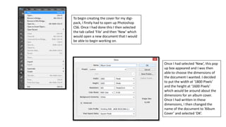
- 1. To begin creating the cover for my digi- pack, I firstly had to open up Photoshop CS6. Once I had done this I then selected the tab called ‘File’ and then ‘New’ which would open a new document that I would be able to begin working on. Once I had selected ‘New’, this pop up box appeared and I was then able to choose the dimensions of the document I wanted. I decided to put the width at ‘1800 Pixels’ and the height at ‘1600 Pixels’ which would be around about the dimensions for an album cover. Once I had written in these dimensions, I then changed the name of the document to ‘Album Cover’ and selected ‘OK’.
- 2. I then needed to put the image I wanted to use onto the document I had created and to do this all I had to do was clicked on the ‘File’ tab and then select ‘Open’. Once I had clicked ‘Open’, my documents then appeared on the screen and I had to find the location in which the image I wanted to use was in. Once I had found the image I wanted, I then selected it and clicked ‘Open’.
- 3. After the image had been put onto my document I then needed to make it smaller to ensure that I would have the image in the position I needed it to be in to begin editing. So to do this all I had to do was click on the ‘Edit’ tab that is located at the top of the screen and then I selected ‘Scale’. After I had selected ‘Scale’ I was then able to begin making the image smaller, but while making it smaller I had to hold down the ‘Shift’ button on the keyboard and this was to ensure that the image wouldn’t go obscure and would stay the same but would just be smaller. On the left is the image that I had made smaller.
- 4. One of the first things I wanted to edit once I had opened this image was the colour of Laura’s eyes. In the original image you are able to see that she had red eyes so I needed to get rid of this and to do this all I had to do was select the ‘Red Eye Tool’ and then just click on the parts of the eye that are red. Once I had done this, the redness had gone and you are able to see that the pupils went back to black rather than being red.
- 5. The next thing I wanted to do was begin editing the colour of the image, but before I did this I wanted to duplicate the image to ensure that I had a copy of it in case anything went wrong while I would be editing it. To duplicate the image all I had to do was right click on the layer that the image was on, then I just had to select ‘Duplicate Layer’ and then a new layer with the same image appeared which was what I wanted to occur. Once I had made a duplicate of the image, I was then able to begin editing the colour of the image. The first thing I did was click the ‘Image’ tab, then I selected ‘Adjustments’ then ‘Vibrance’.
- 6. Once I selected ‘Vibrance’, a pop up box then appeared and I was able to change the vibrance and saturation of the image. When editing the image I actually only decided to change the vibrance as there was no need for me to change the saturation of the image at that time. Once I had changed the vibrance to what I wanted it to be, I then selected ‘OK’ and in the image on the left, you are able to see how the image had changed once I had added this effect.
- 7. I then wanted to continue editing the colour of the image and the next thing I did was again click on the ‘Image’ tab and then I selected ‘Adjustments’ then ‘Selective Colour’. Once I had done this a pop up box then appeared and in the drop down box next to where it says ‘Colous’, I selected ‘Neutrals’ which would enable me to change the majority of the colours that are presented in the image. Once I had done this I then changed all of the features to what I wanted them to be to ensure that the image looked the way I wanted it to look.
- 8. Once I had edited the image in the way I wanted it to be with the ‘Neutral’ colours, I then wanted to change them in relation to the ‘Red’ colours and to do this, again all I had to do was click on the drop down box next to where it says ‘Colours’ and then I selected the option called ‘Reds’. Once I had done this, I then again changed the features in the way I wanted them to be to ensure that the image looked the way I wanted it to look and once I had changed everything I wanted I then clicked ‘OK’. In the image below you are able to see what the outcome of the image was with all these added effects.
- 9. When editing the colour of this image I noticed that the background was the perfect colour that I wanted, but the colour of Laura was odd and I knew that I would need to change the colour of her. So to only change the colour of Laura and not the background as well, I had to click on the ‘Quick Selection Tool’ and once I had done this I just then outlined around Laura’s body and in the image on the left you are able to see that there are dotted lines around just Laura and this means that only Laura will be edited and nothing else will be as she is the only part of the whole image that has been selected. After I had selected Laura, I then decided to change the brightness and saturation of her. Once I had changed the settings to what I wanted them to be, I then clicked ‘OK’ and you are able to see what the outcome of the image looked like once I had done this in the image I have presented.
- 10. Once I had made this edit I then wanted to edit the image more to make it look the way I want it and this meant that I again selected ‘Image’, ‘Adjustments’ and then ‘Hue/Saturation’. Once I had selected this, a pop up box then appeared and I was able to change the features to ensure that the image looked the way I wanted it to look. Once I had made the changes I wanted, I then clicked ‘OK’.
- 11. Once I had edited the image to look the way I wanted it, I then wanted to get rid of some of the shining parts on Laura’s face which would have been created from the flash of the camera. To do this all I had do to was select the ‘Spot Healing Brush Tool’ and then I just selected all of the areas of Laura’s face that were quite shiny. Once I had done this, you are then able to see that all of the shiny parts had gone which made the image look more professional looking.
- 12. The next thing I wanted to do was add a rough white border around the image to make it more Pop Punk, but also to relate to some parts that occur in my music video. So the first thing I had to do was actually get a rough white border and I was able to do this by going onto Google Images. Once I found an image I liked, I then right clicked on it and clicked ‘Save Image As’. After I had selected that, a pop up box then appeared and I had to choose a location that I wanted to save the image in. Once I had found somewhere I wanted to save it, I then changed the name to ‘White Border’ so I would easily be able to find the image when I need it. Then I clicked ‘Save’.
- 13. Once I had saved the image, I then needed to put it onto my album cover and to do this all I had to do was go back onto Photoshop and then select ‘File’ and then ‘Open’. After I had selected this, a pop up box then appeared and I was able to location the image I had just saved. Once I had found the image I wanted, I then clicked ‘Open’.
- 14. Once the image had been placed onto my document I then needed to enlarge it to ensure that it would fit the whole of the document. To do this all I had to do was click on the ‘Edit’ tab and then select ‘Transform’ then ‘Scale’. Once I had done this you are able to see that the image had then been enlarged to the whole of the document which I have presented in the image below.
- 15. I then needed to add a layer mask to the image to enable me to begin editing it. To create a layer mask for the image, all I had to do was select the layer that the image was on and then I just had to select the ‘Add Layer Mask’ button which is located underneath all of the layers and is the second button which can be selected which I have highlighted in the image on the left. Once I had created this layer mask I then selected the ‘Eraser Tool’ and began to move the tool around on the image and you are able to see that once I had done this, all of the black parts of the image had disappeared as I had erased it all and the main image was then visible again.
- 16. Once I had got rid of all of the black parts of the image, I did notice that the rough white border was appearing a bit too much on the image, so I decided just to enlarge it so that only a small amount of the rough border was visible which looked more appealing on the cover. I then wanted to add another feature to the album cover and this time I wanted to add some patterns to the edges of the cover, so again this meant that I needed to get an image which I would be able to use for this. So I went onto Google Images and tried to find an image I would like to use. Once I found an image I liked, I then right clicked on it and selected ‘Save Image As’.
- 17. Again, I then needed to find a location in which I would be able to save this image in to ensure that I would easily be able to locate it when I need it. Once I had found somewhere to save the image, I then renamed it ‘Flowers’ and selected ‘Save’. Once the image was saved I then opened it up onto Photoshop so that I would be able to include it onto my album cover.
- 18. Before adding this image onto my album cover, I firstly wanted to edit it to ensure that it would look appealing on the cover of the album. So I decided to click on the ‘Magic Wand Tool’ and once I had selected this I then get rid of all of the black parts of the images and made the image transparent so that I would only have the white patterns that would appear on the cover of the album. Once I had edited the image to look the way I wanted it to look, I then added it to my main document which included the album cover. Once I had done this, I then needed to change the size of the image I had just put onto my document and again I was able to do this by clicking on ‘Edit’, ‘Transform’ and then ‘Scale’.
- 19. Once I had made the image smaller, I then placed it into the position I wanted it to be in – when doing this I didn’t actually show the whole of the image and I did this because I think it looks more appealing and less messy when I don’t show the whole of the image. After I had got one of the patterns into the position I wanted them to be, I then went through the same process to add another three patterns to the album cover and I put them in the other three corners of the image. When doing this I made each of the patterns different sizes to make them look different and again more appealing rather than it all being the same thing on every corner.
- 20. I then actually wanted to edit these patterns as they stood out more than I wanted them to, so to edit them all I had to do was select the ‘Layer’ tab, ‘Layer Style’ then ‘Blending Options’. Once I had selected this, a pop up box then appeared and in the image on the left you are able to see that the options I chose to use to edit these patterns were called ‘Satin’ and ‘Drop Shadow’. Once the patterns had been edited in the way I wanted them, I then clicked ‘OK’.
- 21. Once I had edited the patterns, you are able to see that in the image I have presented on the left that I made the patterns a lot darker and faded them a bit so they would fit in more with the image rather than standing out from it. After I had done that, I then wanted to add the artists name to the album cover and when doing this I decided to choose the font called ‘Palace Script MT’. Once I had selected this font, I then wrote out the artists name and put it into the position I wanted it to be in.
- 22. In the image I have presented on the left you are able to see the text that I have added to the album cover. Once the text had been added to the album cover, I then wanted to add some effects to the text to make it stand out more and to do this all I had to do was click on the ‘Layer’ tab, ‘Layer Style’ and then ‘Blending Options’.
- 23. After I had clicked on this, a pop up box then appeared and I was able to add the effects I wanted to the text I had written. The effects I decided to add to the text were called ‘Inner Shadow’ and ‘Drop Shadow’. Once I had added all of the effects I wanted I then clicked ‘OK’. Once I had finished editing the artists name, I then needed to add the album name to the cover and again when doing this, the font I decided to use was called ‘Fairydust8’.
- 24. Once I had written this text I again wanted to add some effects to it to ensure that it would stand out and again to do this all I had to do was click on the ‘Layer’ tab, ‘Layer Style’ and then ‘Blending Options’. Once I had done this, again a pop up box then appeared and I was able to choose the effects I wanted to put onto the text I had written. The effects I decided to add to the text were called ‘Bevel and Emboss’, ‘Contour’, ‘Stroke’ and ‘Drop Shadow’. Once I had added all of the effects I wanted I then clicked ‘OK’.
- 25. Once I had clicked on this a pop up box then appeared and when saving the image I needed to change the file format to ensure that the album cover would save as an image rather than a Photoshop document. To do this all I had to do was click on the drop down box next to where it says ‘Format’ and once I had done this I then just selected ‘JPEG’ and this would mean that the document would be saved as an image rather than a Photoshop document. Once I had made these changes I then clicked ‘Save’. When I had completed my album cover I then needed to save it as an image to ensure I would be able to post it on my blog. To do this all I had to do was click on the ‘File’ tab and then ‘Save As’.