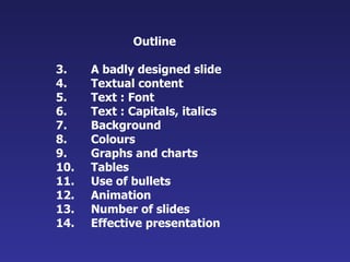
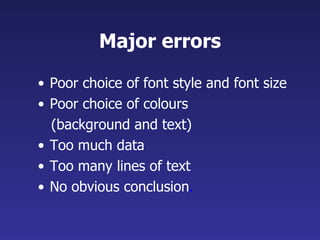
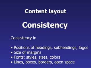
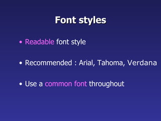
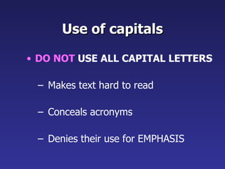
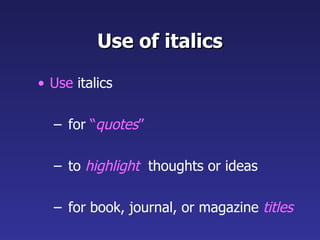
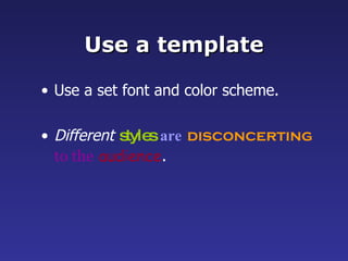
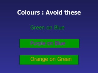
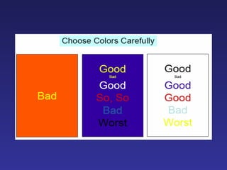
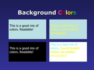
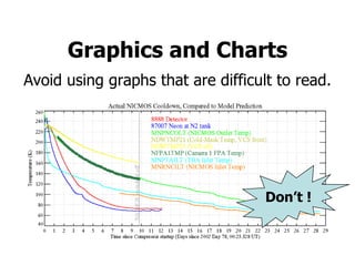
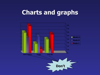
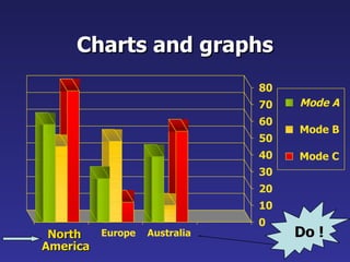
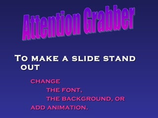
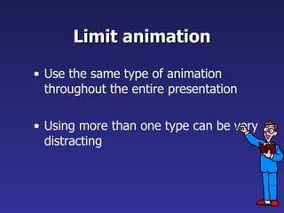
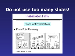
Slide Presentation Guidelines
Slide Presentation: Guidelines  for the use of  fonts, colors, and graphics Dept of Computer Applications  Vidya Academy of science & Technology Thalakkottukara, Thrissur – 680 501
Slide Presentation:  Guidelines  for the use of fonts, colors, and graphics A publication of     Dept of Computer Applications  Vidya Academy of science & Technology Thalakkottukara, Thrissur – 680 501 2008
Outline A badly designed slide Textual content Text : Font Text : Capitals, italics Background Colours Graphs and charts Tables Use of bullets Animation Number of slides Effective presentation
Study the next  slide
Emk1 knockdown inhibits lumen formation in MDCK cells: RT-PCR: EMK1 is effectively knocked down in MDCK cells 24 hours after transfection with P-SUPER (control) or P-SUPER-siEMK1 plasmid; knockdown confirmed on the right with antibodies to EMK1. Collagen overlay assay:  cells cultured 24 h on collagen I before being overlaid with additional collagen on the apical surface,  analyzed 24 h later. Note the lack of lumen in EMK1-KO cultures. Ca switch: control or EMK1-KO cells were plated in low Ca medium 24 h upon transfection with pSUPER or pSUPER-KO. After 12 h, cultures were switched to normal medium for 24 h. Transmission EM of cells sectioned perpendicular to the substratum shows lack of microvilli in EMK1-KO cells.
Major errors Poor choice of font style and font size Poor choice of colours  (background and text)  Too much data Too many lines of text No obvious conclusion .
Textual content Make  text short  and to the point Include only  key words  and phrases Highlight  key points Make  text short
Content layout Consistency in  Positions of headings, subheadings, logos  Size of margins  Fonts: styles, sizes, colors Lines, boxes, borders, open space Consistency
Font styles Readable  font style Recommended : Arial, Tahoma,  Verdana Use a  common font  throughout
Title size : 40 point Bullet point : 32 point Content text :24 point This font size is not recommended for content.  Font size The larger, the better
Don’t Sacrifice Readability for Style Don’t Sacrifice Readability for Style Don’t Sacrifice Readability for Style Don’t Sacrifice Readability for Style Don’t !
Use of capitals DO NOT  USE ALL CAPITAL LETTERS Makes text hard to read Conceals acronyms Denies their use for EMPHASIS
Use of italics Use  italics for  “ quotes ” to  highlight   thoughts or ideas for book, journal, or magazine  titles
Use a template Use a set font and color scheme. Different   styles   are   disconcerting   to the   audience .
Use the  same background   on all slides See the next slide…
Don’t use multiple  backgrounds  in your presentation Changing the style is distracting Don’t!
Colours : Avoid this Lots of people can’t read this – and even if they could, it makes your eyes hurt.
Colours : Avoid these Green on Blue Purple on Blue Orange on Green
 
This is a good mix of colors. Readable! Background  C o l o r s This is a bad mix of colors. Low contrast. Unreadable! This is a good mix of  colors. Readable! This is a bad mix of  colors.  Avoid bright colors on white. Unreadable!
Graphs and Charts Make sure the audience can read them!
Avoid using graphs that are difficult to read. 8 Graphics and Charts Don’t !
Good graph
Charts and graphs Don’t
Charts and graphs 0 10 20 30 40 50 60 70 80 North America Europe Australia Mode A Mode B Mode C Do !
Tables Place on a separate slide 4/19  Fri 109 NICMOS restarted, Ne-loop control continues 4/22 Mon 112 Change to mounting cup control 4/23 Tue 134 Return to Ne control, Filter wheel test begins 4/24 Wed 155 Increase control temperature to allow for  +2 K variations 4/25 Thur 165 Begin darks every 3 rd  orbit 4/26 Fri 174 DQE test visit 1;  Control temp +0.5 K
Illustrations Use only when needed Should relate to the message and  help make a point
Limit each slide to one idea Use  Bullet Points  to cover  components of each idea
Bullets Keep each bullet to 1 line, 2 at the most Limit the number of bullets in a slide to 5
Points to remember Keep bullet points brief Use the same background for each slide Use dark slides with light colored text in large hall events
Avoid the “All Word” slide Another thing to avoid is the use of a large block paragraph to introduce your information. Please use short, bulleted statements and avoid typing out your whole presentation on to the slides.  Also, it is difficult for some to listen and read a large amount of text at the same time.   Don’t
To make a slide stand out   change  the font,  the background, or  add animation. Attention Grabber
Limit animation Use the same type of animation throughout the entire presentation Using more than one type can be very distracting
Do not use too many slides!
Tips for effective presentation
Effective presentation Do not read your slides Do not use too many gimmicks (videos) Do not pace up and down but also don’t stand rigid! Do not wave your pointer all over the slide Do not talk to the screen
Do face the audience and make eye contact Do show enthusiasm and vary the tone of your voice Do practice beforehand  Do ask your friends for feedback Do RELAX and ENJOY your presentation! Effective presentation  (contd.)
Thank You

Slide Presentation Guidelines

  • 1.
  • 2.
    Slide Presentation: Guidelines for the use of fonts, colors, and graphics Dept of Computer Applications Vidya Academy of science & Technology Thalakkottukara, Thrissur – 680 501
  • 3.
    Slide Presentation: Guidelines for the use of fonts, colors, and graphics A publication of Dept of Computer Applications Vidya Academy of science & Technology Thalakkottukara, Thrissur – 680 501 2008
  • 4.
    Outline A badlydesigned slide Textual content Text : Font Text : Capitals, italics Background Colours Graphs and charts Tables Use of bullets Animation Number of slides Effective presentation
  • 5.
  • 6.
    Emk1 knockdown inhibitslumen formation in MDCK cells: RT-PCR: EMK1 is effectively knocked down in MDCK cells 24 hours after transfection with P-SUPER (control) or P-SUPER-siEMK1 plasmid; knockdown confirmed on the right with antibodies to EMK1. Collagen overlay assay: cells cultured 24 h on collagen I before being overlaid with additional collagen on the apical surface, analyzed 24 h later. Note the lack of lumen in EMK1-KO cultures. Ca switch: control or EMK1-KO cells were plated in low Ca medium 24 h upon transfection with pSUPER or pSUPER-KO. After 12 h, cultures were switched to normal medium for 24 h. Transmission EM of cells sectioned perpendicular to the substratum shows lack of microvilli in EMK1-KO cells.
  • 7.
    Major errors Poorchoice of font style and font size Poor choice of colours (background and text) Too much data Too many lines of text No obvious conclusion .
  • 8.
    Textual content Make text short and to the point Include only key words and phrases Highlight key points Make text short
  • 9.
    Content layout Consistencyin Positions of headings, subheadings, logos Size of margins Fonts: styles, sizes, colors Lines, boxes, borders, open space Consistency
  • 10.
    Font styles Readable font style Recommended : Arial, Tahoma, Verdana Use a common font throughout
  • 11.
    Title size :40 point Bullet point : 32 point Content text :24 point This font size is not recommended for content. Font size The larger, the better
  • 12.
    Don’t Sacrifice Readabilityfor Style Don’t Sacrifice Readability for Style Don’t Sacrifice Readability for Style Don’t Sacrifice Readability for Style Don’t !
  • 13.
    Use of capitalsDO NOT USE ALL CAPITAL LETTERS Makes text hard to read Conceals acronyms Denies their use for EMPHASIS
  • 14.
    Use of italicsUse italics for “ quotes ” to highlight thoughts or ideas for book, journal, or magazine titles
  • 15.
    Use a templateUse a set font and color scheme. Different styles are disconcerting to the audience .
  • 16.
    Use the same background on all slides See the next slide…
  • 17.
    Don’t use multiple backgrounds in your presentation Changing the style is distracting Don’t!
  • 18.
    Colours : Avoidthis Lots of people can’t read this – and even if they could, it makes your eyes hurt.
  • 19.
    Colours : Avoidthese Green on Blue Purple on Blue Orange on Green
  • 20.
  • 21.
    This is agood mix of colors. Readable! Background C o l o r s This is a bad mix of colors. Low contrast. Unreadable! This is a good mix of colors. Readable! This is a bad mix of colors. Avoid bright colors on white. Unreadable!
  • 22.
    Graphs and ChartsMake sure the audience can read them!
  • 23.
    Avoid using graphsthat are difficult to read. 8 Graphics and Charts Don’t !
  • 24.
  • 25.
  • 26.
    Charts and graphs0 10 20 30 40 50 60 70 80 North America Europe Australia Mode A Mode B Mode C Do !
  • 27.
    Tables Place ona separate slide 4/19 Fri 109 NICMOS restarted, Ne-loop control continues 4/22 Mon 112 Change to mounting cup control 4/23 Tue 134 Return to Ne control, Filter wheel test begins 4/24 Wed 155 Increase control temperature to allow for +2 K variations 4/25 Thur 165 Begin darks every 3 rd orbit 4/26 Fri 174 DQE test visit 1; Control temp +0.5 K
  • 28.
    Illustrations Use onlywhen needed Should relate to the message and help make a point
  • 29.
    Limit each slideto one idea Use Bullet Points to cover components of each idea
  • 30.
    Bullets Keep eachbullet to 1 line, 2 at the most Limit the number of bullets in a slide to 5
  • 31.
    Points to rememberKeep bullet points brief Use the same background for each slide Use dark slides with light colored text in large hall events
  • 32.
    Avoid the “AllWord” slide Another thing to avoid is the use of a large block paragraph to introduce your information. Please use short, bulleted statements and avoid typing out your whole presentation on to the slides. Also, it is difficult for some to listen and read a large amount of text at the same time. Don’t
  • 33.
    To make aslide stand out change the font, the background, or add animation. Attention Grabber
  • 34.
    Limit animation Usethe same type of animation throughout the entire presentation Using more than one type can be very distracting
  • 35.
    Do not usetoo many slides!
  • 36.
    Tips for effectivepresentation
  • 37.
    Effective presentation Donot read your slides Do not use too many gimmicks (videos) Do not pace up and down but also don’t stand rigid! Do not wave your pointer all over the slide Do not talk to the screen
  • 38.
    Do face theaudience and make eye contact Do show enthusiasm and vary the tone of your voice Do practice beforehand Do ask your friends for feedback Do RELAX and ENJOY your presentation! Effective presentation (contd.)
  • 39.