This document provides guidelines for creating effective presentation slides, including:
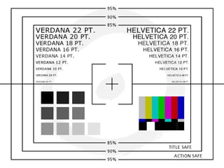
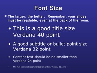
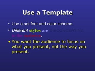
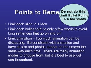
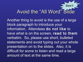
- Using readable fonts, consistent layouts, and limiting text to enhance readability.
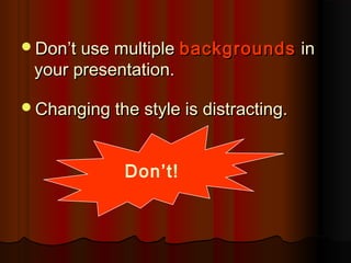
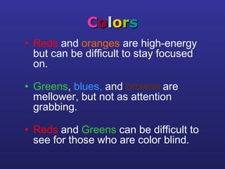
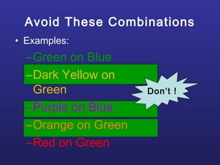
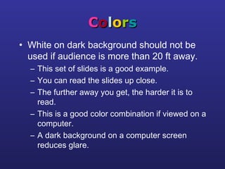
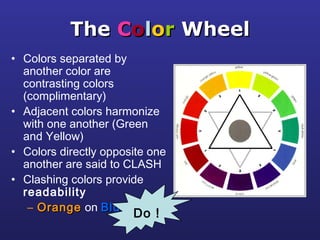
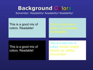
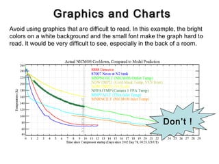
- Employing high-contrast color combinations and avoiding distracting backgrounds.
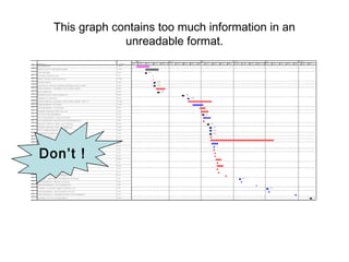
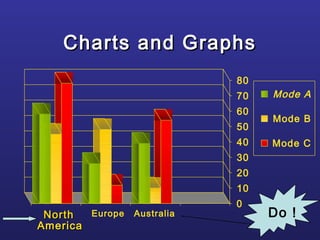
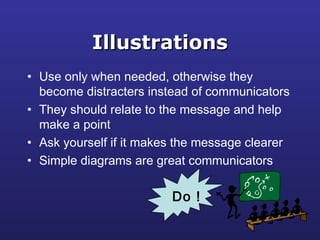
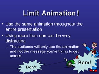
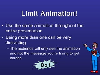
- Incorporating well-designed graphs, tables and illustrations to reinforce key points.
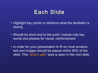
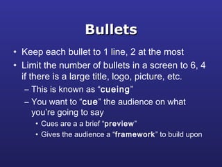
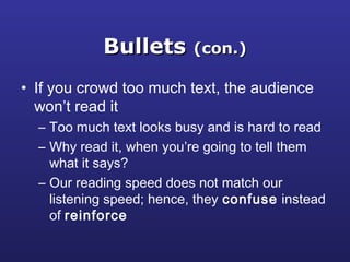
- Limiting each slide to one main idea with concise bullet points to guide the audience.