1. Hollie Hubbard Task three
Front cover
Typography- The mode of address for the
rolling stones magazine is organised and set
out more set up properly his makes it more
appealing to an older target audience. They
also use white and red for the text this makes
it more appealing to different genres as it
connotes different things to different genres.
Also this is conventional for this music
magazine and it doesn’t specify on one genre
it has a wide range of genres linked into it.
Layout- The layout for the magazine uses
route of the eye, this makes it more ordered
and organised this makes it more appealing
and eye catching to the older target audience
as it isn’t all messy or just put in random
places like most music magazines which are
targeted to younger teenagers and children
for example the top of the pops music
magazine.
Colour- The colours used for the front cover
are plainer but affective this is conventional for this type of music magazine as it has to be able to
appeal to a large range of target audience. As it is targeted to a wide range of music genre s. It also
fits in with the magazines mode of address because it uses similar colours in each issue.
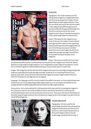
Images- The image fits into the identity of the magazine because it is quite edgy and appealing to the
audience especially the female teenager and older audience as it is revealing of one of a very
popular male artist. It also fits to the identity of the magazine as most images used for the front
cover of rolling stones are edgy and use sex appeal.
Language- The language used fits into the mode of the address because it is more sophisticated and
intellectual so it is more appealing to older target audience as its not simple and childish so less
younger people would be appealed to the text whereas elder target audience
Conventions - this is conventional for a rolling stones front cover and for a mixed genre magazine
this is because it has its own mode of address and its own brand identity this is shown by the
masthead being the same on every front cover of every issue. They also used colours that attracts to
the wide range of target audience that rolling stones magazine has as they target to people who like
lots of different genres.
Double page spread
Typography- the font used for the
double page spread for the rolling stones
magazine used mainly serif fonts as it is
based on a well-known female artist so
there main target audience for the
double page spread will be females. It
2. Hollie Hubbard Task three
also fits into the magazine identity because it is using very similar fonts as it does for its front cover
and other double page spreads. This also keeps it linked into the rest of the magazine.
Layout- The layout of the double page spread follows the route of the eye, so it is more appealing to
the target audience. It also fits into the identity of the magazine as it is usually well organised and
laid out professionally instead of being messy and put in random places so this continues with their
mode of address.
Colour- they colours used for this particular double page spread are black and white, this gives it a
more edgy feeling to the article, it also fits into the fact that it is a multi -genre magazine, so it has a
wide range of audience so it needs to be able to appeal to many more people than it would if it was
a specific genre targeted magazine.
Image- the image used in this article fits in well with the magazine because it focuses on the specific
artist and not what is around them, at it is a more older and sophisticated magazine. It also uses
basic make up and big hair to make the artist look edgy but still exciting and interesting, which also
fits in with the magazine as that’s also the image the magazine wants to give off.
Language- The language used in the spread is quite formal but inspirational toward the artist and her
music, it also uses a more sophisticated language as it is targeted at an older target audience. The
magazine also has a unique sophisticated identity so intellectual language fits in with the identity of
the magazine.
Conventions- The magazine is conventional because it uses all the techniques that fit in with the
identity of the brand and that it is a mixed genre music video for example it uses colours that don’t
connote anything specific apart from sophistication or darkness as it is mainly dark colours. It also
uses route of the eye and it well laid out and structured which also fits into the identity as it is
targeted to a more middle to higher social group also and older target audience.
Contents page
Typography- The fonts used for the contents page are both san serif
and serif. Serif fonts have been used mainly for the main headlines and
san serif fonts have been made for the less important and interesting
information. This makes the more important and eye catching news
and information stand out more to the target audience as it is also in
bold red which makes it more vibrant and stand out than the less
interesting news which is smaller and in plain black text. It also
includes the issue number this is also in every issue on the contents
page, this is its brand identity and mode of address this also looks
authentic and original as most magazines have their issue number in
small text on the inside cover or in a corner.
Layout- the layout for the contents page is quite organised and uses route of the eye. This also links
into the double page spread and front cover which also use the same technique. As in every issue of
the rolling stone, the layout is always need and tidy, it’s not busy and messy so even the contents
page fits into the identity of the magazine and stays in form of the mode of address.
Colour- As seen in this contents page the colours used are all neutral and plain colours; red, black
and white. This also links into their identity as they always use red for their masthead colour and a
black and white outline. It also fits into their target audience as it isn’t targeted at a specific genre.
3. Hollie Hubbard Task three
Image- The image used in the contents page is very retro and old fashioned this fits into the target
audience and identity of the magazine as it targets different genres so it has targeted a specific
genre for the contents page where they may be a little bit about the genre in the magazine, also
because it links into the theme of that issue which is “women who rock 2012” this shows that this
specific issue is targeted to mainly females or males who prefer female artists, it also links into the
identity of the magazine because it shows originality.
Language-the language used in the contents page is quite basic but to the point and effective this is
because it doesn’t want to give you too much information before you go to read all the magazine
however it is still more intellectual language which is still appealing to the older target audience.
Conventions- this is conventional for the magazine because it uses all the same layout, colours and
language which set the mode of address and identity for the magazine.