
Recommended
More Related Content
What's hot
What's hot (15)
Similar to Music magazine evaluation
Recently uploaded
Recently uploaded (20)
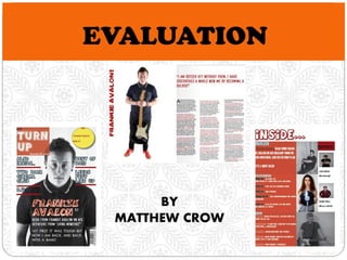
Music magazine evaluation
- 2. In what ways does your media product use, develop or challenge forms and conventions of real media products? RESEARCH The band clearly stand out and are in the centre of the page. Short and snappy logo, not taking up much of the page. 'Take one last trip with the band of the year', this is a very clever technique as it will appeal to the target audience that by reading this magazine they will be going on a journey with the band. The colour scheme used on this magazine cover is very relevant and useful. The shades of blue for the background are not too dark and not too bright. Also, the effect in which the background is a spiral creates a slight illusion when glancing at the magazine. This is a clever technique as it links to the lifestyle of a rock-star, in which they are often under the influence and dazed. The background colour allows the images and all other text to stand out on top of it, and also draws focus even more to the image as it is in the centre of the spiral effect. The title of this magazine is a rhetorical question, this is an example of a magazine code. This rhetorical question again will make fans of the band want to read on, especially if they believe their Arctic Monkeys addiction is 'out of control'. NOTES Short snappy logo. Band in centre of page. Colours not too bright and tacky, spiral effect. Rhetorical question in title.
- 3. In what ways does your media product use, develop or challenge forms and conventions of real media products? RESEACRH The title’s of stories are mainly one word, so that it is easy to read and catches the readers attention quickly. They are in capital letters, which make them stand out and the colours of them are black and white, which contrast each other well, again making them stand out. The content shown for this magazine includes mainly news on fresh new music. NME are known for uncovering new music so most of their magazines content is about new music. On my music magazine I will also give the impression that my stories are based on new and recent news. The subscription of NME is also advertised on this contents page, this may help persuade the reader to buy every issue instead of just one. On my music magazine I will also look to add my magazine title to the contents page to make it look more professional. The subscription of NME is also advertised on this contents page, this may help persuade the reader to buy every issue instead of just one. On my music magazine I will also look to add my magazine title to the contents page to make it look more professional. NOTES New Music Short Titles Subscription Blocky Effect
- 4. In what ways does your media product use, develop or challenge forms and conventions of real media products? RESEARCH As you can see on this double page spread it has one side full of text and the other side is just one dominant image of a band. Consistent colour scheme of red. Quote from the article, making readers want to read more. 3 columns of text. Drop capital at start of article Introduction to the article. NOTES Drop Capital Title overlaps centre fold, image and article don’t. 3 columns. Quotes. Colour scheme.
- 5. FRONT COVER SIMILARITIES: Small logo in the top left. Main character is one single person. Text overlaps the main character. Consistent colour scheme of red ties it together. Competition/Freebie mentioned in the top right. Several other artists mentioned down the sides. Different font styles and colours used. Differences: Props used on NME front cover I used lines to separate the acts down the sides. I made my competition advertisement a different colour to help it stand out more. My image is black and white whereas NME’s is full colour.
- 6. Contents Page SIMILARITES Title at the top of the page. Both tied together by a red colour scheme. Blocky effect, pictures on one side, text on the other. Separate headings for items on each page e.g. featured. Page numbers a different colour to the text explaining what's on the page. Both main artists are at the top of the page as they are the main story of this weeks magazine. Differences I have used background colour for my text. I have used more pictures than the actual magazine. I added the editors of the magazine on this page whereas the actual magazine hasn’t. The actual magazine included the logo whereas mine does not. I have made two of my photos black and white whereas all the actual magazines photos are in full colour.
- 7. Double Page Spread SIMILARITES No overlapping of the centre fold, the image is on one half and the article is on the other half. Both have quotes from the article in a larger different text before the article starts, making people want to read on and catching the readers eye. The photos are both on white backgrounds. DIFFERENCES I use my drop capital at the start of the article whereas the other magazine uses it half way through. The other magazine uses a close up image whereas mine is a long shot, as I used a prop and had to fit it in. I have added the artists name on the side next to the image. The actual magazine uses four columns of text whereas mine uses three.
- 8. How does your media product represent particular social groups? AGE – I have represented teenagers as being the age group who enjoy the indie genre. I have shown this through the clothing and props used in my images. Indie is usually enjoyed by mid-teenagers and older, usually people up to the age of 30 enjoy the indie genre.
- 9. How does your media product represent particular social groups? GENDER – I have represented men and boys as being the main type of people who enjoy indie music. The male gender are often the gender who are more in to the rock and roll lifestyle, and enjoy that type of music. Girls are stereotypically known to be more in to the dance/pop style of music.
- 10. What kind of media institution would distribute your media product and why? DISTRIBUTER – Bauer Media Group would be a possible distributer for my music magazine. Bauer Media Group are responsible for the distribution of Q magazine, which is an indie music magazine like my own. The Q music brand has expanded to Radio and Television, with Q Radio and Q TV being music entertainment that specialises in indie, rock and alternative.
- 11. What kind of media institution would distribute your media product and why? ADVERTISEMENT – I would advertise my music magazine through the use of the internet, social media is one good aspect of the internet which can be used to advertise and promote. Television could also be used to advertise my music magazine on the music channels.
- 12. Who would be the audience for your music magazine? Ross Wall Age: 17 Gender: Male Lucy Sherburn Age: 17 Gender: Female Bill Edgar Age: 16 Gender: Male
- 13. How did you address our target audience? I attracted my target audience through a questionnaire. I did this questionnaire to find out which aspects would be good and popular to use on my music magazine. The following are some of the most important results I gathered to use on my magazine. What features would you most like to see in a music magazine? Interviews – 31%. How much would you pay for a music magazine? £2.00 - £3.00 – 57%.
- 14. How did you address our target audience? I also addressed my target audience by gathering feedback from them. The link below takes you directly to a video which is evidence of my brother giving me feedback on my magazine. https://www.youtube.com/watch?v =wQqVVXyckg4
- 15. How did you address our target audience? CHANGES – As you can see I have taken into account my feedback and made the changes I see necessary, I believe there is a vast difference between my first and final cuts.
- 16. How did you address our target audience? Language - In my article from my double page spread the language is very powerful and up front. Also lots of swearing is used, this is all typical of the rock and roll lifestyle. Images – The aim was to make my images as serious and straight faces as possible. This helped to stick to the indie genre, and allowed me to match my style model.
- 17. How did you address our target audience? Overall, I was looking to create a serious and content atmosphere for my music magazine. I had to find the balance between smiling and happiness, which is associated with the pop/dance genre, and shouting/aggressive faces which is linked to the scream/heavy metal genre. I think I achieved this balance.
- 18. What have you learnt about technologies from the process of constructing this product? The camera I used to take my photos was a Canon EOS 1100D. The main things I was concentrating on when taking my photos were: the shutter speed and the flash. I used the manual setting on the camera so that I could change settings such as the aperture. I used the shutter speed when taking photos to determine how light to make my photo. Zoom Focus
- 19. What have you learnt about technologies from the process of constructing this product? The rule of thirds and different camera shots/angles. High angle shot Long shot
- 20. What have you learnt about technologies from the process of constructing this product? Crop Magic wand tool Magnetic lasso tool Filters Eraser Creating a mask Red eye tool Clone stamp tool
- 21. What have you learnt about technologies from the process of constructing this product?
- 22. What have you learnt about technologies from the process of constructing this product? In-Design.
- 23. Looking back at your preliminary task, what do you feel you have learnt during the progression from it to the full product?
- 24. Looking back at your preliminary task, what do you feel you have learnt during the progression from it to the full product?