1. Evaluation
1)
(Show your style sheet and show the differences and similarities of your
magazine and another one.)
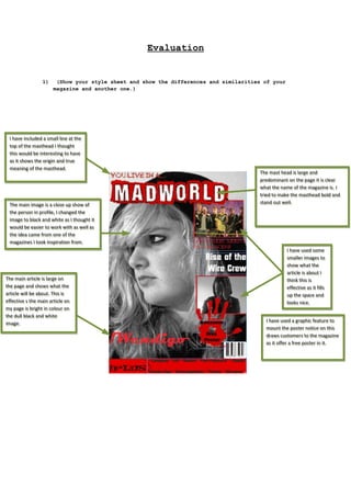
II have included a small line at the
have included a small line at the
top of the masthead II thought
top of the masthead thought
this would be interesting to have
this would be interesting to have
as it shows the origin and true
as it shows the origin and true
meaning of the masthead.
meaning of the masthead.
The main image is a close up show of
The main image is a close up show of
the person in profile, II changed the
the person in profile, changed the
image to black and white as II thought it
image to black and white as thought it
would be easier to work with as well as
would be easier to work with as well as
the idea came from one of the
the idea came from one of the
magazines II took inspiration from.
magazines took inspiration from.
The main article is large on
The main article is large on
the page and shows what the
the page and shows what the
article will be about. This is
article will be about. This is
effective s the main article on
effective s the main article on
my page is bright in colour on
my page is bright in colour on
the dull black and white
the dull black and white
image.
image.
The mast head is large and
The mast head is large and
predominant on the page it is clear
predominant on the page it is clear
what the name of the magazine is. II
what the name of the magazine is.
tried to make the masthead bold and
tried to make the masthead bold and
stand out well.
stand out well.
II have used some
have used some
smaller images to
smaller images to
show what the
show what the
article is about II
article is about
think this is
think this is
effective as it fills
effective as it fills
up the space and
up the space and
looks nice.
looks nice.
II have used a graphic feature to
have used a graphic feature to
mount the poster notice on this
mount the poster notice on this
draws customers to the magazine
draws customers to the magazine
as it offer a free poster in it.
as it offer a free poster in it.
2. There is a header bar; my magazine
There is a header bar; my magazine
does not have a header bar as II
does not have a header bar as
thought it was not necessary.
thought it was not necessary.
The masthead is large
The masthead is large
and predominant and
and predominant and
takes the top of the
takes the top of the
page the same as my
page the same as my
magazine.
magazine.
The main image is a direct
The main image is a direct
mode of address unlike my
mode of address unlike my
magazine which is a profile
magazine which is a profile
shot; however both have a
shot; however both have a
close up shot as the main
close up shot as the main
image.
image.
The main article is large
The main article is large
and predominant on the
and predominant on the
page the same as mine
page the same as mine
this one is however not a
this one is however not a
bright colour but it
bright colour but it
stands out none the less.
stands out none the less.
There is a “quote on this magazine as
There is a “quote on this magazine as
well the same as mine. It shows like
well the same as mine. It shows like
a saying of the week much like my
a saying of the week much like my
magazine.
magazine.
This magazine also
This magazine also
includes a free poster in it
includes a free poster in it
the same as mine.
the same as mine.
This magazine also has smaller
This magazine also has smaller
images to highlight the articles
images to highlight the articles
that are in the magazine. This
that are in the magazine. This
magazine has a right third the
magazine has a right third the
same as my magazine.
same as my magazine.
This magazine also has a
This magazine also has a
section showing what else the
section showing what else the
magazine includes.
magazine includes.
In general both magazines are quite similar although there is a definite difference
in style and colour the layout is quite similar on both. That can be expected as
the Kerrang magazine was used as inspiration.