HARNESSING AI FOR ENHANCED MEDIA ANALYSIS A CASE STUDY ON CHATGPT AT DRONE EM...
Contence Page Analysis
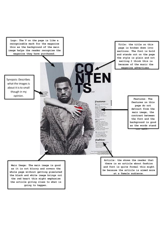
1. Logo: The V on the page is like a
recognisable mark for the magazine
this as the background of the main
image helps the reader recognise the
magazine they have purchased.
Title: the title on this
page is broken down into
sections. The font is bold
and stands out on the page
the style is plain and not
exiting I think this is
because of the music the
magazine advertises.
Synopsis: Describes
what the images is
about it is to small
though in my
opinion.
Features: The
features on this
page do not
detract from the
main image, the
contrast between
the font and the
background is good
as the words stand
out well.
Main Image: The main image is good
as it is not blurry and covers the
whole page without getting pixelated
the black and white image brings out
the red heart this might emphasise
the article giving clues to what is
going to happen.
Article: the shows the reader that
there is an article about fashion
and font is quite formal this might
be because the article is aimed more
at a female audience.
2. Masthead: the masthead is good as the
bright red banner stands out well. The
Q stands out well the reason for this
might be that the Q is like a logo for
the magazine.
Issue Number: This sows the
reader how many issues have
been published.
Main Image:
The main image
is good as it
stands out on
the white
background.
Features: This
shows the reader
what articles
are available.
And in this case
they are
separated by red
lines this is
effectives as
the bright
colours bring
the readers eye
to the column.
Graphic Feature: These smaller
images are effective as they give
the reader snippets of information
which might entice them to purchase
the magazine. Also the more visual
advertising of articles is better.
3. Pull Out Quote: The pull out quote on the page gets
the reader interested in the main article it also
.
emphasises the main article. Getting readers to
want to read that particular article and purchase
the magazine.
Features: This
shows the readers
the articles
available in the
magazine. These are
good as the font
stands out well and
is placing of it
draws the reader
eye to the
features.
Article: this article also stands out as
it has a coloured in text box. The box is
not straight however this this is
effective as the magazine advertises punk
rock which is wild the text box not
straight shows this.
Main Image: The main
image is good quality
and is good in the
sense it takes up the
page well and looks
appealing to the
public.
Main Article: The
main article has the
bright text box which
is effective on this
page as there are not
a lot of colours on
this page