How my media product challenges magazine conventions
1. 1. In what ways does your media product use, develop, challenge forms and conventions of real media texts?
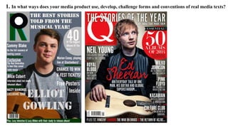
2. When creating my front cover, I have challenged and developed the forms and
conventions of a real front cover design. Through my research, I have been looking and
analysing “Q” magazine to help stimulate ideas for my own magazine. I like the colour
scheme because it reflects the theme and genre of indie, I kept it simple because I want
the audience to focus more in on the contextual aspects as oppose to design. I copied
the consistency of colour from existing material because it looks more professional , the
consistency of colour allows the audience to engage and have a deeper connection with
the magazine as it flows better. I had chosen to copy a “Q” magazine in particular due
to my masthead being one letter “R” meaning “Retro.” Q magazine helped me with the
positioning of my masthead. With regards to my masthead and “Q” as the masthead, I
decided to change the codes and conventions ever so slightly, what I did was used
different colours to make the “R” and I also made it look 3D to make it my own, this
developed and challenged the real codes and conventions of a real magazine as usually
mastheads are simple and 2D. In order to make my magazine have the same codes and
conventions of a current magazine, I made sure I included everything that this Q
magazine had on it. I did alter and change some parts of it to make it my own as you can
see, there is more text on the left as oppose to the right, however I tried to follow the
basic structure of the magazine. I took inspiration from Ed Sheeran's photograph and
created that in a similar way with my model, I also made sure that some of the text
would overlap the model slightly similar to what Q magazine does. I placed a barcode
on my magazine as that fits any magazine codes and conventions. I created my own
shadow behind the model because Ed has a slight shadow behind him similarly I
wanted to re-create it on my own. The layout of my magazine is structured similar to an
existing product, as you can see, I've tried to follow a similar structure to the following
magazine with Ed on. In order to get the right style of language suitable for my cover, I
did a bot of research about what people like to read about and what the language is like.
I created some short, but interesting sublines to want the reader to be intrigued about
what inside. I used a variety of shapes to help split up text and make some things stand
out amongst other parts. I followed the structure of the “Q” magazine with the large
circle on the right with text overlapping, I also used small green rectangles to split the
right and left hand thirds up, this is a convention found on the majority of magazines.
With regards to costume and prop for the cover, I wanted the model to wear something
suitable that will represent the genre of Indie. I did experiment with different outfits but
this jumper was most suitable for what I wanted. The guitar helps the audience know
that he is not just a singer but a musician, it also fits in nicely with the Indie theme. The
fonts I played around with to begin with, but I think I found suitable fonts with relate
the genre but also look quite similar to the current “Q” magazine especially on the left
and right hand thirds. With regards to the name of the model “Elliot Gowling” and “The
Best stories told..” I wanted to find a chunky, loose font making it look more
interesting.
3. 1. In what ways does your media product use, develop, challenge forms and conventions of real media texts?
4. When creating my contents page, I researched various current magazine designs again
to help inspire me to design my own in a similar way and stimulate ideas. I was
influenced by “Q” magazine, as I thought the layout looked very professional so I
decided to try and re-create the conventions of this magazine and challenge them
slightly. Similarly to the front cover I have developer and challenged forms and
conventions of existing material. I followed closely the codes and conventions of
images and layout as a whole, by using a variety of different images across the page it
allows the audience to have a better understanding of the content of the magazine. I
took a variety of different image types because typically that what a current magazine
would consist of to make it interesting. I have used mainly long shots and mid shots.
The location of my images in a way follow similar style to the current magazine as
you can see, one is outside, another one is at a concert and finally one is of a musician
playing their guitar. The main artist “Elliot” hasn’t got a background because I wanted
to place the text around him. Overall, the colour scheme are similar to the front cover
this is to keep the house style consistent throughout. Challenging the codes and
conventions which regards to the positioning of the masthead, I decided to keep it in
the left hand corner. I also challenged the main artist by placing text around their
body as oppose to having just a larger image focusing in on them. The numbers on the
page are positioned exactly the same as the “Q” magazine, the only challenge I did
was placed number “37” to the right and over the picture, also I decided from that I
would also place the smaller numbers in the features column to the right in order to
make I flow better for the audience. The house style of this contents page is consistent
from the Cover because I’ve used the same colour scheme. The masthead is there on
each page, the font is the same from the cover, also there is a date in the right hand
corner, the model is the same as on the front. The house style makes a magazine look
professional, every magazine on the market today has house style to provide a specific
look and layout to that magazine.
5. 1. In what ways does your media product use, develop, challenge forms and conventions of real media texts?
6. When creating my Double Page Spread, I again challenged and followed the codes and conventions
of existing current material. I decided to use the current Double page spread as a base for my own. I
kept the same layout however, moved certain things around to fit the positioning of the model. I used
some of the same conventions from the existing magazine so that I could apply it to my own.
As you can see with regards to my design in comparison to the existing copy, I altered my own ever
so slightly to make it my own and unique. With regards to the colour scheme, I used the main colours
that are in my masthead and adjusted the page to fit around the colours of the masthead to emphasis
the consistency and flow of the magazine. Alongside the consistency and house style of the
magazine. The photograph chosen for the background was an original image I took in Camden
market in London, I wanted to get the city of London but not through as such an obvious
representation like the current magazine DPS featuring Ed Sheeran. The photo is quite ambiguous in
a way which may help the audience as it may interest them into what the article is about. I used a
quote in a white box to emphasise the quote. With the positioning of the model I challenged this
from a current magazine as the shot I took was mid shot. Purposely I wanted to capture the model
laughing slightly or smiling, this in fact challenges the majority of existing material because usually
they are not smiling and look rather serious. The masthead has been placed to each corner of the
pages similar to what existing magazines do. I've kept the same model throughout my magazine to
show the link between the three pages. With regards to the text I've kept it very similar to the existing
copy and used columns to address the article, that way it keeps is neat and tidy and looks structurally
effective.
7. Identifying the audience:
Focus Group- questioning people’s preferences
Questionnaire sent to a variety of people from
different age groups and results analyzed which
came to the conclusion that Indie was the most
popular chosen genre.