
Recommended
More Related Content
What's hot
What's hot (19)
Viewers also liked
Similar to Kerrang magazine analysis
Similar to Kerrang magazine analysis (20)
Recently uploaded
Recently uploaded (20)
Kerrang magazine analysis
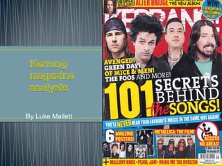
- 2. Target audience, counter cultural ideology one of the people on the front cover has tattoos. which can be symbolic of rebellion or punk backgrounds mainly male target audience, no female photo’s All colours are primary and simplistic because there's only red, white, yellow and occasionally blue To make special features stand out like the sell line and “win!” graphic. The phrases used create suspense as to the Main sell line grabs outcome because its talking about challenging the status quo for listening to music Sell lines Foote r Logo masthead Onomatopoeic guitar string sound Posed shot, Cheesy grin not particularly menacing • Enigma hermeneutic code Cover lines light pun used to dampen the seriousness of the topic so the audience don’t have to think to hard and tune out. Use of rock hand wheel chair Graphic further strengthens my argument that theyre trying to make it as entertaining as
- 3. House style • • • All members of different bands in posing shots cropped from different pictures and merged so they seem collaborated, by their genre of music which funnily enough Kerrang sell. The fact that the bands are from different sub genres of rock show that kerrang has a very large distributed target audience. • House style is already well established so title of magazine doesn’t need to be fully presented • Slot line used for advertisement creates a sense of competition and The fact that they have a world exclusive knowledge of Allier bridge shows that Kerrang have a lot of leverage in their field • The rare use of blue makes the sell line stand out on the page. • Another continuous feature of the magazine is that at the bottom they tend to include what will be covered in the magazine • Also the barcode is in a unusual place compared to most magazines so it could be conceived as wanting to be unconventional or going against the status quo, similar to that of the rock
- 4. • • Its thought by some that Band posters appeal to girls more than boys, so the fact that they offer posters mean they are trying to grab a female and • • position of the bar code had been placed on the bottom right which is the opposite way of a normal bar code that might be placed (bottom left) which proves that Kerrang is trying to be unconventional Audience expanded massively using key words like free or win, as it instantly involves the person who has read that magazine front even if they do not enjoy that particular style of music. House style is already well established so title of magazine doesn’t need to be fully presented Pictures showing other bands available, increasing target audience
- 5. • The way it was presen