Low Rate Call Girls in Laxmi Nagar Delhi Call 9990771857
Mood board
1. Cover
Inspiration
lack of direct gaze from the characters to the camera. Although directly
looking at each other, I believe the effect created when the character in the
main image of a magazine is looking directly into the camera is very effective
as it grabs the readers attention and makes the cover much more captivating
and I wish to use this technique in my own product.
Very conventional and classic layout
and design of a magazine cover.
Masthead is clearly recognisable and a
well know entertainment magazine
brand. Celebrity endorsement by
using the singer, turned actress lady
gag and her co-star Bradley Cooper. I
like how the main story of this
magazine is a hybrid of two genres of
entertainment – film and music. By
discussing the film ‘A Star Is Born’ the
entertainment magazine can include
content on both the film its self and
its respective soundtrack. One thing I
don’t like about this magazine is the
Both of these magazine covers explore
unique ways to display headlines. Both
‘scout’ and ‘Wonderland’ have moved
away from the conventional style of
placing headlines is a list-style down one
side of there page. Instead, the main
headline is placed directly on top of the
image, taking over most of the page.
One negative about not
following conventions and
stereotypes of magazine
covers is that often it is
unclear what the content
or genre of the magazine
is. This will make it less
likely to sell as readers are
unsure if it suits their
interests or style. When
I'm creating my magazine
I will have to ensure that
whilst avoiding the classic
conventions of magazines,
I will also keep it clear as
to my entertainment
genre chosen for the brief.
On this “10th birthday issue” of Wonderland magazine, the main
headline is placed at a diagonal slant stretching through the main
image. The word creates a connotation to be an extension of the
character as they extend from either side of the figure, this is
secured within the consumers mind if they subconsciously
recognise the individual Emma Roberts. a well known American
actress especially relevant amongst my lower age demographic
of 16-25 year olds who were likely to grow up watching films she
starred in such as “Wild child” and “We’re The Millers”.
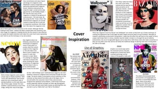
These two magazine covers by ‘Bazaar’ and ‘Wallpaper’ are similar as they both use a similar technique of
creating the appearance part of the page has been ripped and stuck down on top of another. Although all
created in photoshop as post photo manipulation I really love the effect this will have on the reader as there
unique style draws them in curious. Another way the reader is drawn in is through the use of celebrity
endorsement, the use of recognisable figures such as Katy Perry. Both these covers also reject convention as
they use very little cover lines and do not follow the traditional design of placing cover lines running down
the sides of the page.
One thing I really love about
this cover is the colour
scheme and the way the red,
black and white are all
significant themes. I think its
also effective how the
producers of this magazine
have chosen to place green
paint around the characters
eyes, this unusual style
certainly wouldn’t be
considered conventional
make-up and lives up to the
magazines conative title of
being as little different,
strange and bazar.
INSIDE
OUTSIDE
ALL OVER
Graphics are mainly kept within
the characters person, the grey
background is mostly bare which
contrasts and brings out the
colours of the graphics really well.
The added photoshopped detail
of annotation and typography on
this cover is surrounding the main
figure. Most of the white
background is filled with some
sort of graphic which gives the
cover a busy and exciting look.
The cartoon style
eye graphics are
placed out on
this cover both
as a combination
of inside and
outside the main
characters figure.
I do quite like
this cover in that
it is unique and
quite
unconventional,
however I think
the graphics are
excessive and
make the cover
look too chaotic.
Use of Graphics;