
Recommended
More Related Content
What's hot
What's hot (20)
Viewers also liked
Similar to Modern design conveys documentary on selfies
Similar to Modern design conveys documentary on selfies (20)
Recently uploaded
Recently uploaded (20)
Modern design conveys documentary on selfies
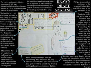
- 1. The columns that are used are very traditional and similar to most magazines, it is a staple convention so there was no need to challenge this These are original images from our documentary. This is a feature that only appeared on some of the radio times double page spreads but they looked very effective and helped us anchor meaning to the text. The drop cap is another classic feature of magazines, we used a font in a final product that looks different to the rest and it makes it stand out more. The page numbers are another original feature that has to be included, it makes the magazine look professional and we stuck with the radio times style and included the headline at the bottom of the page. This in the model that will be used in the double page spread, it is an original image of our presenter in our documentary. We paid very close attention to the clothes that were being worn and matched the colour scheme to what Joe was wearing. We also used props such as the Iphone to anchor the topic of the documentary in order to make it relevant. Pull quotes are another vital feature as the reader will often skim read this in order to get a synopsis of the article.The headline is a vital convention we chose is very fitting as it allows us to reinforce the fact that we had a presenter, which is an aspect that made our documentary more unique as well as linking to our topic. The pug is another aspect that we are unsure of, it is a very conventional element but it is more relevant to a front cover and it does not look as professional. The stand first is a classic convention that is important as it will catch the readers eye and ensure that they will read on. It allows us to address our documentary and the fact we have a presenter.
- 2. DRAWN DRAFT TWO We chose not to use this second design as we felt that it was not a sleek looking as the first. The second design allowed us more room to place still shots from the documentary, so we could link it more effectively. The first design looked more aesthetically appealing and had more eye catching content. It looked professional whilst still having an element of fun, which is what we wanted to convey as much as possible.
- 3. We made the title of our documentary #SELFIE appear frequently in our article. This is appealing as it a consistent reference to social networking sites such as twitter and facebook which is a vital element in terms of appeal as it is something our audience use frequently. We also used a colour scheme that was more modern in comparison to the colour schemes used in Radio Times as they were a bit old fashioned. We will use bright blues and yellows to create a more upbeat colour scheme that will be more fitting to the topic at hand. We taking our original images we made sure that the photo of our presenter and the photos had a consistent prop. The prop we used was a phone as this anchored the meaning of out topic and shows that our young target audience are being addressed and that we have acknowledged the link between the audience and topic.
- 4. The main meaning we tried to convey in drawn drafts was that Selfies have become a popular and well known concept in todays society. Yet we wanted to make sure that this was more subtle. We wrote our article about our presenter Joe as the writer and coordinator of the documentary. This was vital as it anchors the fact that Joe is not only our presenter but a symbol of young people being bright, intelligent and creative whereas the thought of “selfies” often provokes negative connotations regarding young people. We also used a very modern and contemporary theme in a very traditional, long running and well respected magazine. It was important that we made the design look very professional and fitting in order to make sure that the documentary appeared as clear and engaging as possible to maintain the fact that we wish to represent young people in amore intelligent and thoughtful manner.
- 5. DID WE FULFIL THE CRITERIA OF THE TASK? • We completed two drawn drafts and assessed the positive and negative aspects of both and made a final choice based the meaning, creativity and target audience. • We considered not only our target audience but the magazine we were writing for, we thought that the design we chose was more appropriate for use in the Radio Times as it had a sleeker and more traditional style. • We made sure it was consistently relevant to the documentary, by establishing and enforcing our brand “#SELFIE”. This would make us more accessible on social networking sites and allow our target audience to associate the article with the documentary clearly. • We allowed our producer and presenter to be the main feature to convey an ideology of creative and enterprising youth in what is considered to be an unintelligent topic. • We followed the codes and conventions of a TV listings magazine and explained why these features add meaning to our product.