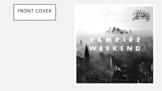
VAMPIRE WEEKEND CASE STUDY
Hannah Wicks
FRONT COVER
BACK COVER
Context
’Vampire weekend’ is an American rock band
from New York City, they were formed in 2006.
The band is composed of three members, They
found a shared love of rock and African music
whilst studying at Columbia college together
where they met. Their first album was released
in 2008, it was an immediate success in the U.K
and the US, charting at number 15 in the
Official U.K Music Chart. Four singles were
released form the album, including their well
know single ‘A-Punk’ that charted, it peaked an
number 25 on the American Billboard Rock
music chart and number 38 in the U.K charts.
The success of ‘A-Punk’ was obvious due to it
being used in the hit 2008 film ‘Step Brothers’
featuring Will Ferrel.
GENRE
• The genre of ‘Vampire Weekend’ music is a hybridity between ‘indie pop’ and ’indie rock’, they have
incorporations of world sounds such as African music into their earliest work. Their music follows the
usual codes and conventions of indie music, they are signed to a big music label therefore they do
not stem from the original meaning of indie music artists.
Black and white tones
indicate an old style of
music, ’Vampire Weekend’
stem from old rock and
African music and these
tones are reminiscent of
these old fashioned genres.
The artist’s name is much
larger than the albums name,
this is a genre convention of
CD Covers as it makes their
name stand out to the public
and more also makes it more
recognizable.
Border around the cover
connotes a certain quirky tone
and conveys that the genre of
music is quite an alterative sub
genre-’indie-rock’
Contrasting fonts, the album
name is an old style serif font
that is reminiscent of old style
tattoos and all things indie.
Whilst the artists name is in a
bold font that illustrates a
strong brand identity.
NARRATIVE
• The CD cover offers a sad narrative through the black and white tones
of the cover, how there is almost a ghostly manner conveyed through
the mist and smoke that is placed in the mid section of the CD cover.
The font sits in the center of this which illustrates the band are focus of
this gloomy tale. This sadness illustrated through the narrative of the
CD cover conveys the conventional themes of indie genre Cd covers,
from this I can read that they want to appeal to a wide variety of
audiences by not challenging such conventions. The focus on the
black and white tones illustrates how it is extremely likely that the
songs on the album will mostly have a miserable background to it
since the panels of the CD amplify this.
REPRESENTATION
• The band could be constructing a regressive representation of themselves with the
focus of this CD cover being so fixated on the past, as discussed before this is
highlighted through the gloominess of the cove which is illustrated to the audience
through the black and white tones along with the mist. An almost dystopian world
is being constructed through the Cd cover, as it looks like an alternative world of
which everything has gone wrong. This reinforces the theme of sadness through
the unrealistic world. They could be sending a subliminal message that things are
not as bad as they look as it looks like they have created a different world. This
representation could be considered to be representing the artists as stereotypical
musicians that are moody and heartbroken, thus a regressive representation of the
band themselves.
AUDIENCE
• Due to the themes of the CD cover, they could be targeting a wide variety of audiences,
this CD cover could be attractive to numerous demographic groups of people. For
example, it could establish a relationship to teens through the doom and gloominess of
this cover, as it is stereotypes that teens are moody and grumpy. However, through the
maturity of this cover and how it relates to older times, it could then relate to a wider age
range that perhaps also reminisce on older times that they could remember. Therefore
although the constructed audience maybe indie teens that can relate to such themes, the
real audience could be much wider than this young age range of 16-24. However, in saying
this, this cover does seem to output rather masculine tones so it could be more popular
with males than females.

Printed texts case study one

  • 1.
    VAMPIRE WEEKEND CASESTUDY Hannah Wicks
  • 2.
  • 3.
  • 4.
    Context ’Vampire weekend’ isan American rock band from New York City, they were formed in 2006. The band is composed of three members, They found a shared love of rock and African music whilst studying at Columbia college together where they met. Their first album was released in 2008, it was an immediate success in the U.K and the US, charting at number 15 in the Official U.K Music Chart. Four singles were released form the album, including their well know single ‘A-Punk’ that charted, it peaked an number 25 on the American Billboard Rock music chart and number 38 in the U.K charts. The success of ‘A-Punk’ was obvious due to it being used in the hit 2008 film ‘Step Brothers’ featuring Will Ferrel.
  • 5.
    GENRE • The genreof ‘Vampire Weekend’ music is a hybridity between ‘indie pop’ and ’indie rock’, they have incorporations of world sounds such as African music into their earliest work. Their music follows the usual codes and conventions of indie music, they are signed to a big music label therefore they do not stem from the original meaning of indie music artists. Black and white tones indicate an old style of music, ’Vampire Weekend’ stem from old rock and African music and these tones are reminiscent of these old fashioned genres. The artist’s name is much larger than the albums name, this is a genre convention of CD Covers as it makes their name stand out to the public and more also makes it more recognizable. Border around the cover connotes a certain quirky tone and conveys that the genre of music is quite an alterative sub genre-’indie-rock’ Contrasting fonts, the album name is an old style serif font that is reminiscent of old style tattoos and all things indie. Whilst the artists name is in a bold font that illustrates a strong brand identity.
  • 6.
    NARRATIVE • The CDcover offers a sad narrative through the black and white tones of the cover, how there is almost a ghostly manner conveyed through the mist and smoke that is placed in the mid section of the CD cover. The font sits in the center of this which illustrates the band are focus of this gloomy tale. This sadness illustrated through the narrative of the CD cover conveys the conventional themes of indie genre Cd covers, from this I can read that they want to appeal to a wide variety of audiences by not challenging such conventions. The focus on the black and white tones illustrates how it is extremely likely that the songs on the album will mostly have a miserable background to it since the panels of the CD amplify this.
  • 7.
    REPRESENTATION • The bandcould be constructing a regressive representation of themselves with the focus of this CD cover being so fixated on the past, as discussed before this is highlighted through the gloominess of the cove which is illustrated to the audience through the black and white tones along with the mist. An almost dystopian world is being constructed through the Cd cover, as it looks like an alternative world of which everything has gone wrong. This reinforces the theme of sadness through the unrealistic world. They could be sending a subliminal message that things are not as bad as they look as it looks like they have created a different world. This representation could be considered to be representing the artists as stereotypical musicians that are moody and heartbroken, thus a regressive representation of the band themselves.
  • 8.
    AUDIENCE • Due tothe themes of the CD cover, they could be targeting a wide variety of audiences, this CD cover could be attractive to numerous demographic groups of people. For example, it could establish a relationship to teens through the doom and gloominess of this cover, as it is stereotypes that teens are moody and grumpy. However, through the maturity of this cover and how it relates to older times, it could then relate to a wider age range that perhaps also reminisce on older times that they could remember. Therefore although the constructed audience maybe indie teens that can relate to such themes, the real audience could be much wider than this young age range of 16-24. However, in saying this, this cover does seem to output rather masculine tones so it could be more popular with males than females.