
Recommended
More Related Content
What's hot
What's hot (19)
Similar to Kanye West Vibe Content's page analysis
Similar to Kanye West Vibe Content's page analysis (20)
Recently uploaded
Recently uploaded (20)
Kanye West Vibe Content's page analysis
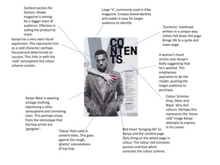
- 1. Kanye West is wearing vintage clothing, expressing a retro atmosphere and connoting class. This perhaps strays from the stereotype that hip hop artists are ‘gangster’. Large ‘V’, commonly used in Vibe magazine. Creates brand-identity and makes it easy for target audience to identify. ‘Contents’ masthead written in a unique way. Letters fall down the page. Brings life to a quite dull cover page. Colour Scheme- Grey, Silver and Black. Very dull colours. Perhaps this represents the ‘stone cold’ image Kanye attempts to express in his career. Kanye has a very stern facial expression. This represents him as a cold character, perhaps focused and determined on success. This links in with the ‘cold’ atmosphere the colour scheme creates. A woman’s hand arches over Kanye’s body suggesting that he’s wanted. This emphasises aspiration to be the model, pushing the target audience to purchase, Red heart ‘bringing life’ to Kanye and the content page. Only thing on the whole page in colour. The colour red connotes passion and love which contrasts the colour scheme. ‘Classy’ font used in content titles. This goes against the rough, ‘ghetto’ connotations of hip-hop. Content section for fashion. Shows magazine is aiming for a bigger mass of audience. Effective in selling the product to more.