1. Kiranjit Jandu
Music Magazine Evaluation
In what ways does your media product use, develop or challenge forms and
Conventions of real media products?
Front Cover
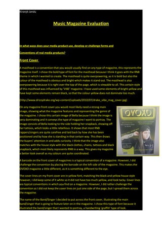
A masthead is a convention that you would usually find on any type of magazine, this represents the
magazine itself. I chose the bold type of font for the masthead because I think it goes with the RNB
theme in which I wanted to create. The masthead is quite overpowering, as it is bold but also the
colour of the masthead is obvious and bright which makes it stand out. The masthead is also
overpowering because it is right over the top of the page, which is viewable to all. This certain style
of this masthead was influenced by ‘VIBE’ magazine. I have used some elements of bright yellow and
have kept some elements remain black, so that the colour yellow does not dominate too much.
(http://www.drizzydrake.org/wp-content/uploads/2010/07/drake_vibe_mag_cover.jpg)
On any magazine front cover you would most likely need a strong main
image, showing what the magazine features and representing the genre of
the magazine. I chose this certain image of Bella because I think the image is
very dominating and it conveys the type of magazine I want to portray. The
image consists of Bella looking to the side holding her snapback, showing off
her tattoos, which looks a little rebellious. It shows that most RNB
rappers/singers are quite carefree and laid back by how she has been
positioned and by how she is standing in that certain way. This then draws
the buyers’ attention in and adds curiosity. I think that the image also
matches with the house style with the black clothes, chains, tattoos and black
snapback, which most likely represents RNB in a way. This gives my magazine
a better look overall as my colours are quite coordinated.
A barcode on the front cover of magazines is a typical convention of a magazine. However, I did
challenge the convention by placing the barcode on the left side of the magazine. This makes the
OVOXO magazine a little different, as it is something different to the eye.
The cover lines on my front cover are in yellow font, matching the black and yellow house style
however, I did keep some of it white so it did not have too much yellow, and look tacky. Cover lines
are typical conventions in which you find on a magazine. However, I did rather challenge the
convention as I did not keep the cover lines on just one side of the page, but I spread them across
the magazine.
The name of the Band/Singer I decided to put across the front cover, illustrating the main
band/singer that is going to feature later on in the magazine. I chose this type of font because it
illustrated the band/singer that I wanted to portray, a handwriting ‘graffiti’ type of look.
2. Kiranjit Jandu
The triple I have used ‘Good Girl Gone Bad’ is effective because it shows the reader that this girl is
rebellious. It also seems to be quite catchy. I decided to put this above her arm because when the
reader is looking at the triple, the reader will also see the tattoos, which would represent that
certain quote. I have used a PUG at the bottom of the page because it draws the reader in knowing
that there is information on drake tickets that they might want to purchase, therefore they can read
page 42 for further details. PUGS are typical conventions on a magazine front cover, with a purpose
of convincing the reader, to buy the magazine.
Double Page Spread
The title of my double page spread is a different title to my front cover; this is where I challenged the
convention, as it would be more appropriate to keep the same title as the front cover. The font is
also different which is challenging conventions once again because its better if it remains the same
font as the front cover so that it is easily recognised, however in a way it’s something unique.
The writing I chose to have the
headings/questions in bright yellow and then
the responses in white, in order to distinguish
who the interviewer is and who the interviewee
is. The questions of the interviewer are in
yellow and the answers are in white. This
differentiae’s the text and breaks up the text, so
the reader is not overpowered with big blocks
of writing. In this text, I have included a lot of
information about the band/singer, including
the songs that she has come out with, latest
news and merchandise. The introduction of the
singer is also included for readers to find out a little bit of background information before they carry
on reading and for readers that are tasking a first glimpse at the singer/band.
The main image I chose was of Bella and Layla; this represents who else is in the band. I wanted to
include one other person on the contents page to make it more interesting. However, in a way I
have challenged the conventions of a music magazine as I have
only used one main image instead of using maybe one or two
more.
Contents Page
For the title of the contents page, I just kept it basic and simple as
I just named It ‘contents page’ this is because I want people to be
3. Kiranjit Jandu
fully familiar that what they are reading is a contents page and this is basically what the whole
magazine features. Therefore, I didn’t really challenge the convention. However, I did challenge
some of the format of the text as I changed it up and made it look quite interesting by breaking up
the word. The size of the font is also quite big and bold as it’s in white and it goes well against the
black background, which makes it easier to read for people.
The date is also included underneath the title which is a convention in any type of magazine saying
what month the issue is being produced at.
The picture on my contents page is Bella doing the OVOXO sign so that people are reminded of the
magazine and what type of magazine they are reading. This particular image gives the magazine a
very unique look. Which shows I have been quite innovative towards the presentation of my picture
on the contents page. I removed the background of the image because I think it blends in the
background of the magazine as Bella is wearing black too, it automatically makes her a part of the
magazine more and it fits in with the whole idea of the theme I have created. I think that the picture
also matches the genre of the magazine I was going for.
The column on the left of the contents page consists of the main pages in the magazine. The colours
for the font I used are white because I didn’t want to over use the yellow, however I did use a yellow
border to highlight the features, as it has some importance. This part of the magazine features what
the magazine will include and what kind of upcoming stories are around. I feel like I had to keep the
white for the text so that the yellow didn’t look overpowering, as it could take the attention off the
actual content of the text, which is more important to the reader than the colour, in my opinion.
How does your media product represent particular
social groups?
Front cover
The social groups that are represented in my music
magazine are the readers which you would expect to
see purchasing an ‘up to date’ music magazine. Which
are most likely the younger generation of people.
My magazine would mainly be targeted at people of
the young generation like ages (16 – 20), teenagers
who are interested in R&B music. However, I think the music magazine will mostly target the male
gender but also female gender as I have challenged the convention by using Bella on the front of the
magazine because most R&B magazines use a powerful male figure. Also, the ethnicity doesn’t
matter; this magazine is aimed at anyone that is interested in this type of music. Any person from
any class can buy this magazine, they wouldn’t get judged.
The gender which I am portraying in my magazine is a group called ‘OVOXO’, this group is not
stereotypical in any way. The girl on the front cover is portrayed as strong and dominating. This is
shown by the picture on the front of the magazine:
With Bella holding her snapback and with the powerful look she is fiving shows that she is quite
rebellious. Bella is wearing clothes that normally a male figure would wear as that’s how it is
4. Kiranjit Jandu
stereotyped; however I have challenged that stereotype by using a female figure. This picture has
been influenced by drake on the front cover of VIBE magazine as drake is giving a very fierce looking
but he is also wearing quite ‘gangster’ looking clothes which makes him look tough, however I have
used a female figure – the female gender does not look passive.
What kind of media institution might distribute your media product and why?
The music magazine will need suitable publishing
companies to publish the magazine effectively. There
are various publishers that publish music magazine,
however choosing the right publication company is
vital to ensure that the magazine is distributed well
enough and that it reaches its target audience.
Therefore, I looked at a certain distributor called ‘Spin Media’.
Spin media is a publication company that owns a numbers of pop culture websites
including spin, buzz net, vibe and The Frisky etc. I feel like OVOXO could possibly fit
into the type of magazines that spin media normally publish. As the target audience
for the magazine is a younger target audience so this fits in with the Spin Media
image. The company has a lot of experience in the market and would give my
magazine a good advantage over other media products. As Spin Media is an established publishing
company it means they already have a strong brand image. It is very significant that the magazine
fits into the Spin Media image. My magazine is quite unique and is a new product which is targeting
upcoming musicians and young artists and is aimed at attracting young readers. Also, I think that
Spin media would be a good company to publish my magazine as it has already came out with the
magazine called ‘VIBE’ which is what my magazine was influenced by.
Therefore, I think that overall Spin media would be a better option to publish the OVOXO magazine;
this is because Spin media have a lot of experience in publishing magazines and are very successful
in publishing the magazines. Also, I think that if Spin media has all the experience then they will have
experience in publishing different genres of magazines, including the R&B genre.
Places OVOXO could be sold at;
• Music shops: (HMV)
• Newsagents: (Co Op, WHsmiths)
• Supermarkets: (Tesco,Asda, Sainsbury’s)
Who would be the audience for your media product?
5. Kiranjit Jandu
These magazines all have a target audience of people who are:
• Any gender
• Targeted towards the younger generation (teenagers/young adults)
• Interested in music
However, my magazines audience is a little different. It could possibly be targeted more towards
teenage girls as the front cover; contents page and double page spread are all girls. Besides the
images being girls, the girls are still dressed up in more of a manly way as the use of colours presents
that and the style of clothes and accessories.
How did you attract/address your audience?
I attracted my audience to my magazine through the use of colours and font. I kept the same colour
scheme throughout the magazine. I think that it was significant to keep the same colours consistent
through the magazine because it looked professional because if you don’t then the magazine will
look like each page belongs to a different magazine; therefore I used the same elements in parts of
the magazine.
I chose the main colours of black, yellow and white for my magazine. This is because the yellow
really stands out on the black. The presentation of the magazine looks readable; this attracts the
reader into buying the magazine.
I also attracted the audience to my magazine through the use of
exclusives. The example of drawing the reader into my magazine
was by the use of a PUG on my front cover. The sentence ‘Tickets
selling now’ stands out to the potential buyer, however what
stands out more is the word ‘Drake’ as Drake is a famous known
rapper people will pay more attention as that word is what any
consumer would like to see.
6. Kiranjit Jandu
I attracted my audience to the magazine through the use of pictures; all the pictures in my magazine
attract the audience because they all have a ‘rebellious ‘‘attitude’ ‘different’ look about them.
Everything about all the images would interest the audience, wanting to know about these new
upcoming artists. All of the pictures were edited on Photoshop, in order to make them look lighter as
some of the images were a little dark, therefore I wanted to make the image bright so that the image
was more viewable.
I also attracted the audience to my magazine
through the use of language. For instance on
my double page spread I used easy going
language, the Q&A is very chatty, making it
nice to read for all the readers. Also, having a
lot of useful information inside, which will
keep the reader interested.
I then attracted my audience to my magazine through the attitude. This is extremely important; it
attracts the audience straight away by their body language. For instance on my double page spread
the body language of the two girls is very laid back and relaxed, quite careless looking which is what
R&B represents in a way. I think that for the attitude of the magazine portrayed this needs to be
done on the front cover, because this is the page the potential customer will first look at for a music
magazine.
I attracted the audience to my magazine by the masthead. I chose the name OVOXO because ‘OVO’
is what drake uses as his label which means ‘Octobers very own’ which is founded by drake as his
birthday is in October. Drake normally collabs with ‘The Weeknd’ who is a singer and uses the label
‘XO’ ‘which is the slogan of his and this stands of ‘Ecstasy and oxycodone’, which in fact are drugs,
this then represents the genre as R&B normally is related to violence, sex and drugs.
The colour yellow was influenced by the ‘VIBE’ magazine which drake was issued i think the yellow
against the black background is very strong, bold and it really stands out.
This masthead matched my magazine because the letters look like graffiti and has a very ‘ghetto’
style to it; this reflects most R&B bands. This links in with the audience which will be mostly people
who are interested in R&B music and this masthead gives off the ‘R&B' look. With it being unique
and ghetto looking.
What have you learnt about technologies from the process of constructing this product?
Throughout this process these are the soft wares which I have used:
7. Kiranjit Jandu
I used Photoshop to cut out the green screen background in my image; I did this by using the magic
wand to eliminate any green areas so I could use my own colour in the background. I also changed
the brightness and adjusted that on Photoshop to make the image stand out more and make it
appear more realistic as if it was a real image going onto a real magazine.
I learnt how to copy and paste the image into Photoshop and erase all the background that I didn’t
want. Then I made the image a little small to fit into my magazine perfectly, once I had erased all the
background I placed it appropriately on the front of my magazine.
I didn’t use Microsoft for text; however I did use Microsoft for text for my double page spread as it
was much easier because I had a lot of text for it. Whereas, for my front cover I just used text from
Photoshop and inserted it in my magazine. Using the text box from Photoshop wasn’t as hard as I
thought.
Blogspot.com was very easy to understand and a very quick process. It was simple and quick to
upload work. When creating my three elements I worked in chronological order, I first produced the
front cover, then the contents page and then the double page spread as it made sense to me to do
so.
Looking back at your preliminary task, what do you feel you have learnt in the progression from it
to the full product?
From the preliminary task I feel like I have become a lot more familiarised with the codes and
conventions of a magazine, I have also more knowledge on the presentation of magazine and how
they should be presented. I have become more of a creative person by using all sorts of software
such as Photoshop, Microsoft, and blogspot.com. I know what to expect and not to expect in a
magazine. My knowledge in the distribution of magazines has grown e.g. (SPIN MEDIA) (VIBE).
How is it like existing similar products? How is it different and why?
The OVOXO magazine is similar to ‘VIBE’ magazine. This is because the ‘VIBE’ magazine I looked at
has the same type of look to it, as the colours are the same like the black and yellow. Also, the vibe
magazine focuses on more R&B magazines. However, the magazine is quite different to mine as I
have used Bella, whereas the’ VIBE’ magazine has used a powerful male figure like Drake, who
everyone knows as a popular rapper.
Explaining editorial decisions why you used/didn't use some images.
I used certain images on the front cover, contents page and double page spread. For instance on the
front cover I used a singular person on the front because I wanted the main upcoming star in front,
so it was clear that Bella is the main subject and that the magazine features Bella mostly. However,
8. Kiranjit Jandu
for the double page spread I used two people as it represents that they are a group and that there’s
not just one singer but there’s two. Also, I used two people on the double page spread because
there’s a lot of text and a lot of information; therefore I think it’s important to have more than one
image to showcase more about who the singer might collab with.
How has learning to use Photoshop been?
I did have some problems with Photoshop, I couldn’t manage to get some of the small sections of
the green screen background from my image, so therefore to prevent that I zoomed into my image
and used the eraser to eliminate it, so that my image looked right for the magazine. Also, another
thing is that I would use a certain photo but it wouldn’t fit right, as the image was too big, therefore I
tried to make the image smaller, but I think that as I did that the graphics of the image would be of
less quality and that was a concern because I wanted my images to be of high quality so that my
magazine looked proficient. Therefore, I used an image that didn’t have to be that altered. I would
say that using Photoshop has been a good experience, because as I made mistakes I also learnt on
the way of doing so.
How has your learning and understanding of media products come along since you made your
school magazine?
I think that I have become more experienced in creating a music magazine as I had to create more
complexed things such as a good heading, PUGS, loads of text and a barcode for the magazine. Also,
what was difficult was editing my images in Photoshop and erasing every green bit from the image,
to make it stand out and look professional. Whereas, in my school magazine I created it on
Microsoft word which was quite basic and dull looking, I feel like I didn’t put as much effort and it
looked quite tacky because the images were not even edited, so it made it look dull.