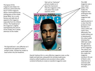
1. This VIBE magazine uses a clear colour pallet, I this makes the magazine very striking but also makes the magazine look more sophisticated as it is clear that the producers have decided on a colour pallet and used it very effectively. The model clothes are in keeping with this colour pallet showing that VIBE have really thought about the appearance of this magazine. The colours are quite bright and this makes the magazine standout, the use of black is also important as it contrasts with the bright pink and blue. Text such as “exclusive” attracts readers as it gives the impression that this magazine is the only place they could read this article. The layout of this magazine also helps it to stand out, particularly the top 3rd of the magazine which is dominated by the striking pose of the model Kanye West, he is a very famous and adds lots of appeal to the magazine especially from his millions of fans. The headmast of the magazine is slightly overlapped by the picture of the model, this is draws attention of the reader. The big bold text is very effective as it emphasises the appeal of what is written inside. It draws the reader to look further into the headlines. Overall I believe this is a very effective magazine cover, as the bright and bold text, along with the striking model pose, cleverly crafted headlines and consistent colour pallet, combine brilliantly to create an excellent magazine cover.
2. Esquire have used this model brilliantly, he has a very different appearance from most men used on magazine covers, I believe this makes the magazine unique and very inspirational towards other magazine creators. In a way his appearance contrasts with itself, as his hair and facial hair is scruffy which contrasts with his formal clothing. The Esquire magazine is very different to the VIBE one, but is equally effective. The simplicity of the magazine combined with the standout pose of the model create an amazingly simple but influential magazine. Esquire have clearly used a black and white colour scheme, which is consistent. Using these contrasting colour really makes the magazine attractive. Using black and white in my opinion makes the magazine seem more formal, a point which is emphasised by how smartly the model is dressed. Unlike VIBE, this edition of Esquire has very little information on what is inside, this works to its advantage as it adds an element of mystery as to what the magazine contains beyond the cover. The model, Joaquin Phoenix, is a very talented and popular actor, who played Johnny Cash in ‘Walk The Line’
3. This magazine, like VIBE is very colourful, however it does not seem to have a consistent colour palette. The font used is very artistic as it is in the style of a stencil, surrounded by a red box, the way in which the text is laid out is also very effective and gives the reader the impression that the magazine is unique and creative. The Photograph used on the cover of this magazine ties in with the creative impression given off by the colours and layout of the magazine. The photograph is off a very famous singer and designer Pharrel Williams, the picture has clearly been edited to give to impression that it has been sketched, fitting in with the art theme in the top left hand corner. Unlike esquire and VIBE, this paper magazine has position its model in a side on pose looking back at the camera, this is more interesting than the standard front on especially with the sketched effect as it gives the picture much more detail, for example his ring. All the text used on this magazine cover is placed inside a coloured box, this adds even more colour to the cover but also draws the readers attention to text.