
Recommended
More Related Content
What's hot
What's hot (20)
Similar to Front cover analysis of Mixmag
Similar to Front cover analysis of Mixmag (20)
More from Josh03
More from Josh03 (17)
Recently uploaded
Recently uploaded (20)
Front cover analysis of Mixmag
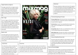
- 1. Target Audience andgenre The target audiencefor this magazine would 15-25 or people who would regularly attend festivals as area lotof advertisements for festivals and the genre of music wouldn’t appeal to adults.The genre of music would be dance and clubbingmusic (as itsays itatthe top). Main Image The main image is of DJ Heidi Van Den Amstel. She is usingdirectaddress and is wearinga leather jacketwhich could suggesta rebellious tone. Her physicality suggests sheis aboutto go work (metaphorically) as itlooks likesheis pullingon the jacket.The red lipstick contrast with the white and the black and fits with the house style. Model credit The model credit for thisarticle forms part of the title, the model credit mayrefer to Heidis music or could be tie inwiththe metaphor that clubs are like jungles. The red font again acquiesces withthe house style andcontrasts withthe white which it contrasts with. Lead Article The lead articleis of the artistHeidi,the font is in bold white letters that fit in with the artist’s hair.The font is straight and connotes with tidiness and sleek,it also exhibits themagazine as beingvery modern because of the colours ability to combine with a lot of colours. Colours/Typefaces/House style The house style of thus magazine is red and white. These two colours combineto create quite a modern and neat looking issuewhich will appeal to the target audiences tastes. The white especially produces a polished look and feel to the magazine Masthead Mixmags mastheadruns right acrossthe top ofthe magazine in a banner-like fashion. As the title hasthe biggest font size on screen it wouldbe the first thing the audience notices. This is supported bythe fact the ‘Mi’ of the title starts inthe primaryoptical area. The mastheadis insans serif. The colour of the mastheadalsofits inwiththe house style of the magazine. The GutenbergDesignPrinciple Primary Optical Area: The title starts here so by exhibitingthe startof the title here it notifies the audience immediately who has published this magazine. Terminal Area: A cover lineis placed here that introduces the other articles in themagazine to try and capture more customers Strong Fallow Area: The titleis also exhibited here and the aim is also to advertisewho publish the magazines Weak Fallow Area: The editor has used this position to place barcodeas this would be the lastplacethe customer would examine. Coverlines The coverlines showcased here advertisethe other articles and dj’s in the magazine as the audiencecan see the coverline“plus”,this is done to attractmore of a wider audience. The titles of the coverlines follow te house styleof the front cover with the titles in red and the information in white, this is doneto fit in with Heidi’s costume. Banners/Flashes/badges Mixmag contains a banner that runs vertically acrossthetop of the magazine which aims to self-promote the magazineas they coin themselves “the world’s biggest dance music and clubbingmagazine”. By doing this they aimto bringin more sales.