Comparing magazine covers of NME and Kerrang focusing on design principles
•Download as DOCX, PDF•
1 like•172 views


Recommended
More Related Content
What's hot
What's hot (20)
Viewers also liked
Viewers also liked (16)
Similar to Comparing magazine covers of NME and Kerrang focusing on design principles
Similar to Comparing magazine covers of NME and Kerrang focusing on design principles (20)
More from Jodene Chisholm
More from Jodene Chisholm (20)
Recently uploaded
Recently uploaded (16)
Comparing magazine covers of NME and Kerrang focusing on design principles
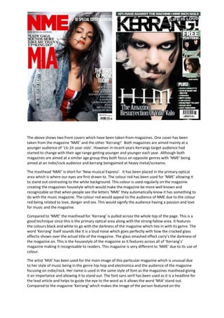
- 1. The above shows two front covers which have been taken from magazines. One cover has been taken from the magazine ‘NME’ and the other ‘Kerrang!’ Both magazines are aimed mainly at a younger audience of ‘16-24 year olds’. However in recent years Kerrangs target audience had started to change with their age range getting younger and younger each year. Although both magazines are aimed at a similar age group they both focus on opposite genres with ‘NME’ being aimed at an indie/rock audience and kerrang beingaimed at heavy metal/screamo. The masthead ‘NME’ is short for ‘New musical Express’. It has been placed in the primary optical area which is where our eyes are first drawn to. The colour red has been used for ‘NME’ allowing it to stand out contrasting to the white background. This colour is used regularly on the magazine creating the magazines housetyle which would make the magazine be more well known and recognizable so that when people see the letters ‘NME’ they automatically know it has something to do with the music magazine. The colour red would appeal to the audience of NME due to the colour red being related to love, danger and sex. This would signify the audience having a passion and love for music and the magazine. Compared to ‘NME’ the masthead for ‘Kerrang’ is pulled across the whole top of the page. This is a good technique since this is the primary optical area along with the strong fallow area. It features the colours black and white to go with the darkness of the magazine which ties in with its genre. The word ‘Kerrang’ itself sounds like it is a loud noise which goes perfectly with how the cracked glass effectis shown over the actual title of the magazine. The glass smashed effect carry’s the darkness of the magazine on. This is the housestyle of the magazine as it features across all of ‘Kerrang’s’ magazine making it recognisable to readers. This magazine is very different to ‘NME’ due to its use of colour. The artist ‘MIA’ has been used for the main image of this particular magazine which is unusual due to her style of music being in the genre hip-hop and electronica and the audience of the magazine focusing on indie/rock. Her name is used in the same style of font as the magazines masthead giving it an importance and allowing it to stand out. The font sans serif has been used as it is a headline for the lead article and helps to guide the eye to the word as it allows the word ‘MIA’ stand out. Compared to the magazine ‘Kerrang’ which makes the image of the person featured on the
- 2. magazine cover less obvious due to his name being placed in a sentence in the weak fallow area. Although above this features the text ‘HIM’ written in serif font with a line going through the middle giving it a gravestone effect linking back into the darkness of the magazine. The word ‘HIM’ is placed to the left but more or less in the middle of the magazine making it work in some ways as our eyes will be drawn to this and we will want to know who ‘HIM’ is which would make us want to buy the magazine. In the magazine ‘NME’ following The Gutenberg’s design principle nothing has been placed in the left bottom corner of the magazine as it is a weak fallow area but instead has been placed on the right hand side in the terminal area. Our eyes are drawn to the primary optical area which in this case is the masthead ‘NME’ naturally we look from left to right whilst our eyes are drawn down by reading gravity forcing us to look at the terminal area. Gutenberg’s design principle has been used differently in the magazine ‘Kerrang’ as it focuses on the strong fallow area of the magazine in order to get our eyes to be drawn down to the terminal area. In the middle of these two areas features a sign saying ‘Free Posters’ which would encourage people to buy the magazine more. The word ‘Free’ is surrounded a lime green background which is the only bit of bright colour featured on the magazine making it stand out more. In the terminal area many artists names such as ‘Florence and The Machine’ and ‘Biffy Clyro’ which are big selling artists are mentioned in a list which will encourage the readers to buy the magazine as they will want to find out more about there favourite artists and what MIA has to say about them. This is also the case with the music magazine ‘Kerrang’ as it lists artists such as ‘Ozzy Osborne’ and ‘Good Charlotte’. ‘Introducing the new top 10 special edition covers’ this tagline has been placed in a strong fallow area where people’s eyes are drawn to. The words ‘special edition’ will encourage the readers to buy the magazine as they will believe that the magazine features something that they have never seen before of something that they will never do again when in actual fact this is probably untrue. The lead article is ‘The State of Music Today’ by MIA. On the top left hand side of the page in the primary optical area a quote from the magazine saying “Lady Gaga sounds more like me than I f**king do” relating again to her ‘badboy’ image that is being portrayed. A famous name such as Lady Gaga will also make the viewers want to know more about what MIA has to say. The artist has been dressed in a top which features Great Britons flag and a denim jacket with the sleeves rolled up. MIA has been placed in the Great Briton top due to it symbolising how she is proud to be British. The sleeves of the artists denim jacket and the cigarette that has been placed in her mouth giving her a ‘bad boy’ image whilst the pose with her head tilted up is strong giving off the impression that she is a strong woman who is strong for her country. Also the messy hair shows that she doesn’t care what people think of her. This is very different to the image we see of ‘Ville Valo’ as we see the colour black dominate him on this image. Black eye shadow has been used for around his eyes giving him a dark edgy look. Direct address is used in the image making the audience feel like ‘Ville Valo’ is looking directly at them, to them. It makes the magazine feel more personal to the audience. The image used of ‘Ville Valo’ is a close up making his eyes and beard stand out more. The beard gives off a rugged ‘I don’t care’ effect relating to the dark side of the magazine. The smoke coming from ‘Ville Vallo’s’ mouth travels upwards towards the primary optical area making the word ‘Kerrang’ stand out and allowing peoples eyes to be drawn to either the main article on ‘Ville Vallo’ or the magazine masthead ‘Kerrang’. Compared to the main image of ‘MIA’ on ‘NME’S’ magazine the image of VilleValo featured on ‘Kerrangs’ fits in with the magazines genre more easily due to him being part of a rock band and the genre featuring rock.