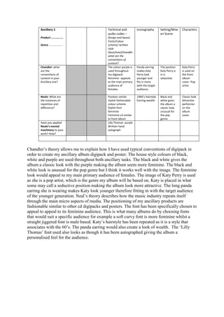
1. Ancillary 1 Technical and Iconography Setting/Mise Characters
audio codes – en Scene
Product …………….. Design and layout
Fonts/Colour
Genre ……………….. scheme/ written
style
(lexis/tone)Chandler
what are the
conventions of
content?
Chandler: what The colour purple is Panda earring The position Katy Perry
are the used throughout makes Katy Katy Perry is is used on
conventions of my digipack- Perry look in is the front
content in your feminine –appeals younger and seductive. album
Ancillary one? to the main primary fits in more cover- Pop
audience of with the target artist.
females. audience.
Neale: What are Position similar 1960’s hairstyle Black and Classic look.
the instances of stylish fashionable Earring-wealth white gives Attractive
repetition and colour scheme the album a performer
difference? Stylish font classic look, on the
feminine unusual for album
Feminine cd similar the pop cover.
to front album genre.
Have you applied Lilly Thomas- purple
Neale’s mental Written hand
machinery to your autograph
work? How?
Chandler’s theory allows me to explain how I have used typical conventions of digipack in
order to create my ancillary album digipack and poster. The house style colours of black,
white and purple are used throughout both ancillary tasks. The black and white gives the
album a classic look with the purple making the album seem more feminine. The black and
white look is unusual for the pop genre but I think it works well with the image. The feminine
look would appeal to my main primary audience of females. The image of Katy Perry is used
as she is a pop artist, which is the genre my album will be based on. Katy is placed in what
some may call a seductive position making the album look more attractive. The long panda
earring she is wearing makes Katy look younger therefore fitting in with the target audience
of the younger generation. Neal’s theory describes how the music industry repeats itself
through the main micro aspects of media. The positioning of my ancillary products are
fashionable similar to other cd digipacks and posters. The font has been specifically chosen to
appeal to appeal to its feminine audience. This is what many albums do by choosing fonts
that would suit a specific audience for example a soft curvy font is more feminine whilst a
straight jiggered font is male based. Katy’s hairstyle has been repeated as it is a style that
associates with the 60’s. The panda earring would also create a look of wealth. The ‘Lilly
Thomas’ font used also looks as though it has been autographed giving the album a
personalised feel for the audience.