1. Salford City College
Eccles Centre
AS Media Studies
Foundation Portfolio
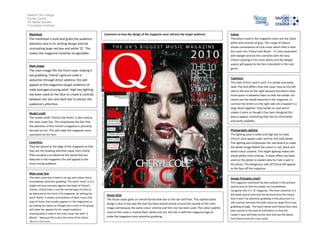
Masthead
The masthead is bold and grabs the audience
attention due to its striking design and the
contrasting large red box and white ‘Q’. This
makes the magazine instantly recognisable.
Main image
The main image fills the front cover making it
eye grabbing. Cheryl’s gesture code is
seductive through direct address; this will
appeal to the magazines target audience of
male teenagers/young adult. High key lighting
has been used on her face to create a contrast
between her skin and dark hair to attract the
audience’s attention.
Model credit
The model credit ‘Cheryl Cole Rocks’ is also used as
the main cover line. This emphasises the fact that
the attention of this month’s magazine is primarily
focused on her. This will make the magazine more
appealing for her fans.
Coverlines
They are placed at the edge of the magazine so that
they are not drawing attention away from Cheryl.
Their purpose is to advertise the bands that are
featured in the magazine; this will appeal to the
music loving audience
Main cover line
The main cover line is bold in its size and colour and is
immediately attention grabbing. The word ‘rocks’ is in a
bright red and contrasts against the black of Cheryl’s
clothes. Cheryl Cole is not the normal type of artist to
be featured on the front of Q magazine, by writing the
word ‘Rocks’ it shows connotations of Rock music (the
type of music that usually appears in the magazine) so
by making her seems as though she is now in this group
will make her appeal the Q’s target audience
Intertexuality is used in the main cover line with ‘3
Words..’ because this is also the name of her latest
album at the time.
Colour
Thecolours used in the magazine cover are red, black
white with accents of grey. This range of colours
shows connotations of rock music which links in with
the cover line ‘Cheryl Cole Rocks’. It’s also associated
with danger and sex this connotes with the way
Cheryl is posing in her cover photo and the danger
aspect will appeal to the fans interested in the rock
genre.
Typefaces
The style of font used is serif, it is simple and easily
read. The font differs from the cover lines on the left
side to the one on the right because the letters have
more space in between them so that the reader can
clearly see the bands featured in the magazine. In
contrast the letters on the right side are crowded in a
large block together, they harder to read which
makes it seem as though it has been designed this
way to appear interesting than too be informative
and easily readable.
Photography Lighting
The lighting used is white and high key to make
Cheryl’s face appear paler and her hair look darker.
This lighting also emphasises her red lipstick to make
the whole image fitwith the colour sc red, black and
white colour scheme. This bright lighting makes the
whole photo more striking. A water effect has been
used on the photo to explain why her hair is wet in
the photo. This dangerous side off Cheryl will appear
to the fans off the magazine.
Design Principles Used?
The magazine masthead has been placed in the primary
optical area so that the reader can immediately
recognise that it is ‘Q’ magazine. The main coverline is in
the weak optical area and the terminal area this means
that it won’t be attention grabbing in this place but it is
still used her because the bold colour an large font is eye
grabbing enough. The band names and Cheryls face have
been placed in the area of orientation so that the
reader’s eyes will looks across here and see the bands
that feature and the cover artist.
House Style
The house styles gives an overall formal look due to the san serif font. This sophisticated
design is due to the way the text has been placed evenly around the outside of the main
image and because the same colour scheme and font size has been used. The colour palette
used on this cover is mainly black, white and red, this ties in with the magazine logo to
make the magazine more attention grabbing.
Comment on how the design of the magazine cover attracts the target audience: