Your Desire Will Betray You (Film Poster Design Process
•Download as PPTX, PDF•
0 likes•284 views


Recommended
More Related Content
What's hot
What's hot (20)
Viewers also liked
Viewers also liked (20)
Similar to Your Desire Will Betray You (Film Poster Design Process
Similar to Your Desire Will Betray You (Film Poster Design Process (20)
Your Desire Will Betray You (Film Poster Design Process
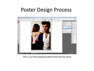
- 1. Poster Design Process This is our final selected edited shot that we chose.
- 2. Poster Design Process We as a group started to edited the poster design. We decided to start to try our some different colours to see how they would go with the picture. Blue was good but it was to dark to see due to cardigan being very dark.
- 3. Poster Design Process After picking out colours we decided to go with the colour red for are poster design. This would enable the title to be visible as it was a nice dark colour. Unlike other colours Tom and Gamma were making the title invisible. The colour being red suites the thriller theam to our film as it represents mystery and blood.
- 4. We started to decided where the title would be placed. We decided that it would be placed in the top left corner to see what it would look like. But Toms hair was two dark and it did not suite with the title as it looked like the title had a break between the background and the Toms Hair.
- 5. At this point of design we were trying things out. With started to put in our tag line ‘Your Desire Will Betray You’ under the title and we were happy with this. We also made the picture more faded and not so dark to see what it might look like.
- 6. At this point we decided to go back to our original shading for the poster. We had placed were we wanted the title and the tag line. We also added the certificate of our film, for added affect.
- 7. With everything in place and happy about what we had done, we decided to add some effects as we were not happy and thought that something was missing. We added a red gradient fill. The effect gave the impression of blood and that's what we wanted. Its shows the woman in the poster to be sinister and because of the weapon it gives the effect she has or will use it.
- 8. At this point satisfied with the gradient fill, we had to put in the stars names that were in our film. We decided to go with black as it would show up clear and defined. We also decided to change the title Deathly Obsession to a different font because of the way it stood out.
- 9. We then put in toms name into the poster. And we decided as it was placed on his hair that it would be in white so it could again like Gemma stand out.
- 10. With two amendments to the stars names making then words sharper in a different font. We ended on this design for final product for our first poster.