Presentation1
•Download as PPTX, PDF•
0 likes•60 views

This document describes the process of editing a photo to add titles and credits for a thriller film. Various techniques were tried, such as changing font colors, sizes, and positioning. A red gradient was added under the titles to make them visible against the dark shadows while maintaining a creepy tone. The names were also added in contrasting colors representing the characters' roles in the narrative.

Recommended
More Related Content
What's hot
What's hot (20)
Similar to Presentation1
Similar to Presentation1 (20)
Presentation1
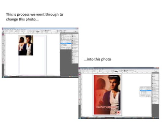
- 1. This is process we went through to change this photo... ...into this photo
- 2. I felt that this print screen was significant because it is the first time we see the title. We tried to have the title in the middle, but because of the stark shadows and colour it wouldn’t of worked in black.
- 3. In this photo we have tinted it so that we could see the title and sub-title, but this did not work as it took away the thriller vibe. We also lowered the title to make it more visible and changed the colour to red so it would stand out against all the shadows.
- 4. Here we have now got all the titles sorted in the right colours so they are visible, and have added a certificate. I thought that the red font with the shadows coming off it worked well as it gave to the creepy vibe, and I also thought that having the sub-title in opposite colours worked quite well.
- 5. We have now added a red gradient layer underneath the titles so that the titles are still visible, but the photo is faded red, we have also changed the font to make it look for thriller-ish. We have done this because the red really adds to the evilness of this scene and shows the audience that the woman will more than likely do something bad to the man.
- 6. Now we have added the actors/actresses’ names, in different colours due to their background, and the photo is more or less complete. I thought that having the woman's name in black and the man’s in white also added to some of the narrative, considering the woman is evil and the man is good, more or less.