
Recommended
More Related Content
What's hot
What's hot (19)
Similar to Media question 1
Similar to Media question 1 (20)
Recently uploaded
Recently uploaded (20)
Media question 1
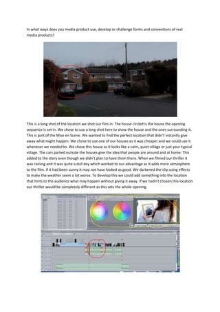
- 1. In what ways does you media product use, develop or challenge forms and conventions of real media products? This is a long shot of the location we shot our film in. The house circled is the house the opening sequence is set in. We chose to use a long shot here to show the house and the ones surrounding it. This is part of the Mise en Scene. We wanted to find the perfect location that didn’t instantly give away what might happen. We chose to use one of our houses as it was cheaper and we could use it whenever we needed to. We chose this house as it looks like a calm, quiet village or just your typical village. The cars parked outside the houses give the idea that people are around and at home. This added to the story even though we didn’t plan to have them there. When we filmed our thriller it was raining and it was quite a dull day which worked to our advantage as it adds more atmosphere to the film. If it had been sunny it may not have looked as good. We darkened the clip using effects to make the weather seem a lot worse. To develop this we could add something into the location that hints to the audience what may happen without giving it away. If we hadn’t chosen this location our thriller would be completely different as this sets the whole opening.
- 2. When editing our thriller opening we wanted to make sure it was the best it could be as the story line wasn’t the best. To do this we used a lot of short cuts for the parts of the story that weren’t as important but were key in our thriller opening. The part circled in red is the majority of the short cuts which help the film flow but adding a bit of suspense at the same time. We kept them short to stop the film from dragging on and to keep the audience wanting to carry on watching. Editing was a key part as our thriller would have been very confusing without it. This is because the shots we took were quite long as we wanted to have too much footage rather than not enough. Also it brings the story together and you can cut out parts which aren’t necessary. The part of the image circled in yellow is colour correcting. For this part of the film we tried to make it brighter by changing the contrast and making it brighter. We wanted all the attention to be on the photo so that the audience would understand the story and the flashback later on in our thriller opening. To develop this clip further we could enhance the photo a little more to make sure the attention is only on the photo. If we hadn’t added the filter over the top the clip would look very simple and we wouldn’t be able to get across to the audience what may happen later on. When adding the titles we wanted to make them similar to the ones used in the movie The Roommate. The ones used in that film faded in and out. As we took inspiration from this film we thought it would be a good idea to make our titles/credits a little like the ones used in The Roommate. We laid our credits over the top of our opening clip and placed them along walls, on the
- 3. ground etc. They aren’t placed perfectly but it works well with the buildings and objects in the clip. We used fade to transition the titles/credits in and out of the clip. We used this because its simple and doesn’t take all the attention away from the clip shown at the same time. We didn’t edit the original clip at all but when we added the credits in we had to position them in specific places to make them look as if they were in the film rather than being placed on top. To develop this we could change the font and place them in the right places and make them look better. If we hadn’t added the credits in the way we did, they may look quite boring and un noticeable. For this part of our thriller opening we used hand held camera work. This is a point of view shot of the other character. We used this so that the audience could put themselves in the characters shoes and see the situation from the characters perspective. Also the hand held camera tells the audience someone’s moving and the shakiness suggests the character is creeping up on the other character. We used this here because it gives the idea someone is moving/ coming closer and it adds more tension and suspense to the film. It works well here as all of the other shots were straight and still and this makes the film a little different and more interesting to watch. To develop this we could make the person look around to make it more natural and as if the character is checking no one is looking. If we hadn’t had used hand held camera work here our film opening may have looked very simple and the audience may find themselves un interested in our film. Also the suspense created may not have been there and we would have had to add in sound effects to add tension. We used a filter on this clip to give an idea that this clip is from eye level. We used vignette which blurs the edges of the clip. We felt it looked like the shape of an eye which helps when looking from the characters perspective. To develop this we could have made it blink like eyes or have them in the shape of two eyes. This is something we could have done when adding filters to our thriller. If we hadn’t had used this filter, the audience may not think that it’s taken from the characters perspective and see it as the camera walking towards the other character.
- 4. The title of our thriller is Best of Friends and we wanted the girliness of the film to come across in the title as it says a lot about our film. We found the font for our titles on dafont.com which has a wide range of different fonts for different things. We chose this one as we felt it looks like smudged makeup on a mirror and the dripped effect on the F’s and the T add a bit of horror to the font. This gives the idea of a girly film with a bit of horror mixed into it. The title brings the whole film together but still creates an atmosphere that shows the two girls are not just best friends. The white font on the black background jumps out and draws the attention to the title which is what we wanted as the title Best of Friends fits our film perfectly. To develop this we could have thought of a better name as I feel the font fits our thriller and wouldn’t need changing. If we hadn’t has used this font i don’t think the audience would understand the suspicious side of our film and it may not draw the audience in as much as we would hope. When editing our film we wanted to make certain sounds in our film louder and music to create different atmospheres. For the start of our thriller we got rid of the diegetic sound from the clip and added some upbeat mysterious music over the top. We did this because we felt the diegetic sound wasn’t enough for an opening to a film. If we were to do this again i think we would leave the diagetic sounds in as it added to the film and may have made our thriller a little bit better. When editing the sound for the slam of the picture we made it slightly louder as we wanted to emphasise the smack to show the anger from the character. We also did this for the knock on the door as we wanted it to be loud enough to show the other character could hear it. The flash back is other place
- 5. we added music. For this we again took away the diegetic sounds as they weren’t relevant in this part of our film and we wanted it to be a happy memory which is why we added some romantic, happy music to show the relationship between the characters at this time. For the end of our film we used some eerie music as the titles appear to hint to the audience that something bad has happened or is going to happen. The music we used we found on garage band and just repeated if needed. To develop this we could spend more time on the music a layer clips over each other. Also we could make the diegetic sounds in the film louder if needed to create more suspense. If we hadn’t had added music to our film, it would have looked like someone had taken a camera and filmed a conversation and if we hadn’t made to diegetic sounds louder the audience may not understand the story.