Micromeritics - Fundamental and Derived Properties of Powders
Digipak ideas analysis.
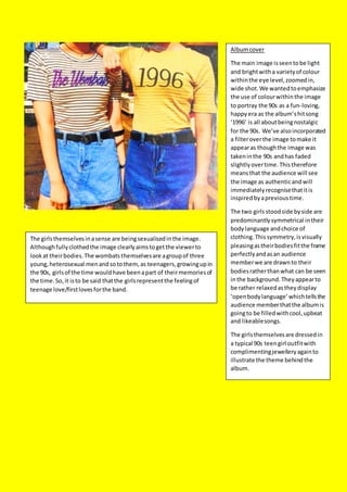
1. Albumcover
The main image isseentobe light
and brightwitha varietyof colour
withinthe eye level,zoomedin,
wide shot.We wantedtoemphasize
the use of colourwithinthe image
to portray the 90s as a fun-loving,
happyera as the album’shitsong
‘1996’ is all aboutbeingnostalgic
for the 90s. We’ve alsoincorporated
a filteroverthe image tomake it
appearas thoughthe image was
takeninthe 90s andhas faded
slightlyovertime.Thistherefore
meansthat the audience will see
the image as authenticandwill
immediatelyrecognisethatitis
inspiredbyaprevioustime.
The two girlsstoodside byside are
predominantlysymmetrical intheir
bodylanguage andchoice of
clothing.Thissymmetry,isvisually
pleasingastheirbodiesfitthe frame
perfectlyandasan audience
memberwe are drawnto their
bodiesratherthanwhat can be seen
inthe background. Theyappearto
be rather relaxedastheydisplay
‘openbodylanguage’whichtellsthe
audience memberthatthe albumis
goingto be filledwithcool,upbeat
and likeablesongs.
The girlsthemselvesare dressedin
a typical 90s teengirl outfitwith
complimentingjewelleryagainto
illustrate the theme behindthe
album.
The girlsthemselvesinasense are beingsexualisedinthe image.
Althoughfullyclothedthe image clearlyaimstogetthe viewerto
lookat theirbodies.The wombatsthemselvesare agroupof three
young,heterosexual menandsotothem,as teenagers,growingupin
the 90s, girlsof the time wouldhave beenapart of theirmemoriesof
the time.So,it isto be said thatthe girlsrepresentthe feelingof
teenage love/firstlovesforthe band.
2. Albumcoveridea#2
The secondIdeafor the albumcover
isinspiredmore towardsthe music
videothatisgoingto be produced.
The silhouettesaimtoreflectthe
twomain characterswithinthe
narrative.We decidedtodothis
because itwouldthenmeanthat
there’dbe a recurringtheme from
the musicvideo,tothe DVD cover
and finallytothe albumcover.This
therefore meansthatthe audience
wouldfamiliarise themselveswith
the imageryandassociate itwith
The Wombats.Furthermore
repetitionwouldaidwithaudience
memory.
We know thatthe silhouettesare in
an intimate relationshipastheir
bodiesare plasteredupagainstone
and other. The couple represent
traditional genderstereotypesas
the suggested femalefigure onthe
leftiscurvierthanthe suggested
male silhouette,aswell asshe is
seentobe shorterthanthe
suggested male silhouette which
againreinforcesstereotypes.
The coloursused,again,aimto reflecthowthe ninetieswas
viewedasa funloving,livelyerainthe eyesof the band.The
coloursaimto connote a feelingof love andwellbeingasit
consistsof redthrough to pink.These coloursare traditionally
usedto representlove asonValentine’sDayforexample,these
coloursare usedbycompaniesforproductsand marketingfor
Februarythe 14th
.
The coloursthemselvesare cutunsymmetricallyinordertocreate
an artistic,abstract effectinordertolinkto the indie genre.
The font andtextusedhave remainedinthe same throughoutthe
digipakideasasitrepresentsthe band’slogoandthe albumtitle
that isbeingpromoted.
3. DVD exterior, front cover- The main
image.
The main image is related to our
proposed music video narrative. The
pairs of legs aimto represent the couple
seen in the video, as we can see that
the girl on the right is on her tiptoes to
kiss her lover. They wear the same
shoes (Doc Martens) as these shoes are
seen to be unisex.
Furthermore, the styleof shoeis heavily
associated with indiecultureas the
combat boot is rebelliousand has
military connotations.Therefore, to the
alternativeaudiencewould be ‘cool’
because itis different from the
mainstreamshoes that aresold in high
street stores e.g. flashy trainers or
strappy heels. Lastly,itis famously
known that the grunge fashion scenein
the 90s became obsessed with the boot
after it had been favourited by previous
generations of youth subcultures such as
skinheads,punks,scooter riders and
new wave musicians.
The background image of the street is
blurred so that the foreground stands
out becausewe want the audienceto
get the reference to the music video.
Followingconvention,the age certificateand DVD sticker are placed
to the left and right of the cover. This helps the audience understand
that this is a DVD as this layoutis familiar to them.
(In the final productboth logos will sharethe same background as the
main image)
The age certificateas under ‘bbfc’ regulations is rated 12A. We
decided that this would be the appropriateageas itis unlikely that
persons under 12 have an interest in the band,but if they do their
parent must accompany them as stronglanguage could be a part of
the band’s vocabulary,when we filmoffstage outside of the music.
Those 12 and over will beableto comprehend what’s happeningin
the filmand will havea higher attention span seeingthem more likely
to sitstill and watch the DVD.
Text
The title consists ofthe bandnameto drawin fans
as well as thenameoftheiralbumwhichalso
happens to bethenameofthetour to which
promotes thealbum.The text is in aninformal,
handwriting stylefont which links back to the indie
genre. It is placedin between the coupleas ifit
were at thetop, following convention, it wouldn’t
be as readable as wellas ithelps to fill in theblank
space betweenthecouple.
The same principle applies to thesubtitle below.
For the finalproductit will sharethe same
backgroundas themain image. Thefont chosen is
simplisticand structured to contrast againstthe
title.
4. Music magazineAdvert
I would imaginethat The Wombats would be featured in magazines
such as ‘NME, Q and KERRANG!’ magazine for their alternative
sound.
We decided to give an artistic overall styleto the advert as itreflects
the indiegenre. Fans of this genre expect to see a creative advert,
that stands out from the norm as that is what the indiegenre is
centred around.
Therefore, instead of havingthe predictable,image of the band
we’ve used the animal thatthey named themselves after to make
the band appear comical as well as smart.The audiencewill engage
with this as itshows off more of the personality of the band. The
baby blue and white colour scheme provides a refreshingtwist to
the style of image. This is becausepeople would commonly expect
to see black and white to show lightand shadow. So, the baby blue
tones the contrastdown and provides for a more relaxed image as
black and white could make the image appear too serious and
regimented.
The same fonts are used throughout for the band name and album
title to show that they arelinked furthermore itaids in visual
memorisation of the band to the audience member. Whenever they
see that font or a font in a similar styleto that, they’ll immediately
think of the band.
The subtitlebeneath reading‘OUT NOW’ was a common statement
found amongst our group’s research of magazine adverts. It’s
upfront, ‘in your face’ and direct letting the audienceknow that the
albumhas been released and is availablefor purchase.As we would
expect, the font differs from the title to show that both pieces of
text are different.The fontusedisformal andthe lettershave
beenspacedoutso that itis legible.