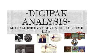
2. Artic Monkeys - ‘Whatever People Say I Am That’s
Exact What I'm Not’
This digipak is for the debut album for the Artic Monkeys. It was
released in 2006.
As this was their debut album they needed to make an impression with
their album on their audience on what they're all about and what their
music means to them. The name of the album ‘Whatever People Say I
Am That’s Exact What I'm Not’ came from the book the singer loved at
the time. The songs in this album are very similar to the book, its about
feeling good and going out. This title stereotypes the band into the indie
genre. This helps the audience recognize whether they'd be into this
music or not.
The main image of a man on the front and the back is not actually a part
of the band, which may seem strange however the man might represent
what the band see/ feel themselves as. The band may also not want to be
judged purely by their looks. The man looks working class, and is just in
casual clothes. This could convey they idea that the fame hasn’t affected
how they see themselves. Also if they had a full band on the cover it ay
stereotype them to a typical boyband.
The man on the front cove could also reach their target audience looks
wise more than maybe just a band picture would. The man doesn't’t look
like he’s come from fame, he looks like a normal working class, the indie
genre is very clearly shown by this male on the cover.
The colour scheme is very stripped back and conveys the indie rock band
genre.
3. Beyoncé – ‘4’
This digipak has one main focus and that is the artist herself. Beyoncé is
on all of the CD, the front cover and the back , her make up isn’t too
heavy and unnatural which reinforces the well known ideology that
Beyoncé is a natural beauty. She is doing a different pose on each piece.
The pose on the front cover is quite neutral but also serious. This
portrays the romantic/pop/hip-hop genre. The backgrounds are similar
in colour throughout, being quite dull, although this is effective as is
makes the actual artist and name stand out against the background.
Beyoncé is wearing all black which does make her stand out against the
background, however it also relates to her star recognition as she’s
portrayed as strong, powerful and elegant, and her being in black helps
convey that star appeal.
The angle on the front cover is a low angle camera shot. This enforces
the idea that Beyoncé is a powerful and strong woman. Many of her fans
look up to her as a queen as she has passes several stages in her life
making her strong and independent alongside having a family.
The artists name is plastered across all three pieces at the top in bold
and the same font. This is Beyoncé’s trademark font. Her fans and fans
of the romantic/pop genre easily recognize her CD’s. The song titles and
any information is also written boldly and in the same font. This helps
make it clearer and more understandable to the audience.
4. All Time Low – ‘Don’t Panic’
This digipak has the album title very clearly displayed on a black
background to make the text stand out. This helps it be immediately
obvious what it is to the audience. The cartoon drawings on the cover
relate to the punk-pop genre as its quite fun and different to most things
out there. They can also relate to the title, the cartoons are quite
humorous of situations that could provoke panic but the bands image is
too fun, energetic and cool to panic.
The band are also not pictured on the front cover which could suggest
that they’re not too struck by the fame and their fan base are not purely
for their looks.
The back of the CD case is less busy as the rest but still carries on the
cartoon drawing theme. This is to help the audience read the given track
information without being too ‘in your face’ with the drawings, yet still
tying in all the sides together.
The cover on the back is the first sight the audience see of the band in
cartoon form. This portrays the idea that the band feel their music is
more important than their appearance and how they se themselves.
The CD disk has the exact same image on as the front cover does, this
makes it easier to identify and finally ties all the digipak together.