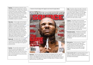
1. Masthead- The masthead uses dominant contrast
so the audience spots it straight away, it’s done this Comment on how the design of the magazine cover attracts the target audience: Colour - The colours used are red, white, a minuscule
by the use of bold text. The colour of the masthead amount of black and a background which seems like a
connotes passion, power, and danger. The type mix of brown, grey and white. The connotations of
faced used is a formal text with an informal layout red are power, passion, danger etc. This may suggest
of the masthead as the word “The” is on its side to that he is a dangerous person which goes with the
give the word “Source” the full view for the fact he has a gun. I think the target audience will be
audience. The positioning of the masthead is also interested that he has a gun, as it shows he is
used to draw the audience’s eyes toward the male, powerful and maybe a leader of a gang.
this highlights the picture as important.
Typefaces – The typefaces used are quite bold/
Main image - The main image is the first thing the object like, firm text, maybe to connate that they/he
audience will see, the designers have done this by has power in some way. The layout of the text is
making him a dominant contrast with use of the formal but they is different colours used in-between
background. The image is of a man who by a every text, which isn’t too formal. The actual text
judgement is involved in gangs which explains the used is the music titles and maybe a significant
gun held to his chin and his many tattoos. The sentence “suicide is not an option” which may appeal
image will shock the target poo t audience as you to the target audience of living a dark life.
don’t expect someone to do this. This effect of
shocking the target audience poo will make them Photography Lighting – The lighting use is both high
want to know why he is doing that, so it creates an and low key, the high key is used on his face to help
enigma. So the audience will read on and as the the dominant contrast and make him standout,
image targets a specify audience they will more suggesting he is significant for the magazine. The low
than likely take an interest in the magazine. key lighting is used in parts around him to help make
him stand out.
Model credit – The model credit in this is that his
music it advertised and this appeals to the audience
as they like his music therefore the model credit will
Main cover line - The main cover line is “The game”
make the audience think highly of the magazine if
this might be a quote by the main image which
they like the artist.
could be referring to life is a game. This appeals to
the target audience as if there looking at the
magazine because of the main image, the saying
Coverlines – The cover lines used are names of “The game” must take a interest from the target
artists and a sentence which appeals to the audience.
audience and you know it’s important as it’s
underlined. The colours in the cover lines are white
then red white then red and so on. This is done so Design principles used? The Guttenberg design principle is
there is a contrast between the cover lines so they House Style – the house style consists of 3/4 colours for the typefaces and main image. The used in this magazine and the title of the magazine is
both stand out equally. colours are red, brown, black and white, these colours are used to make the image or text positioned and the picture achieves formal balance but the
standout. It also highlights key information that the designers want the audience to see such as text achieves informal balance.
the type of music in the magazine, so it appeals to the target audience. The layout is simple to
follow and the text is laid out formally.