1. Salford City College
Eccles Centre
AS Media Studies
Foundation Portfolio
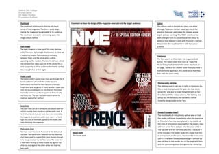
Masthead Comment on how the design of the magazine cover attracts the target audience: Colour
The masthead is featured in the top left hand The colours used in the text are black and white
corner of the magazine. The font is quite large although Florences red hair takes up a lot of the
making the magazine recognisable to its audience. space on the cover and makes the images appear
The masthead is in white contrasting again the bright and eye catching. The ‘NME’ masthead has
image colours behind been changed from its conventional red colour to
white so that it doesn’t clash with Florence’s red hair,
these makes the masthead fit in with the colour
Main image scheme.
The main image is a close up of the main feature
artist, Florence. By having a photo taken so close up
it makes the reader feel a sense of intimacy Typefaces
between them and the artist which will be The font used is serif to make the magazine look
appealing for the readers. Florence’s red hair, which formal. The larger cover lines such as ‘State The
she is known for, takes up a lot of the photo this is Music Today’ look bold to make them stand out on
done purposely to show audience familiarity so that the page. Some of the smaller cover lines also have a
they know it’s her at first sight. more feminine approach; this could be so that they
fit in with the cover artist.
Model credit
The model credit ‘I would never have got through the X
Factor auditions’ will shock the reader because
Photography Lighting
Florence and the machine have become a famous
The lighting used is high key to light up Florences fac,
British band and her genre of music wouldn’t make you
think she’d consider going on the XFactor. This make this is done to emphasise her pale skin that she is
the reader want to buy the magazine to find out why known for and also to make the white light on her
she thinks this. The text has been used in white to face fit in with the colour scheme. The lighting also
stand out against her red hair. brings out her famously red hair which will be
instantly recognisable to her fans.
Coverlines
The cover lines are all in white and are placed over her
red hair making them stand out and be easily read. A Design Principles Used?
list of other bands that are have been interviewed by
The masthead is in the primary optical area so that
the magazine are written underneath each in a list in
the reader will know immediately what the magazine
hope that one of them will appeal to the reader and
is. Florence’s face has been placed in the middle of
make them buy the magazine.
the area of orientation meaning that the readers eyes
will look across here and see who the cover artist is.
Main cover line The barcode is in the terminal area this is because it
The main cover line reads ‘florence’ at the bottom of House Style is the last place the reader looks this shows that this
the cover. Her band name Florence and the Machine
The house style is unimportant on the cover. However the main cover
ahsnt been used to suggest that she is famous enough
line is in the weak follow area although it will still be
to be recognised just by her first name. The cover line
eye catching to the reader due to the large bold font
in bold black writing so that it stands out against her
white top and against the other white text that has and the contrasting black text against her white top.
been used.