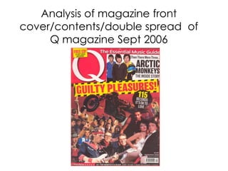
2. FRONT COVER ANALYSIS
THE MASTHEAD – SELLING LINE – The
This is name of the selling line, is very biased
magazine in this case the promoting themselves as ‘The’
magazine is called, ‘Q’ this only magazine suitable for
sets the house style as you your music.
can see this is white
text, and the biggest text
COVER LINE – This differs
from conventional magazines, as
on the page.
there is only one cover line. This
BACKGROUND makes this magazine unique and
The background and stand our from other magazines.
main image consist of Added to that this is biggest text
many different musical on the page.
artists and people
associated with the genre
of music, the collage of
FLASHER- This gives an offer to
the reader this also links to the
people can detonate to
house with the yellow but stands
us how close fans and
out on the black background.
artists of that genre are
closely knit together.
THE MAIN IMAGE – This
BARCODE/DATE magazine is very image based
and has gone against mundane
ISSUE/PRICE – This is magazine covers by using a
conventional and is montage of images instead of a
displayed on every medium or close up shot. As a
magazine. result of this this gives potential
THE FOOTER – This is customers in the target audience
which would give them more of a
information about what is
chance to recognise an artist may
included in magazine
like which may lead to them
separate from the main
buying this whereas one main
story/article, this shows
image does not.
how Q are rated.
3. BANNER –This is
Q MASTHEAD –This is the CONTENTS ANALYSIS where you would
same colour as the Masthead on expect to see Banners
the front cover, this comes on all magazines, this
across as professional and also a also follows the house
consistent house style. style. Which contents
the date.
MAIN IMAGE – The main
image is the focal point of this
page as this is the biggest
feature on the page, we see a
BYLINE -This is credit
medium long image of a male for author and
dressed in black with a mode of photographer.
address direct to the audience.
Using a famous artist for the
image may interest other HOUSE STYLE – This
readers too. house style has been
consistent throughout use
of the same colours all of
MAIN COVER LINE - This the way through.
links with the main cover line
from the front cover giving the
reader more information about INDEX – The index is
what this consists of. sub headings and brief
information that is
included in the
magazine.
USE OF A PULL QUOTE
– This is a quote from Cliff
Richards which says ‘Devil
RULE OF THIRDS –
Rule of thirds is used on
woman is my kind of
this magazine and most
rock’n’roll!’ , this lets the reader
other magazine for
know about about the article
guidelines to the layout.
before reading.
4. DOUBLE PAGE SPREAD ANALYSIS
MISE EN
SCENE – This is
created by the
image of the male
and the scenery of MAIN IMAGE
the sky and the sea – The main image of
behind him. Matt Bellamy takes
up the whole of the
page, this could be
used as a poster by
fans of him. This
COPY- this is image relates to his
based in a interview page.
question and
answer
form, however
differs again from
other magazine as
there is no drop MAIN HEADLINE –
capital. The main headline is
a pull quote, this
may attract readers
that can relate to
quote or people that
are interested in the
topic of the article.
3 COLOUMNS – This SUB HEADING – This is brief
PAGE article is has a layout of information about what is to come
in the article, in this case, Muse
NUMBER/NME 3 columns, this is a very
artist Matt Bellamy .
TITLE/DATE – This conventional style.
conventional and
expected to see on all
double page spread.
5. Q BACKGROUND
http://www.qthemusic.com/
The review section covers; new
music, film, concerts and also radio and
television.
Readership - 80,418
Editor – Paul Rees
Price £3.90
Q magazine does not really have a
genre of music, its main interest is new
releases and upcoming artists they also
base on interviews. Generally the
magazines are aimed at over 18’s, due
to the variety of music they cover . Q
has been published monthly since 1986
by Bauer Media Group.