
Recommended
More Related Content
What's hot
What's hot (20)
Similar to Media Album Cover Analysis
Similar to Media Album Cover Analysis (20)
Recently uploaded
Recently uploaded (20)
Media Album Cover Analysis
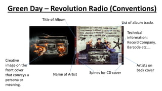
- 1. Green Day – Revolution Radio (Conventions) Name of Artist Title of Album Artists on back cover List of album tracks Technical information: Record Company, Barcode etc…. Spines for CD cover Creative image on the front cover that conveys a persona or meaning.
- 2. Green Day – Revolution Radio (Cover Analysis) Prop – Radio on fire Green Day is often categorized as some form of punk rock which is known for being a genre that is very anti- establishment, and I think this image is an example of this. The radio nowadays is dominated by mainstream pop music, so by having this image be a radio on fire, it could be symbolic of their stand against mainstream pop music. Font – Graffiti The font used for both the titles and the song listing looks a lot like graffiti, which too has connotations of being anti-establishment and rebellious, which is what the band are going for. Mise-En-Scene – Performance The bands stances whilst sitting down, specifically the frontman's look casual. This makes the band seem fun and down to earth Prop – Radio The radio is seen again, except this time the fire is burnt out and the radio is destroyed Mise-En-Scene – Costume Both the clothes that the band members are wearing and the colourful hair give the band members more of a rebellious image.
- 3. Bruno Mars – 24K Magic (Conventions) Artist on Front Cover Name of Artist Title of Album Technical information: Record Company, Barcode etc….. List of Album Tracks
- 4. Bruno Mars – 24K Magic (Cover Analysis) Camerawork – Long shot of artist sitting on a chair. Bruno Mars is shown sitting on the chair in a very laidback fashion and with good looking, expensive clothes on, specifically his hat, sunglasses, shoes and necklace. This is important as it shows Bruno Mars as this laidback and cool person, which also reflects the feel of the album. It is also important to have an artist on the cover of the album so that more people recognise them. Font – The font used for both the album title and the tracks from the album looks very fancy and sophisticated. The type of writing that would be on very expensive drinks. This further conveys Bruno Mars as someone who is very rich. This is also further shown by the fact that the font is gold. Design – The design of the album is very basic, with just a plain white background apart from the two red lines and one black line that appear on both sides. This is different to many album covers that’re colourful and more thoroughly designed, whereas this cover is quite stripped back. It’s just Bruno Mars sitting on a chair. Perhaps the stripped back nature of the album cover could be to show Bruno as someone who is more down to earth and relatable, which I feel contradicts with him flaunting his fancy clothes and the fancy font.