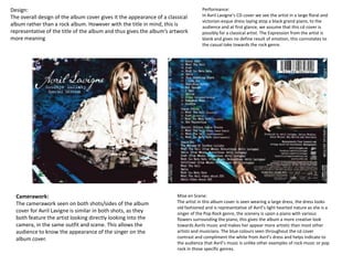
1. Camerawork:
The camerawork seen on both shots/sides of the album
cover for Avril Lavigne is similar in both shots, as they
both feature the artist looking directly looking into the
camera, in the same outfit and scene. This allows the
audience to know the appearance of the singer on the
album cover.
Mise en Scene:
The artist in this album cover is seen wearing a large dress, the dress looks
old fashioned and is representative of Avril’s light hearted nature as she is a
singer of the Pop Rock genre, the scenery is upon a piano with various
flowers surrounding the piano, this gives the album a more creative look
towards Avrils music and makes her appear more artistic than most other
artists and musicians. The blue colours seen throughout the cd cover
contrast and compliment the white from Avril’s dress and helps indicate to
the audience that Avril’s music is unlike other examples of rock music or pop
rock in those specific genres.
Design:
The overall design of the album cover gives it the appearance of a classical
album rather than a rock album. However with the title in mind, this is
representative of the title of the album and thus gives the album’s artwork
more meaning
Performance:
In Avril Lavigne’s CD cover we see the artist in a large floral and
victorian-esque dress laying atop a black grand piano, to the
audience and at first glance, we assume that this cd cover is
possibly for a classical artist. The Expression from the artist is
blank and gives no define result of emotion, this connotates to
the casual take towards the rock genre.
2. Camerawork: The shot seen in this album cover is of a long shot of a
couch, in both shots it stays the same, however on the back it shows the
artists sitting on the couch, this breaks the conventions of the album
covers and makes the artists on the album appear more creative to
parody the convention, saying that they are out of the norm.
The slight angle to the shot gives a strange view to the couch and gives it a
bolder, more welcoming posture, the complementary mix of Green and
Red in the CD cover also help gives the couch a bolder image, as it helps
welcome newer audiences to not only purchase the album but to also get
acquainted to the pop rock genre.
Mise en scene: The scene shows a forest at night with a red
velvet couch, the couch clashes with the natural colours of the
forest. In the second shot of the album cover we see very little
difference in the content of the shot but a larger change in it’s
post production, the gamma is reduced and gives a darker,
more muted colour palette which is more blue rather than
green and thus the couch is less of a focus, this connotes that
the band sitting on the couch are now the new focus of the
album cover. It’s also an interesting point to explain that the
artists only make an appearance on the back of the cover
rather than the front which requires the viewer to look further
towards the album in order to see the artists.
Design: The album cover’s font provides the viewer with a sans
serif typeface which has a casual, laid back appearance and works
well with the appearance of the couch. The light and overexposed
colours and editing on the front photo give the album a more
artificial and altered performance, much like Paramore’s music is
an alternation on two genres; rock and pop.
Performance:
The four members of the band are all slouched onto the couch looking directly into the
camera, they all seem huddled together and the audience is assured that they are a group
and work together, their slouched and confident appearance along with the high angle of
the camera helps reinforce the rebellious nature of the group.
3. Mise en Scene: This album cover for Mcfly’s work is much more graphic
than the previous album covers and is less conventional than the two,
the graphic of the microphone and the typeface both match the curving
nature of each other and provide a more eye catching appearance. The
blue backdrop contrasts heavilly with the typeface and the image and
thus allows everything on the album to stand out towards other
audiences.
Design: The graphic image shown on the album cover is stylesised and has a
lot of curves seen throughout the design, in a way this resembles the curves
and characteristics of the Mcfly logo, and thus the two work well together.
The colours of the microphone along with the overall design is over
exaggerated and expressive, the contrast in colours between the chrome of
the microphone and the yellows and reds of the mouth shows contrast and
colour in this CD cover.
Performance:
The Aggressive posture of the album cover’s image is a representation of
the kinds of cultures and fans which listen to rock, considering many songs
of the rock genre are aggressive, whereas Mcfly use the graphic to give
the impression to the audience that their music fits with the conventions
of rock, but isn’t as aggressive, due to the use of a casual blue background.
Typeface.
The font and logo for the band is cursive and playful, it can both be
interpreted as a formal script style typeface, but also has a lively design
to itself. The type face draws in the audience with it’s usage of typeface
and serif and formal fonts to indicate that whilst they come across as
aggressive or formal, they are in fact more casual than what they appear.